was successfully added to your cart.

how to wear color Archives - Style Clinic

ColorSense_part 2

COLOR SENSE: Part 2, Contrast

By | Colour, Coordination | 15 Comments

At some point, most of us come to the realization that the colors wear have an affect how we look, feel and how others react to us. Colors that compliment our skin, eye and hair color boost how healthy and vibrant we appear and can magically turn back the clock a few years by giving us a more youthful glow.

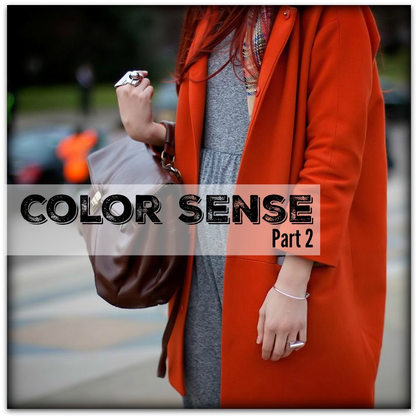
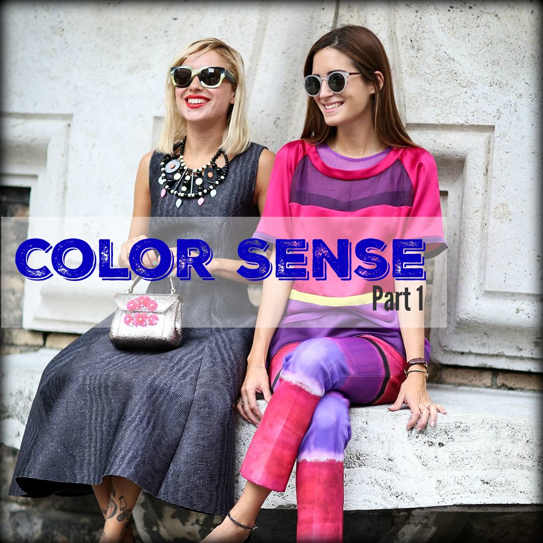
Following on from part 1, this time I want to talk about ‘Color Contrast.’

While a color analysis provides valuable information for selecting the colors that work best for you, there are other important aspects of color coordination within your range of best colors that is seldom taught.

To start, contrast is created when two or more colors are placed next to each other.

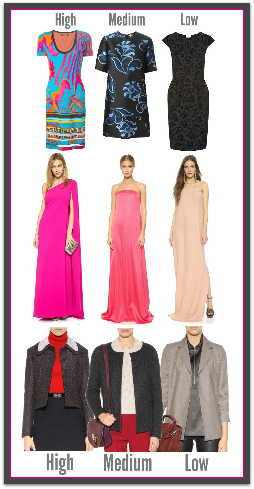
There are three contrast levels:

  • High: bright, loud, vivid contrast that makes you say ‘WOW.’
  • Medium: two or more colors where a mix of light and dark is seen.
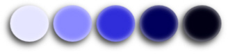
  • Low: a mix of colors which are similar depth to each other and seem to blend together.

Contrast Circles

Each contrast level affects:

  • how well a garment reacts with the contrast between your hair, eyes and skin.
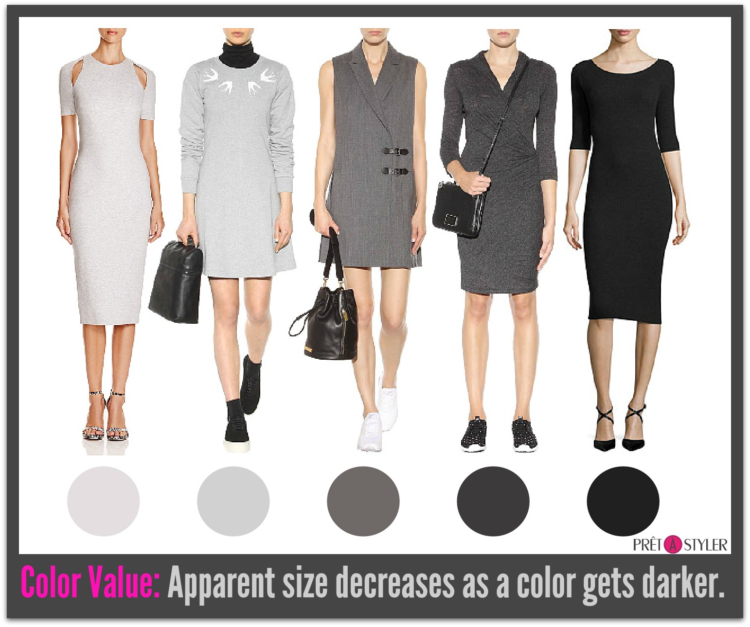
  • the perception of the size of the area over which the garment is being worn,
  • your image when wearing the contrast level.

Focus is naturally drawn to contrast. Once understood contrast can be used to:

  • highlight or hide an area of your body,
  • make a visual statement or blend in and observe,
  • be taken seriously, remembered and listen to, or be overlooked or discounted.

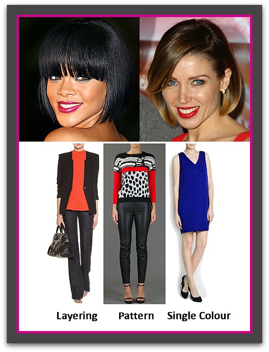
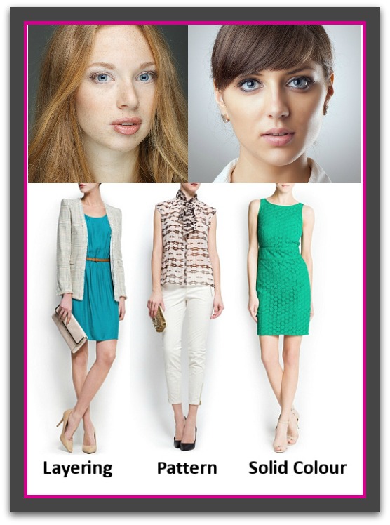
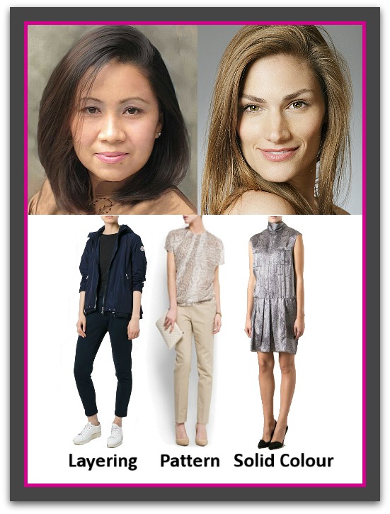
Each contrast level can be created in the following ways:

  • between colors within a pattern or print
  • between garments when layering
  • between a solid colored garment and your skin.
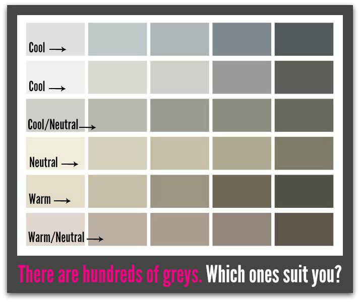
Contrast Grouping

Skin Deep

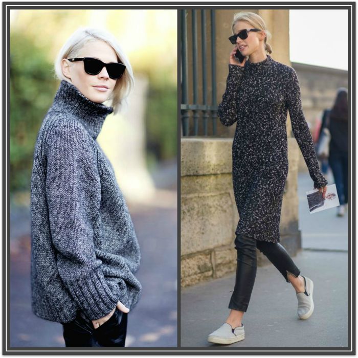
Also worth noting is that a person’s skin coloring dictated which colors are high, medium or low contrast. Notice Isha in the burnt orange jacket below (low contrast) and Katie in the oatmeal colored dress, also low contrast. If we placed the orange jacket on Katie, the contrast would be medium. Alternatively, if we swapped Katie’s oatmeal dress onto Isha it too would be medium contrast.

Constrast Comparison bewteen black and white skins

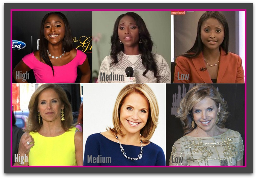
Top Row: Isha Sesay  Bottom Row: Katie Couric

High Contrast

High contrast is created when two colors combine to create a very bright combination – one that causes others to say or think ‘WOW.’ It may be a dark color with a bright color or two bright colors together i.e. purple and yellow.

High contrast is best worn by individuals who have a medium to high color contrast between their hair, skin and eyes, as well as bright looking eyes and skin (tends to be combination to oily). These color groups are:

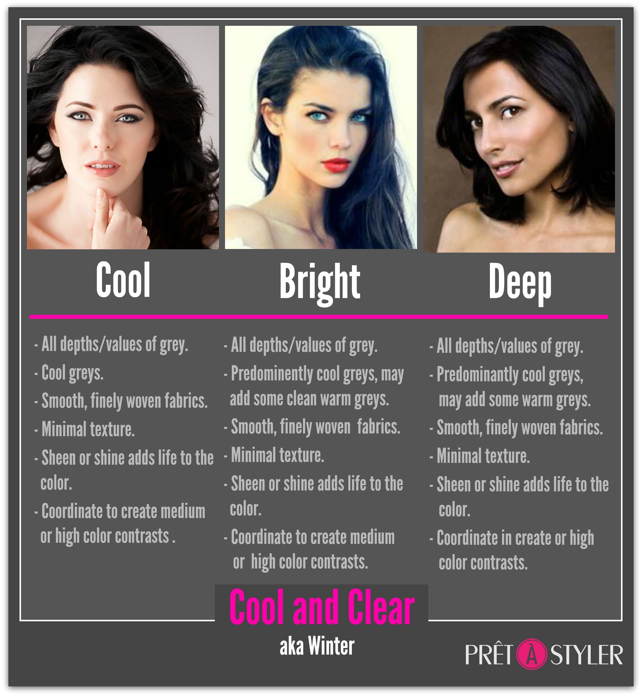
  • Bright Winter / Cool, Clear,
  • Cool Winter / Cool and Clear,
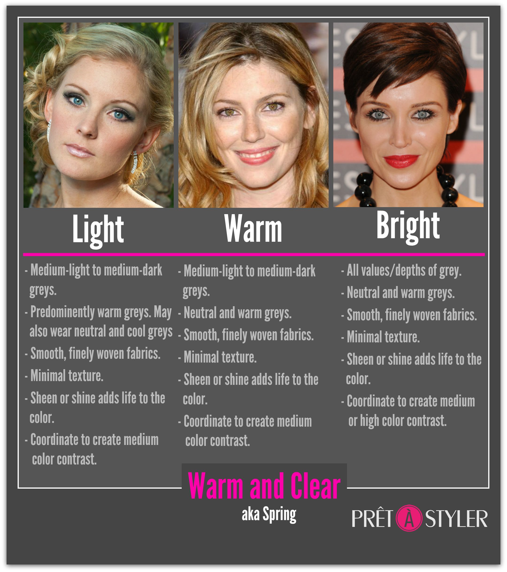
  • Bright Spring / Warm, Clear and Bright.
  • Deep Winter / Cool, Clear and Dark

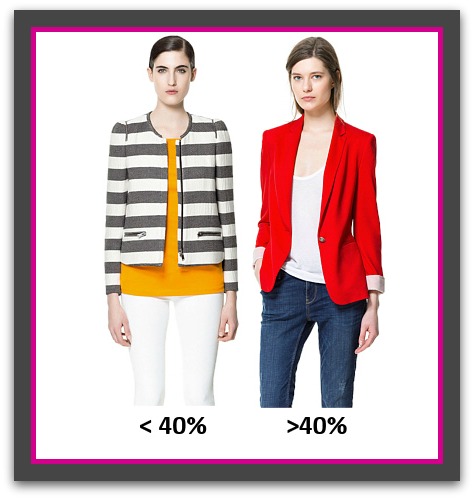
Women with a low contrast will find that high contrast clothing will be so bold that the garment, not they will be the center of attention – see >40% model below. 

Depending on the pattern and the colors used, the psychological effect this combination produces is one of power, authority, flamboyance, creativity or eccentricity. High contrast combinations are generally worn by confident, outgoing people and while the look will certainly get you noticed, it is not necessarily one that is approachable or people friendly. Often people will stand back and observe you for a while before deciding if you are someone they feel comfortable approaching. This contrast level is most effective at times when you need authority or to stand out and be noticed. Not recommended for job interviews or situations when you need to win people over to your idea or side of the argument.

High contrast exaggerates all pattern sizes, especially those that are medium to large.

High contrast also highlights the area to where it is applied; drawing attention to it and visually advancing the area making it appear larger. Therefore, it’s best worn over the smallest area of your body.

When layering, to be able to pull-off high contrast without blinding anyone keep the high contrast color less than 40% of the color seen – see <40% and >40% images below.
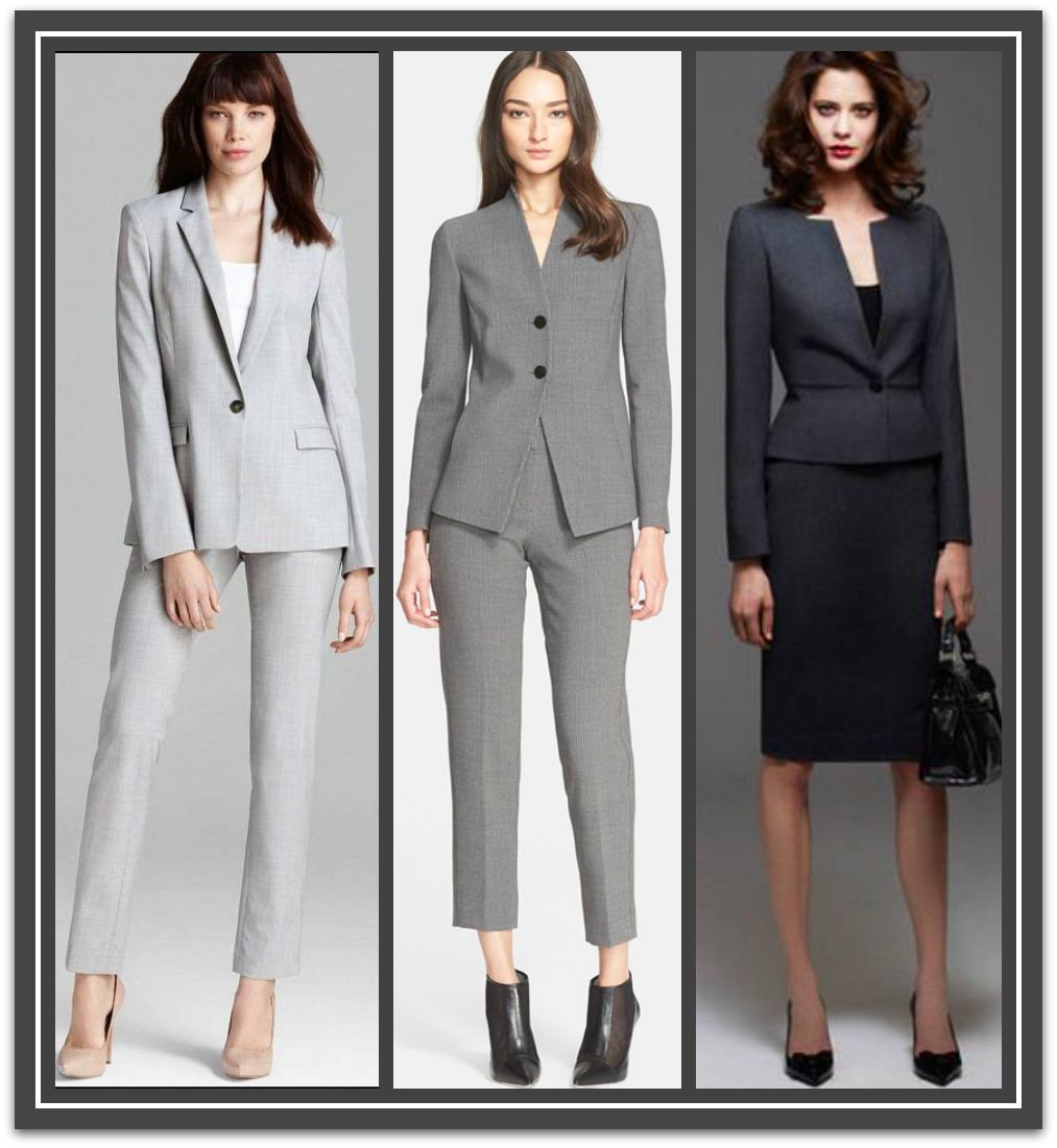
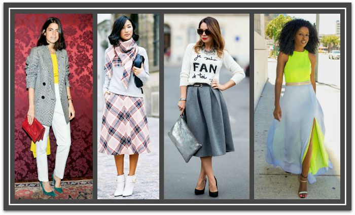
High Contrast Group

High_Contrast_percentages.

Medium Contrast

Medium contrast is created when various color depths are combined that are easy on the eye and harmonious.

It is a contrast level suits all individuals regardless of personal coloring or ethnicity.

The psychological effect this combination produces is one of confidence, professionalism, appropriateness. Medium contrast attracts attention in an approachable and people friendly manner. The look inspires others to notice, remember, listen to and taken you seriously. It is appropriate for all situations, locations, and occasions.

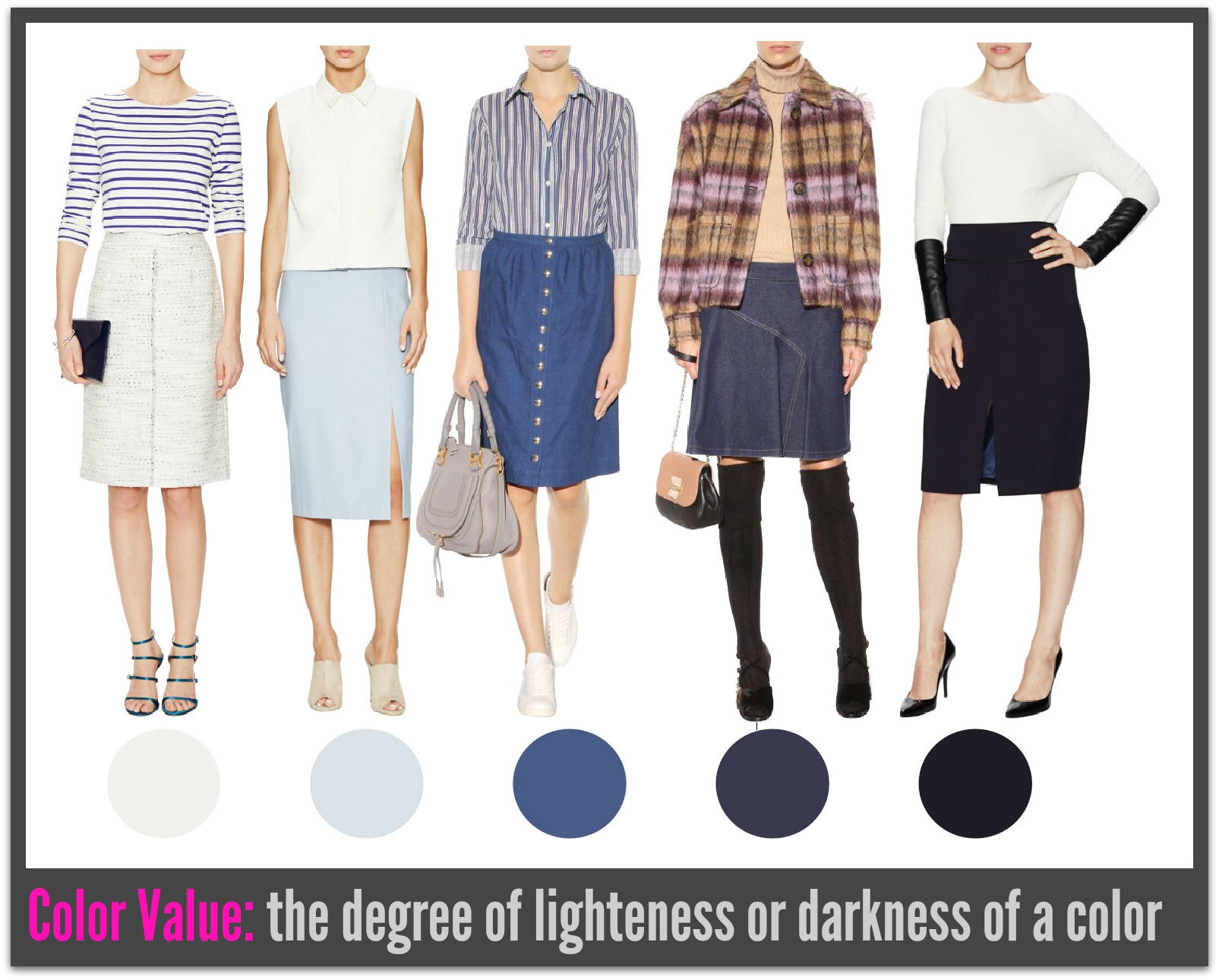
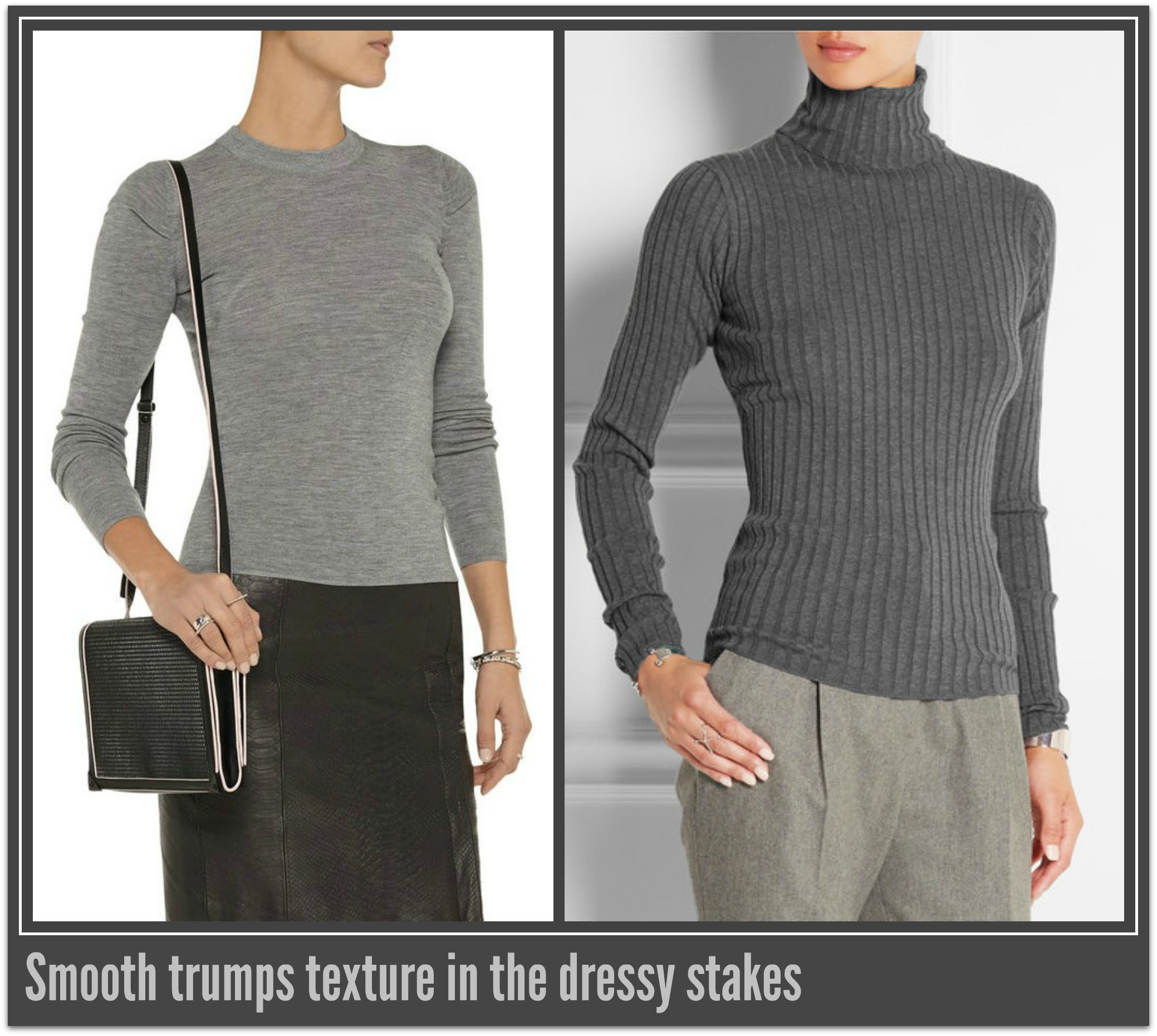
Patterns of medium contrast are best placed over the smallest parts of your body. When placed over an area that is large be sure to choose the opposing garment in dark color from the pattern as this will draw the attention away from the larger area and visually elongate and slim your silhouette.
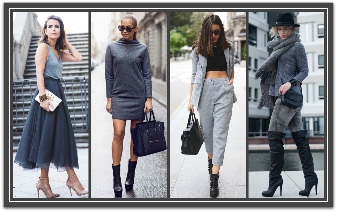
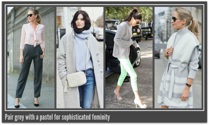
Facebook1 (1)

Low Contrast

Low contrast is when colors of similar value (color depth) are combined. This contrast level is easy on the eye.

This contrast levels best suits individuals who have a similar contrast level between their skin, hair, and eyes plus a matte appearance to their skin.

These color groups are:

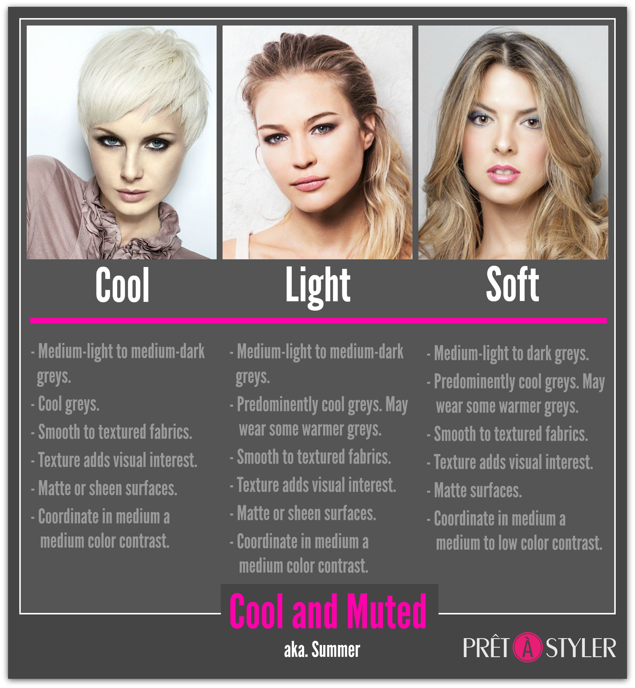
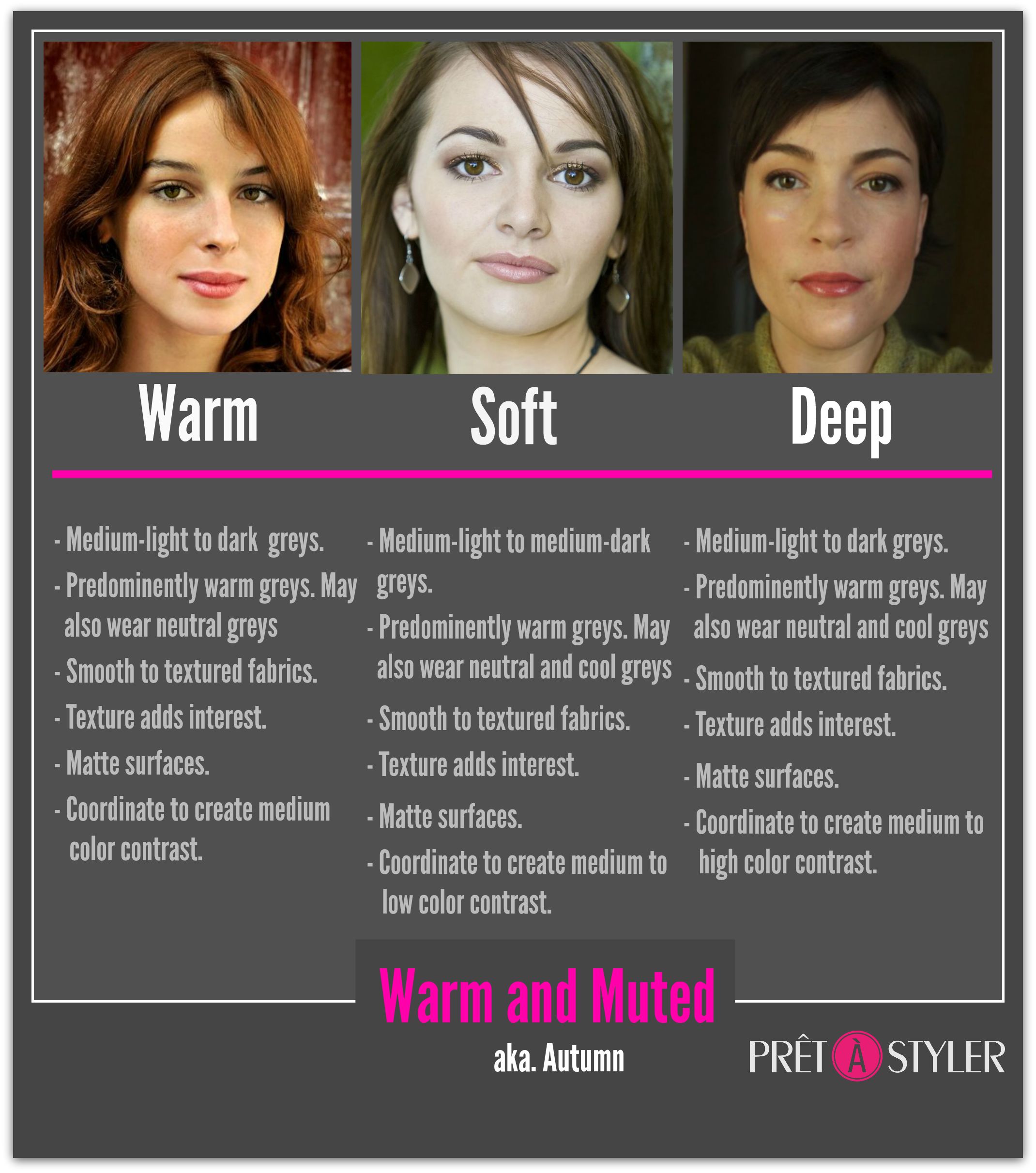
  • Soft Summer / Cool, Muted and Soft
  • Soft Autumn / Warm, Muted and Soft

On brighter individuals this combination may appear boring, drain them of color and be aging.

The psychological effect this combination produces is one of innocence, subtleness, and passivity. Low contrast while people friendly and elegant, is also almost invisible to others (especially in light combinations) and the wearer will need to either have already established their authority and position or else will struggle to be noticed, listened to or remembered. Give these facts low contrast is best left for after work hours.

Low contrast patterns are the easiest to wear even when the pattern size is large. This is because the subtly of the colors does little to increase apparent size. However, I would still recommend that if you wear the pattern on the largest part of your body that you select a color from the pattern for the opposing part of your body to ensure the sleekest silhouette.

Light, low contrast combinations are great for weekend wear and endows the wearer with casual elegance. Dark low contrast combinations create a evening elegance that is hard to beat.

Low Contrast Group2


Ann2015Blue

If you enjoyed this week’s feature
please like it on Facebook or Instagram
or leave a comment/question below.
Thank you.
Ann Reinten AICI CIP
Author


BannerColorSense

COLOR SENSE: Part 1, Value, Perceived Weight and Size

By | Colour | 5 Comments

Color is a powerful factor in our lives; it can attract or repel, alter the perceived shape, size and weight of objects, nurture or aggravate, uplift or dampen moods, cause a release of energy or calm us to the point of sleep.

In the USA the 1940′s witnessed the birth of color analysis which quickly spread worldwide to become a global sensation and a ‘must have’ consultation for every woman. Today the color a person chooses to wear is still as important as ever and is often the make or break of how good an outfit looks on us.

I believe that learning what you best colors are is a incredibly beneficial thing to do; after all a great style in an unflattering color will always be a bad buy.

‘ a great style in an unflattering color will always be a bad buy’

effects

But that’s not what I want to explore with you today. Instead, I want to share with you the impact specific color characteristics have on your apparent shape. In later parts I’ll explore other areas of color.

Think about the last time you went clothes shopping, more than likely it was the color of a garment that first caught your attention, then it drew you in and invited you to touch it. From there it was a short trip to the fitting room.

Sounds like you? You’re not alone, but buying by color alone is responsible for more poor purchases than any other factor. Liking a color and even if it’s one that suits your coloring and being able to look good are two totally different things. It may suit your personal coloring but what about your body shape? A great color needs to suits both.

Let’s start this journey by looking at color VALUE which is the apparent lightness or darkness of a color.

VALUE

I find it easiest to place colors on a scale value of one to five.

  • Light
  • Medium light
  • Medium
  • Medium dark
  • Dark

Value_dots

The value of a color value has two effects on the apparent size and shape of a garment.

  • It can alter it’s apparent size 
  • It can alter it’s apparent weight.

Value

Size

The lighter a color is, the larger it makes the garment and the area it’s been worn on appear larger, because light colors advance (appears to move forward). Medium colors on the other hand neither advance or recede and so have little effect on size. Dark colors appear to recede (move backwards) making the garment and area it’s worn appear further away and therefore smaller.

Take home point

By considering the depth (value) of a garment and the effect it is likely to have on the area of your body it is designed for before you considering taking it into the fitting room will save you time and equip your eye for success.

My Private Stylist makes this easy for you by showing you your best color value for dresses, pants, tops, pants and skirts. PrêtàStyler takes the color depth of the item into consideration when assessing an item’s suitability to be added into your personal mall. 

ValueApparentSize

Apparent Weight

Depending on the depth of a color it will appear to be either heavy or light.

Yes, you read correctly- colors have apparent weight.

Light colors appear to weight the least and dark colors appear to weight the most. Why? Because of how our natural world has conditioned us. In general, those things around us which are are heaviest are darker and visa versa.

A few years ago when explaining this in a class I was running to train image consultants I was told the story by one of the students that she had been a HR manager in a transport company and the men who were loading the trucks were complaining of the weight of the boxes they were being asked to load. The weight of these boxes were in accordance with industrial regulations, so should not have been causing so much anguish among the men. The unions were involved and eventually a consultant was called in and he noticed that the boxes were all dark, having a printed outer. The consultant suggested the company change the colour of the boxes to a light colour and voila the problem was solved. No mention of the color change was made. The company informed the men and union that the issue had been addressed and hoped the situation would be resolved. The workers celebrated the win and the lighter boxes, and everything went back to normal despite no change in the content or actual weight.

It’s the same with the garments we wear. Given a dark color appears to heavier than a light color it will appear more visually appealing when it is either worn as a whole item or on the top half of the body.

ApparentWeight

Take home point

If you are bigger below your waist (triangular), short or generally overweight its best to wear the darker color below your waist. The light color draws the eye up making the body appear taller and slimmer and the dark color minimizes the hips.

If you desire to wear a darker color on your top half ensure that if you have a big bottom the top covers all of your backside.

Ann2015Blue

If you enjoyed this week’s feature
please like it on Facebook or Instagram
or leave a comment/question below.
Thank you.
Ann Reinten AICI CIP
Author


BannerGreyMatters

HOW TO FIND AND WEAR YOUR BEST GREY

By | Colour, Coordination, Wardrobe Savvy | No Comments

Is grey the new black?

Probably not but it should be here’s why…

Grey:

  • works for more personal colorings than black
  • is kinder to complexions when you are over 50
  • is more versatile than most other neutrals and lends versatility and timelessness to a wardrobe
  • is a color that easily transfers from the office to casual outings
  • pairs perfectly with all colors
  • can be worn all year round

Not all greys are equal.

There are many greys in various temperatures, discovering your best grey is a great place to start.

Shades of grey1

There’s a Grey for Every Coloring

Grey_Cool and Clear

Grey_Cool and Muted

Grey_Warm and Clear

Grey_Warm and Muted

The Basics

  • Stick to one temperature of grey. Mixing different temperatures of grey can be tricky.
  • Wear darker greys around the problem areas in our body, and lighter colors around the areas you want to highlight.
  • Choose fabrics and silhouettes that reflect the current season.

Seasonal shapes and fabrication

Source: Image 1, Image 2, Image 3, Image 4

  • Lighter shades are perceived as more casual than dark shades. To raise your authority wear medium to dark greys

Vales of grey

Source

  • Greys in fine, smooth fabrics are dressier than those that are textured. Use this to tip to increase the formality of light grey. Structured shapes will also add to the formality/authority.

TexturevSmooth

Source

  • Grey marle has its origin in sport, making it the most casual version of grey and best left for non-business/casual occasions.

Marle

Source: Image 1, Image 2

Monochromatic Outfits

All grey outfits have the potential to look boring, to prevent this coordinate grey outfits garments in different depths of grey. This will unify you look and showcase your color knowhow. Max out at three depths, one light, one medium and one dark.

Grey Levels

Add texture or textural elements to create visual interest e.g, tweed, mohair, pleating, draping, print, fur etc.

Textural elements

Source: Image 1, Image 2, Image 3

Mixed Color Outfits

Mix with other neutrals

This creates a minimalist and modern aesthetic. Black, camel and white all play very well with gray, and give you a hundred chic points for looking sleek and effortless. Overlaying a black garment with a grey item can soft black’s sometimes harsh effect.

grey and neutrals

Source: Image 1, Image 2, Image 3, Image 4

Pop a Color

From a subtle peek of bright color, to an elegant matching pink lip and heels combo, or even a shocking red maxi skirt, grey is the perfect color to serve as a canvas for a splash of strong color.

grey+Color

Source: Image 1, Image 2, Image 3, Image 4

Pastel Paring

Pastels always turn heads when juxtaposed with tones of grey. The mix is elegant and feminine but don’t limit yourself to wearing it in the spring, these light colors are just as appropriate in fall/winter too.

Pastle pairings

Source: Image 1, Image 2, Image 3, Image 4

Turn Down the Volume

Greys are great for toning down a loud all-over print, impactful graphic or bold colored outfit.

Create Subtley

Source: Image 1, Image 2, Image 3, Image 4

Want More? He’s an interesting piece on the psychology of wearing grey.

So now that you know a little more about how to wear grey to look amazing will you be giving it ago?

I’d love to see you wearing grey outfits – why not post your photos on our Facebook page.  Add #MeInGrey