was successfully added to your cart.

Category Archives: Coordination

mixing-prints-and-patterns

HOW TO MIX PRINTS, PATTERNS & TEXTURES

By | Colour, Coordination, How To... | One Comment

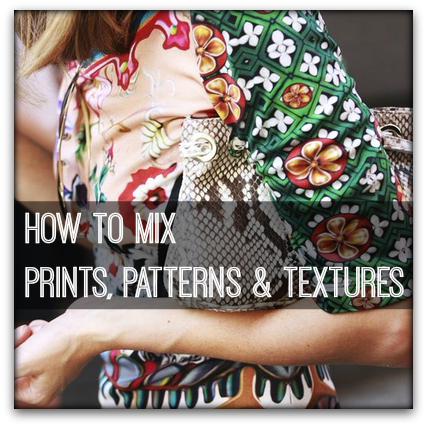
Do you get a little bamboozled when it comes to mixing prints and patterns together?  It’s not really that difficult when you have a few tried and true guidelines to follow. 

The more prints and patterns you try to combine in one outfit the more skill it takes, and when the fad/trend is at its height you’ll see designers pushing the boundaries to imprint their ideas on the fashion forward.  The wiser of us will pull back a little from their flights of fantasy and create outfits that work for our height, weight, shape and age.

Know When to say No 

When you peruse stores and fashion magazines you’ll be bombarded with photos of models wearing all manner of weirdness, and just because a model is wearing it or a designer has deemed it to be ‘in’ does not mean that it’s worthy of wearing.

When you see a look you’re attracted to ask yourself:

  • Will I be the focus if I wear this?  If the outfit is the clear attention winner – pass it by.
  • Do I feel a sense of confusion looking at this?  Yes –  pass it by. 
  • Is it ugly? Yes – pass it buy.
  • If I wear this will my best or worst features be highlighted?  No need to give you the answer here.
  • Will I get my money worth in wearings from these pieces, or, it it a one season only look?  One season – pass it by unless you have plenty of cash to spend. 
  • Can they be separated to create other outfits?  No- pass it by.

Get insync

To appear harmonious the colors and/or shapes within an outfit need to look as though they belong together.

Here are how to to mix prints and patterns together:
  • If you are a novice max out at two patterns
  • The busier or more complex the pattern/print, the better you are to coordinate it with a solid colored garment or a garment with a simple pattern or texture.g, pin stripe   
  • When mixing prints and patterns look for a characteristic that you can use to unite the patterns.  This may be a colour (the easiest), the theme or design line.
  • Texture should be considered a pattern if the pattern is obvious when you stand 1 meter (3 feet) away from the garment.
  • Different textures are often easier to mix than different patterns.
  • One pattern should be dominant so the eye has a place to settle on first. And that place should be your best area given that’s where the focus will be.
  • Adding a solid colored accessory or skin between patterns can lock them together and/or calm the overall effect.
  • Ask store assistants if there were other items that were designed to team with the garment you have chosen.  Often designers put a story together that consists of several mix and match garments but always keep your in mind that every item in your wardrobe should go with at least three other items if they are to be a good purchase.

Mixing solid colors and patterns

This is a task that businessmen need to master as they commonly need to coordinate a suit, shirt and tie.  However, the rules are just as relevant for women when a ‘mix everything together’ pattern trend is in.

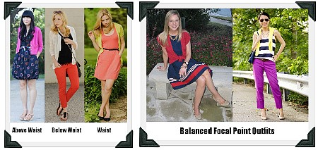
Failsafe coordination comes from mixing two patterns and one solid color or two solid colors and one pattern.

Coordinating 3 Patterns

  • Look for a common theme color, line or design.
  • Each pattern/print should be a different scale: small, medium and large.
  • Select each print/pattern in a different value – light, medium and dark.   
  • One pattern should stand out from the rest.
  • The smaller the prints or patterns, the easier it is to mix them.  However, avoid mixing two patterns of the same size as this can appear to busy unless there is a significant colour difference.

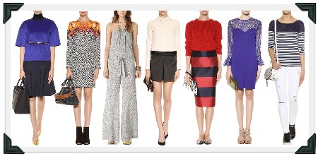
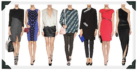
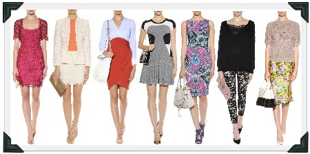
Now you’ve got the gist of pattern coordination you’re ready to look at the catwalk with a educated eye.  Test what you’ve learned by casting your eye over the following websites sites showing Fall 2013 mixed pattern looks.

 
simple fashion style tips

SIMPLE STYLE TIPS TO LOOK GREAT EVERYDAY

By | Colour, Coordination, Figure Flattery, How To..., Wardrobe Savvy | 2 Comments

Are there tricks to looking slimmer, taller, better?

Yes! In fact, using the following simple style tips you can achieve the look you want. All use design lines, colors, and fabric characteristics to enhance and/or minimize your appearance.

GET IN LINE

VERTICAL design elements slim and lengthen any area of the body they are worn on. The more vertical lines there are, the slimmer and taller you will appear. Vertical elements aren’t limited to vertical stripes. They include zippers, pants, monochromatic outfits and garments, open jackets, pleats, and center front buttons, which elongate your overall appearance.

ec
HORIZONTAL design features add width to the area on which they’re worn. Working the opposite of vertical lines, they make you appear shorter and wider. Examples range from horizontal stripes to yokes, boxy skirts, belts, wide leg pants, and wide or contrasting waistbands. These appear to “cut” the appearance of the body into sections. A good rule-of-thumb to remember is that you will appear as wide as your widest hemline.

ed

DIAGONAL design features run at an angle across the body, but follow vertical/horizontal illusions. If the angle is more vertical, the area appears taller and thinner. If the angle is more horizontal, the area appears shorter and wider.
ee

CURVED/ROUND design elements add (surprise!) curves. While this sounds ideal if you’re going for a feminine look, know they also add width and weight, which is not ideal if you have ample sources of both. Floral, paisley, and swirly patterns, along with round necklines, curved hemlines, and contoured belts achieve the look.
ef
TAKE A COLOR ADVANTAGE

Color is an easy device to use to maximize or minimize your size and manipulate your height (i.e. appear shorter or taller).  Below are some simple style tips related to color.

Look at the following photos: in Photo A, the hips appear wider than in Photo C. Why is that? Light, bright colors “advance,” making the area they are worn over appear larger. Light colors worn on the upper half your body draw the eye upward, thus they also make you appear taller (Photo C). Dark colors “recede,” and do the exact opposite (medium depth colors have no movement effect). Darker colors also appear “heavier” than lighter colors and help you appear more balanced when worn on your lower half. Photos D & E show the slimming effect of the use of darker colors and low color contrast coordination (i.e. one continuous column of color). You must be naturally tall and slender to pull off the looks in Photos A and B.

eg
There are some colors which suit almost everyone because they have certain characteristics:

  • They contain a little of the opposite temperature in the mix
  • Are medium-light to medium-dark
  • Are neither very bright (clear) nor very dull (muted)


These universal colors appear along with each new season’s crop of trend colors and are widely available. Here are just a few:

eh

IMPLEMENT YOUR BEST SILHOUETTE

Besides using lines and colours to enhance your appearance, you must also consider a garment’s silhouette. The wrong silhouette for your figure can make even the cutest garment look bad. The right silhouette, however, can make you look great.

There are 4 silhouettes:

  • Very fitted: best for slender, youthful women with firm bodies because tight, clingy fabrics highlight every lump and bump.
  • Semi fitted: flattering on all women
  • Boxy & stiff: falls straight and stiffly and disguises the body’s shape. Best for straight-figured women under 45 years of age. A boxy jacket is best when it sits above the low hipline and hides a midriff roll or tummy. A boxy jacket can appear matronly on women 45+ years old if the jacket is longer or in an out-of-style colour.
  • Boxy & soft: made of a flowing soft fabric that’s flattering for all ages and weights, particularly on mature, full-figured women.

ei
ACCENTUATE THE POSITIVE

What turns plain old clothes into a winning outfit? A focal point! A focal point is anything which attracts attention: smoky eyes, hair highlights, a piece of jewelry, a print, shoes, a handbag. It’s intended to draw the eye to it.

If you’re not certain your attire has a focal point or if your intended focal point is appropriate, try this experiment: get dressed and stand in front of a full-length mirror. Close your eyes and then open them. What’s the first thing you notice? That is your major focal point. Now ask yourself if you want people looking there. Yes? Then you’re probably doing something right. No? It’s time to find another focal point.
If you’re big in the hips or posterior, you’ll want your focal point to be above the waist. If you’re large busted and wish to minimize your appearance, you’ll want your focal point below the waist. This can be done by counterbalancing a body feature by adding a competing focal point in the right place. See in the photo below that the hemline stripes of the blue dress are balanced by the red cardigan, while the striped top and yellow cardigan attract attention away from the bright pants.

Be on your guard against fussy looks by using less than three focal points. A great subject to study for how to achieve the 3-focal point or less look is the Duchess of Cambridge.

ej

FIND FIGURE FLATTERING FABRICS

Fabrics come in three basic surfaces which alter the appearance of the garment and manipulate the size of the wearer. They are:

Matte surfaces: absorb light rather than reflect it (wool, most cottons, linen). Tend to make the wearer appear slimmer.

Fabrics with sheen: reflect light, thus appears to “advance” slightly, but will not add significant bulk to your size unless the garment is clingy or tight.

Shiny/sparkly surfaces; highly reflect light, thus appear to “advanced” greatly and enlarges the area it covers. Soft, shiny fabrics can also highlight every bump and lump.

ek


(Purple dress by IGIG, Leggings by Asos, Jacket by Free People, & Jacket by Bloomingdales)

Besides its surface qualities, fabric weight and texture can be used to your advantage. For example, did you know you can “lose” a few pounds by wearing the right fabrics? Thin, lightweight, smooth fabrics cling to the body and have little bulk and texture, which visually slims your silhouette.

Firm, smooth fabrics are figure flattering when they echo the silhouette of your body (i.e. a tailored suit or leggings) but won’t necessarily minimize your figure.

Sheer fabrics are great for camouflaging challenge areas, such as a full upper arm, tummy, or full behind.

If you want to “bulk up” certain areas of your body, wear thicker, heavyweight fabrics, especially those with a bulky texture (corduroy, crinkled, quilted, ruffled, or fur).

4 SIMPLE TECHNIQUES

Every “body” is unique; therefore, what looks good on a celebrity or an acquaintance won’t necessarily flatter you. So before you try to copy a look you like, keep these 4 rules in mind for style success:

  1. Slimline tops and bottoms work well together for a long, lean look.
  2. A full skirt/pant is best worn with a slim top.
  3. A full top is best worn with a slim bottom.
  4. A full top and bottom usually doesn’t work well because they create a wide, shapeless look.

el