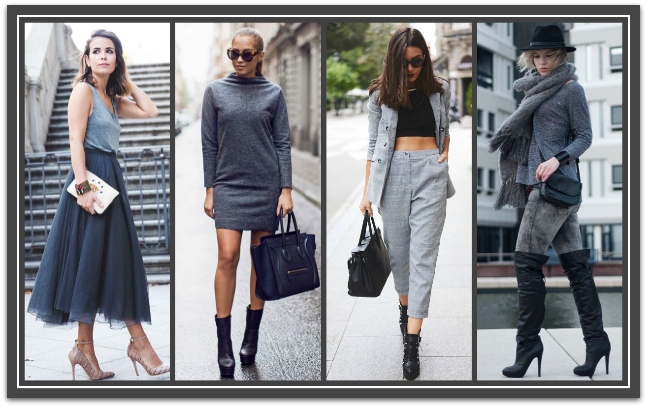
was successfully added to your cart.

Category Archives: Coordination

Style Clinic, Image Innovators, Work Style, Ann Reinten, Image Consultant training

APPEARANCE: The Resume that Matters – Pt 3

By | Colour, Coordination, How To..., Personal Style, What to Wear, Work Style | 6 Comments

Welcome to part 3, the final instalment of my Appearance series on how to create a positive visual impression at work.

This time I’m primarily concentrating on color and accessories.

Color Up for Authority

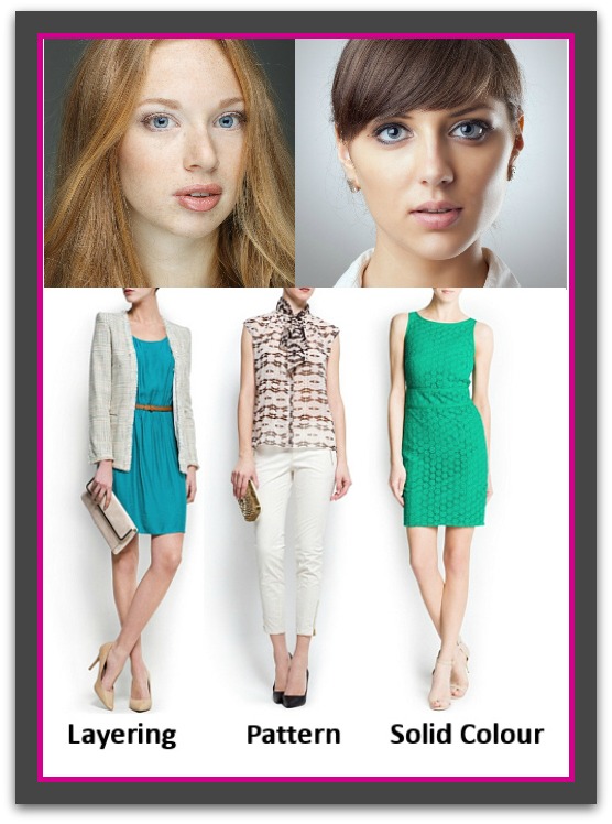
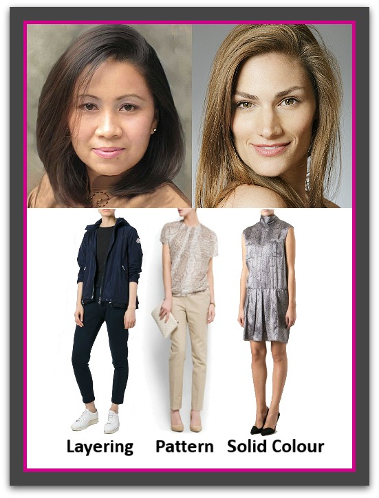
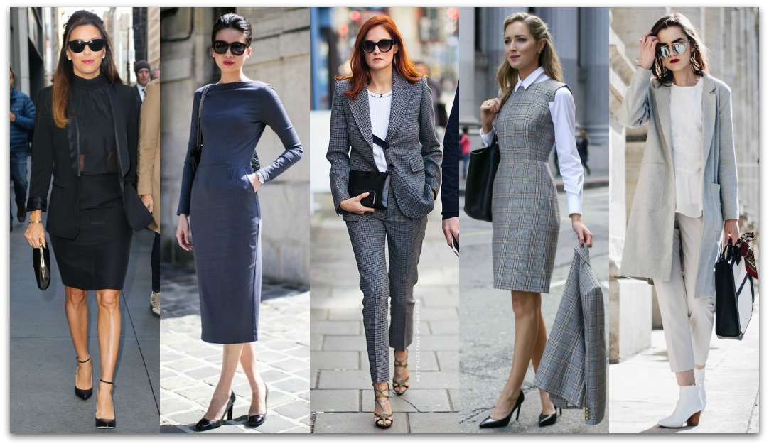
Solid colors are the best choice for your foundation work pieces i.e., skirts, dresses, pants and jackets. Subtle patterns are best left for your next tier of work wear. 
Never underestimate the power of color depth – the darker the color the more authority it will bestow on you. If you suffer from dandruff or flaky skin conditions opt for medium colors and seek help for your condition.
Image Innovators, Style Clinic, Ann Reinten, Image Consultant Training, Work Style

Color-Up for Impact

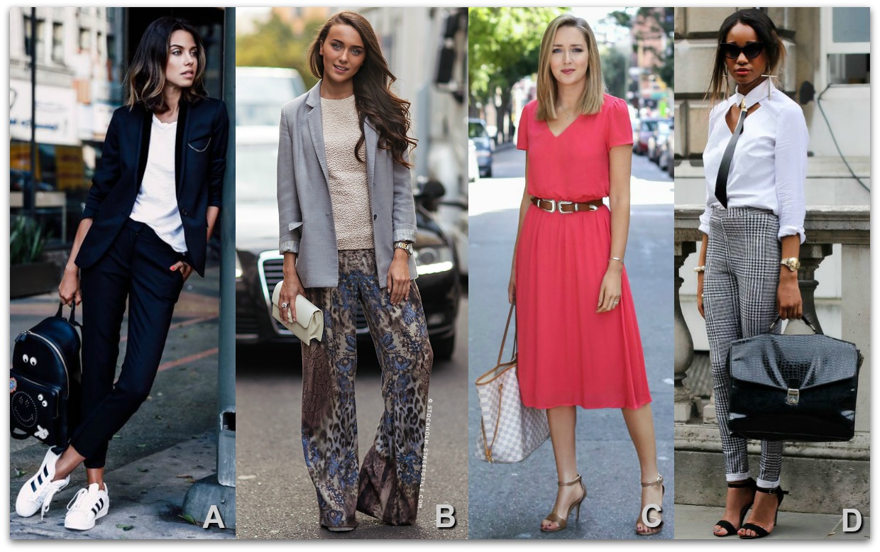
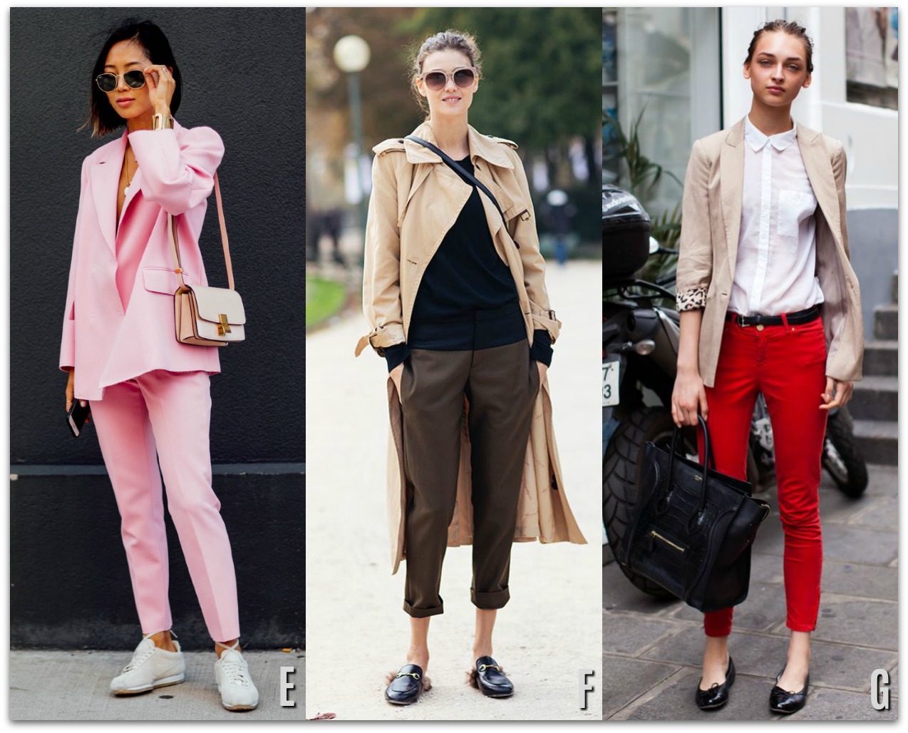
  • Clear colors are crisp, clean colors which show no signs of grayness/dullness. They create an image of mental clarity, vitality and action.(A)
  • Grayish/dull colors (especially those which are cool) can create a perception of mental dullness, passivity, low energy and mature age.(B)
  • Warm clear colors are seen as friendly, happy, energetic, youthful and playful. (C)  Wear sparingly to work.
  • Cool colors (the darker the better) are generally perceived as trustworthy, reliable and professional. (D)
  • Feminine colors such as pinks, lilac, yellow can diminish authority (E), while colors traditionally associated with men generally provide authority e.g., black, charcoal, navy.(A,D)  Avoid mid greys if you are over 50 as they tend to make you appear older.
  • Warm dull colors are emotionally reassuring however, they can also be perceived as low energy or passive. (F)
  • Bright, vivid or intense colors raise energy and enthusiasm and/or increase tensions depending on the color and situation. (G)
For more psychology of color insights click here.
Image Innovators, Ann Reinten, Style Clinic, Image Consultant Training, Work Style

Color Hierarchy

Being savvy about what colors to wear to work will help ensure you create the impression you’re after.

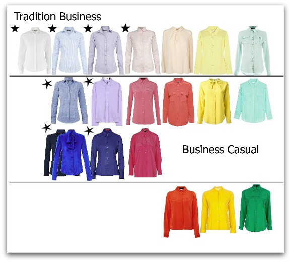
Traditional Business Attire: White has long been considered the most professional color for business shirts.  Next in line are the light/icy shades of blue, lilac and pink which are the most recognizable formal business colors (stars in Tradition business row).  Wear solid white when you wish to create the most serious/formal impression.

Business Casual colors are led by mid to dark blues and purples (stars in Business Casual row) and followed by mid shades of pink, orange, yellow and green. Bright, unusual colors not commonly associated with seriousness are best left for after work hours.

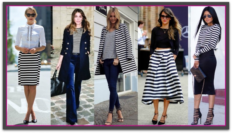
Prints and Patterns: For stripes and checks the background color should be considered first for its level of authority followed by the color of the stripes. Also, the narrower and closer together the stripes the more business like your image will be.
%image_alt%

Contrast for Attention 

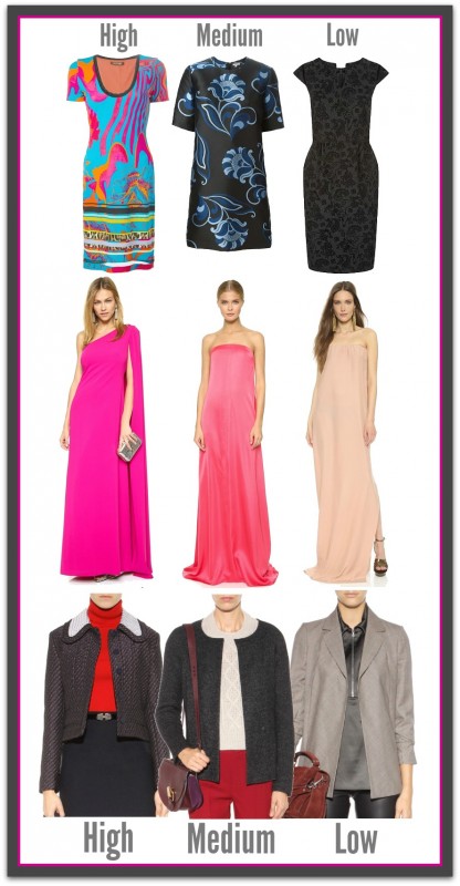
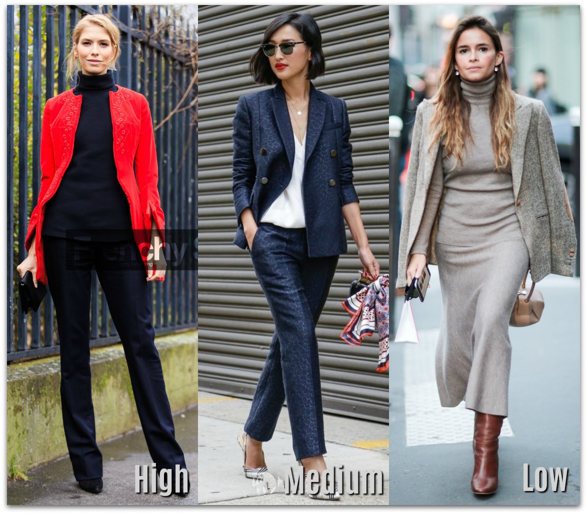
Another important aspect of color is its ability to subtly solicit attention.  The contrast level of an outfit is created between the colors you are wearing and will be in either a high, medium or low.  In the case of you wearing one color i.e., a beige dress, it will be between the dress and your skin (low contrast if you have light to medium Caucasian coloring). The higher the contrast the more the brain will be stimulated to take notice. Knowing how to manage this secret weapon can give you a real advantage.

  • High contrast is created by strong light/dark or bright color combinations; the kind that make you want to say WOW.  Depending on the colors this contrast can have you being perceived as authoritative (think 80′s power dressing) or eccentric.  It will definitely wake the brain and have you being noticed, but is so loud/strong that it can tend to make others stand back rather and observe rather than to interact with you. 
  • Medium contrast is created when the color contrast comes from colors that are lighter and darker than each other while being easy on the eye.  This level of contrast is professional and people friendly, think navy and white.  This contrast will have you noticed, listened to, taken seriously while remaining approachable.
  • Low contrast is created when different colors of the same or similar depth are combined.  This soft look tends to be perceived as elegant and sophisticated when rich or dark colors are combined and passive, casual, aging or bland when light colors are coordinated together.  If the colors are also close to the depth and of your skin the effect is multiplied. Imagine a dark skinned woman in the navy and black outfit. Low contrast is so quiet it can place you into visual incognito, as such it’s brilliant for observing and letting others take the lead, but when you want to take the reins or be noticed, listened to or taken seriously it’s not the way to dress.

It’s also important to mention that wearing colors that suit your personal coloring is also something to take seriously. The right colors will enhance your skin, hair and eyes, invigorate youthfulness and seriously increase your attractiveness. Image Innovators have many consultants who can help you discover your best colors.

Image Innovators, Ann Reinten, Style Clinic, Image Consultant Training, Work Style

A Touch of Spice is Nice

Every outfit we wear is accompanied by at least one accessory: shoes, belt, earrings and/or handbag etc.  While it’s easy to just throw them on without a thought, considering them only ‘finisher items’, they are in fact, much more important than just ‘finishers’.
For relatively small cost you can own a minimal wardrobe of basic items and have multitudes of different outfits that will be ready to take you anywhere, anytime when you fully employ the power of accessories.  In other words, accessories can expand your wardrobe by giving your outfits multiple looks, moods and a current look. If you’ve never truly explored your wardrobe’s mix and match possibilities, take a day and pull out all your tried and true outfits. Go through all your accessories to find at least several new outfits. Explore ways to dress each up and down using earrings, necklaces, scarves, hosiery, shoes and bags etc. When it comes to career dressing, understanding what style of accessory and how many to employ at any one time is the key to ensuring a professional presentation. The aim is to create visual interest to your outfits whilst maintaining a professional image and ensuring the attention is firmly focused above your bust line.
Key points
  • By the best quality you can afford. Quality over quantity – your accessories should support your image.
  • Your face is your fortune. If you add several accessories ensure the one near your face is the most dominant.
  • Ask yourself, ‘does this accessory say polished professional?’  If it doesn’t or you’re in doubt, take it off.
  • Limit yourself to 3 visual focal points. More than this and you’ll be in danger of looking too ‘busy’ for businesses.
  • Learn how to accessorize – there are lots of great blog, books and YouTube videos to learn from.
  • Hand carry as few things as possible to avoid looking clumsy or disorganised.  Avoid backpacks.
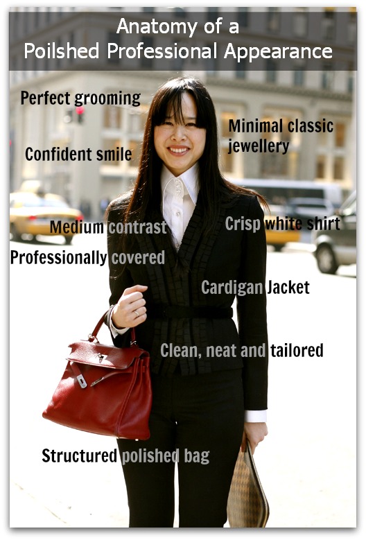
  • Handbags: The more structured and polished the bag the more professional you’ll appear.
  • Earrings: understated, classic and no larger than medium-large.
  • Shoes: the most professional are – at least medium height, leather with a closed, tapered to pointy toe.
  • Belts: medium to narrow, classic style, understated buckle and leather.
  • Watch: classic style, non-bulky, leather or chain strap.

Be Current, Be Clever
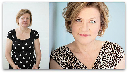
An up-to-date appearance is essential. It says I’m aware of what’s going today in the world around me.  A current appearance puts others at ease and builds credibility and trust.  Wearing clothes, eyewear, hairstyles or makeup that is a decade or more old will give you a look that advertises that you are clearly out of sync with the world about you and if you look out-of-date, maybe so are your skills and knowledge. Remember; we trust that what we see is a reflection of your character and abilities. I’m not saying you need to wear the latest fashion, but you do need to wear clothes and accessories that are recognizable with specific trends that are no more than five years old.  This is especially important for anything that is close to, or on your face/head as these are the areas noticed most.
There’s also no understating the personal confidence and pleasure an up-to-date and impressive image will give you.  When YOU like what you see in the mirror it’s incredibly empowering.
%image_alt%

Say What?

To be heard takes more than putting a great idea/point across at the right time, to the right people.
Your words can dissolve mid-air if you are wearing something, or acting in a way that attracts more attention than what you are saying.  Distractions have the power to totally sabotage what you are trying to say or do. Not only do they cause others to focus on ‘it’ rather than what you are trying to get across, they create an internal dialogue about the item and you or, the item and them.  Whatever you were saying becomes white noise and depending on what the distraction was it may also damage your credibility.Image Innovators, Ann Reinten, Style Clinic, Image Consultant Training, Work Style
Examples of distractions:
  • strong perfume
  • ornate/large earrings and rings
  • jangling bracelets
  • low cut necklines
  • very short hemlines
  • visible tattoos
  • dark lingerie under light colored clothes
  • food stuck in teeth
  • weird/inappropriate makeup or hair
  • wardrobe malfunctions eg., fallen hems, bra straps, buttons missing, clothes straining or gaping
  • inappropriate clothes i.e., for weight, age, occasion, people present etc
  • anything out of the ordinary e.g., an earring missing from one ear
  • Before any important meeting where you need to be seen and heard take a last minute full-length look at yourself to check everything is as it should be.

Turn Offs

Similar to distractions, though potentially much more costlier to an individual’s career, is the creation of the perception that a person lacks a degree of self-awareness and/or sensitivity for others. This conclusion having been made from an individual’s experience of the way they dressed, looked or behaved in a given situation. While most of us live in countries where we are blessed with the right to dress and behave as we please (within the limits of the law).  This privilege will backfire if the person is considered to be a maverick that cannot be totally trusted to dress or behave within social norms at important times. We may love them as friends or peers but their ‘loose-canon’ personality will cause us to exclude them from participating in important events.
%image_alt%
 That ends this series, I hope you enjoyed it and have been able to adopt some of it into your wardrobe.
I’d love to hear your comments, stories or questions in the comment area below.

Ann2015Blue

If you enjoyed this week’s feature
please like it on Facebook or Instagram
or leave a comment/question below.
Thank you.
Ann Reinten AICI CIP
Author

Hosiery Banner

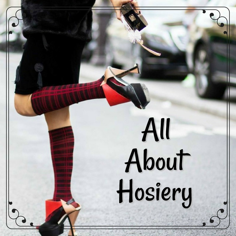
ALL ABOUT HOSIERY

By | Coordination, Wardrobe Savvy | 8 Comments

Do you wear hosiery?

I know many women these days don’t, at least not in summertime. However, hosiery has a few big benefits that make it worth considering if only for the more important or dressy events in your life.

A Brief History

Hosiery originates from an old Anglo-Saxon term ‘hosen’ meaning to cover or covering and is a term that encompasses a variety of legwear, including tights, socks, leggings, stockings, thigh-highs, and pantyhose. The earliest hosiery found is a pair of red, knitted socks that were discovered in a tomb in Egypt. has existed, as far back as the 9th century.

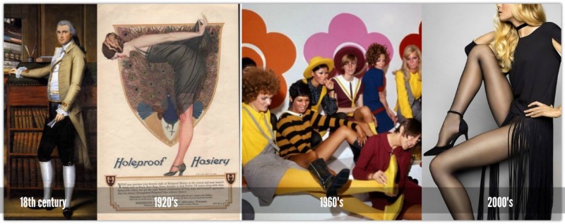
While hosiery is worn by women today, it was originally a male garment and worn for both protective and adornment purposes. It was only in the 18th century that women started wearing hosiery. From that time onward, hosiery was worn by women and men started wearing trousers and socks, rather than stockings and breeches.

The 1920s heralded in a new era in hosiery with the invention of synthetic fibres. Synthetic fabrics as opposed to natural materials like cotton, made hosiery more durable and easier to produce and to wear as well.  “Nylons” became the generic name for all hosiery manufactured during the ’40s and interestingly, when nylon production shifted to the WWII effort, women would paint seams on their legs to make it look like they were wearing nylons.

Hosiery Timeline

In the 50s, full coverage tights were introduced into the market. Tights/pantyhose became extremely popular in the 1960s, largely due to the mini skirt and tights combo that Mary Quant pioneered. Since then technology has advanced hosiery and fibres like Lycra which stopped ugly wrinkly knees and ankles and the ability to weave intricate patterns into hosiery has made it an enduring piece in stylish women’s closets.

In the 2000′s, it would seem that hosiery especially in summer and in now ever more casual work places is now a passé item. Personally, I think that it’s just a temporary phase and hosiery will return from time to time as fashion temporarily elevates it to a must-have. In addition, for women like myself with less than perfect legs, hosiery makes a world of difference to how I look when I have not tanned my legs.   

Types

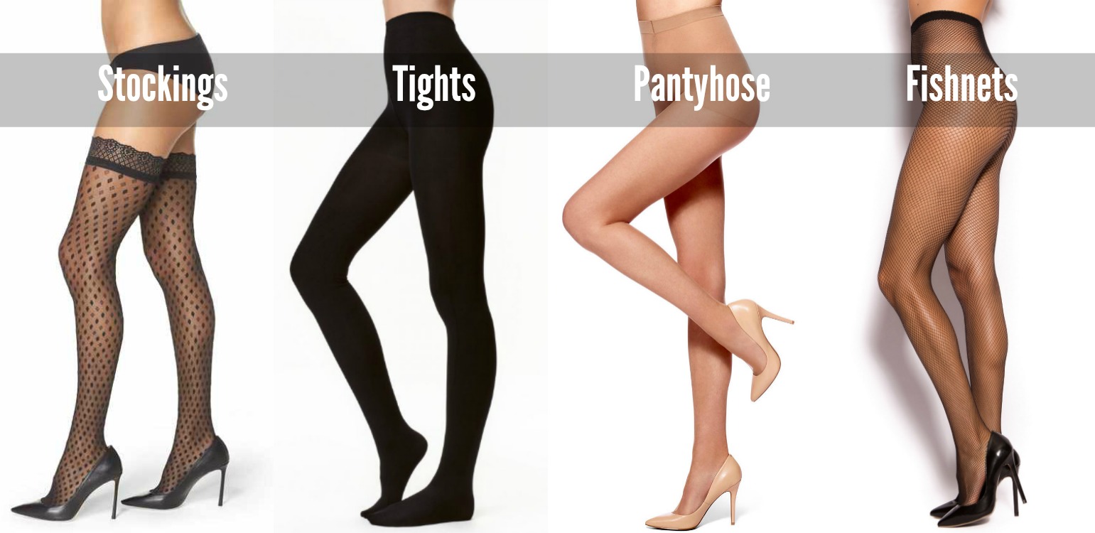
These are the most common types of hosiery:

  • Anklets: ankle length socks made from sheer hosiery fabric.
  • Knee Highs: Hosiery that reaches to the knee and designed to be worn under pants.
  • Stockings: reach up to the upper thigh are are held in place with a girdle or garter belt and are usually sheer. Hold-ups are stockings that are held in place with an elastic band typically with some silicone that acts as traction
  • Tights: thick full leg hosiery.
  • Pantyhose: goes from waist and covers the entire foot, made of nylon
  • Fishnet: hosiery that has a cut-out fishnet pattern

Hosiery Lineup

Denier and Expectations

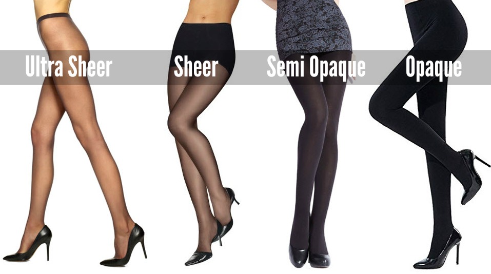
A denier is a unit of measurement for tights. It is used to convey the thickness of hosiery by measuring the unit of density. The lower the denier of a pair of hosiery is, the more sheer it will be since the material or the yarn is finer and less dense.

Here’s a quick cheat sheet for you:

  • Less than 10 denier = ultra sheer
  • 10-20 denier = sheer
  • 25-35 denier = semi-opaque
  • 40+ denier = opaque

Denier is also a good factor in determining the longevity of any hosiery. Anything less than a 12 denier usually doesn’t last beyond one wear. The higher the denier, the more durable and resilient it is. When a pair of hosiery has more synthetic material than natural, you should expect that it will have more wear i.e. Nylon tights will last longer than cotton blend tights. Hosiery with shapewear built-in will also last longer. Wear expectations also depends on how you care for your leg wear and whether or not you bought the right size or not.

Denier Lineup

Size and Toes

Like clothing the size of hosiery varies from brand to brand. Buying the right size will not only be more comfortable but will also add to the longevity and look of your hosiery. With that in mind all hosiery packets come with a size chart on the back as well as specialty ranges for pregnant and plus size women. Take the time to check out your best size.

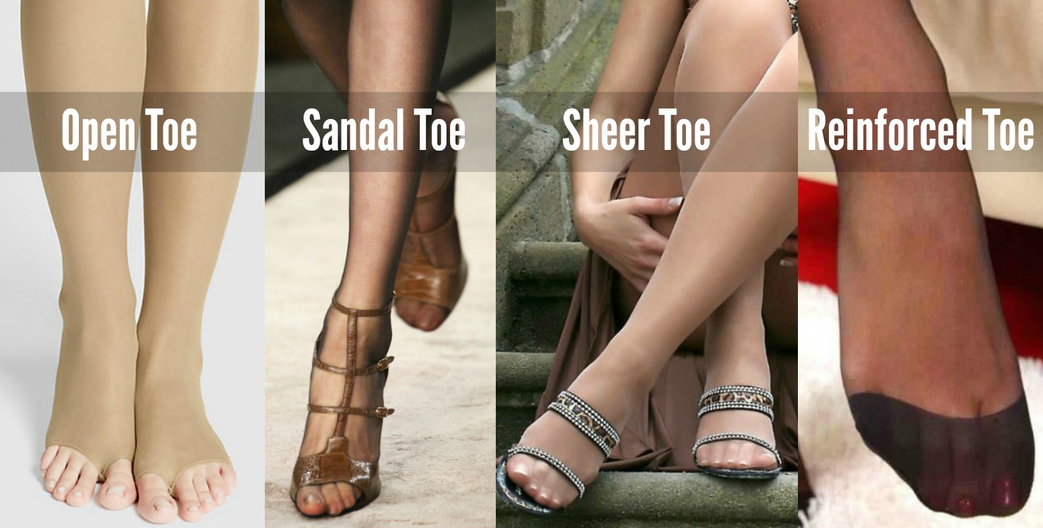
Likewise hosiery comes with a variety of different toes. From toe-less to reinforced there’s a style of toe to suit all needs.

If you wish to wear hosiery when wearing sandals make sure you select sandal toe for the best possible look. Sheer toe and open toe are good for peep toe shoes. Reinforced is good only for closed toe shoes.

Hosiery Toes1

Finish/Surface

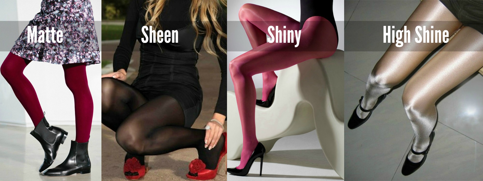
There are three prevalent finishes for hosiery: matte, sheen, and shine. When you want to look polished or dressy (in the formal sense) go sheen. Shiny hosiery while very dressy is best reserved for glamor and evening affairs and then only of your legs are slender. Shiny hosiery is great at making legs appear larger. 

Surface 1

Finding The Right Nude Hosiery For You

https://www.pinterest.com/pin/1548181103845283/

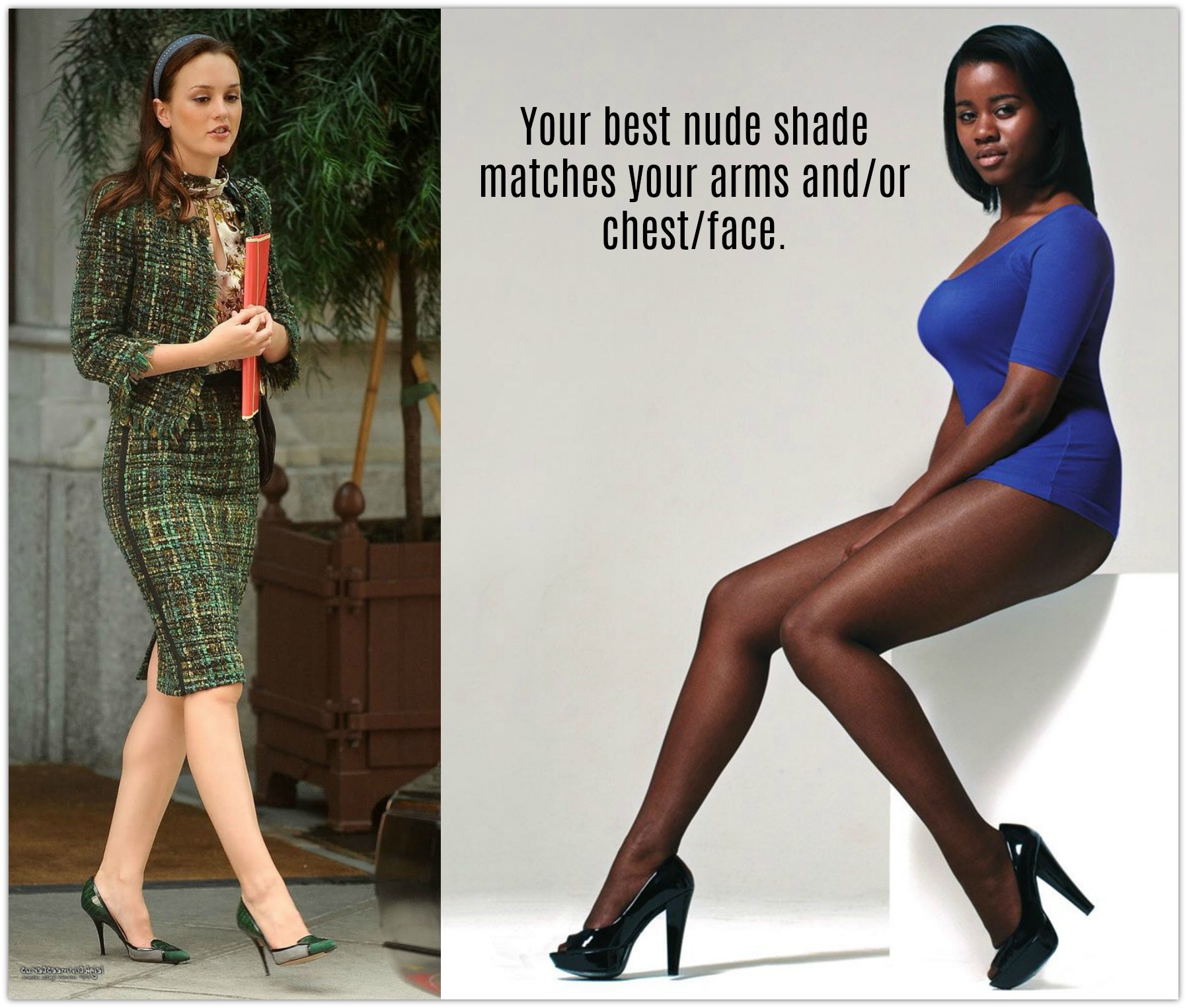
The right nude hosiery is a wardrobe essential. There’s nothing worse than nude hosiery that is different to your natural color; you can go a shade darker if you want to look a little more tanned but one shade max.

Match the shade

Coordination

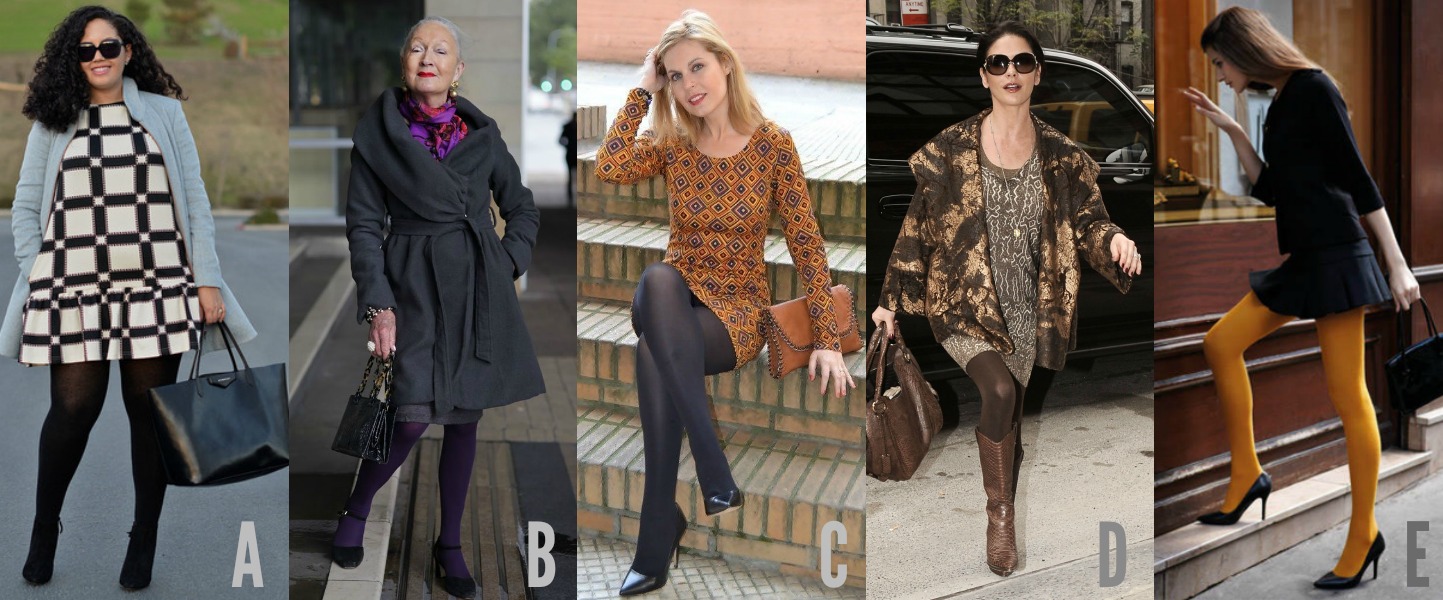
When it comes to selecting the best color for your hosiery go with nude and shades of black for professional occasions. Other than that you can:

  1. Add opaque hose to a skirt or dress that is too short (A)
  2. Match the color to an accessory (B)
  3. Match the color to a color within a print (C)
  4. Go monochromatic (D)
  5. Make a statement with a bold color (E)

GROUP 3

Put Your Hosiery on With Care

Though technological advancements have made hosiery more durable than ever, you should still take care to put them on correctly, especially when they are sheer.

First of all, make sure take any rings and bracelets off and ensure your nails are smooth to prevent snags. If your hosiery is ultra sheer consider wearing cotton gloves if you don’t have a spare pair handy. 

  1. Start by sitting down and roll down the tights down to the toe area.
  2. One leg at a time, slip your foot into the hosiery and curl your toes downward to prevent toe nail snags.
  3. Gently roll the hose up your legs. Always use both hands and stretch the hosiery up each leg carefully.
  4. Lastly, when both legs are in, stand up and carefully pull hosiery over the waist.

Hosiery Care

Finally, here are some basic do’s and don’ts of hosiery care:

  • Hosiery should be hand washed with in warm water using a mild detergent.
  • Do not bleach.
  • Do not leave to soak
  • Do not put your hosiery in the dryer, instead dry flat between two towels or drip dry.
  • Do not dry using direct sunlight or direct heat.
  • Fold flat or roll up when storing in your bureau. Make sure to place away from items it may snag on.

Want More: How to Style Fishnet Hosiery


Ann2015Blue

If you enjoyed this week’s feature
please like it on Facebook or Instagram
or leave a comment/question below.
Thank you.
Ann Reinten AICI CIP
Author

Hooray (1)

HOW TO STYLE CARDIGANS

By | Coordination, How To... | 18 Comments

Each fall and spring we need to become more imaginative when creating outfits that can cope with cool mornings and warmer days. Clever layering is often the key. Cardigans were born for this time of year and most women have at least one in their closet, but far from being a grab and go item, the cardigan can also be a real outfit transformer.

So in this time, I want to share my favorite ways to upgrade the humble cardigan into something special. 

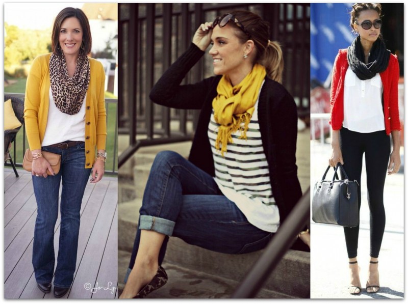
T + Scarf

Your standard white tee and denim uniform duo is great for casual days. But add a bright hued cardigan, and complement it with a fabulous scarf and your every day instantly elevates to wow. 

T and Scarf2

Source: Image 1, Image 2, Image 3

Back to Front

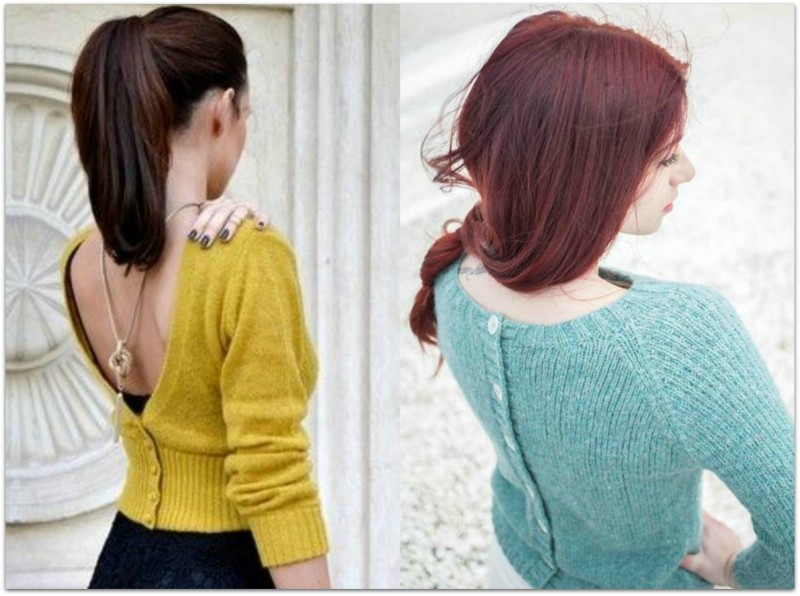
I admit I learned this trick from Gok Wan and it’s been a favorite ever since. It’s such a creative and unexpected way to wear a cardigan. It adds interest to the back of your ensemble and gives you a perfect canvas in the front for a statement necklace. If you have long hair, be sure to wear it in a sleek ponytail or a classy updo to showcase he back. 

How to Style a Cardigan _Back to Front2

Source: Image 1, Image 2

Belted

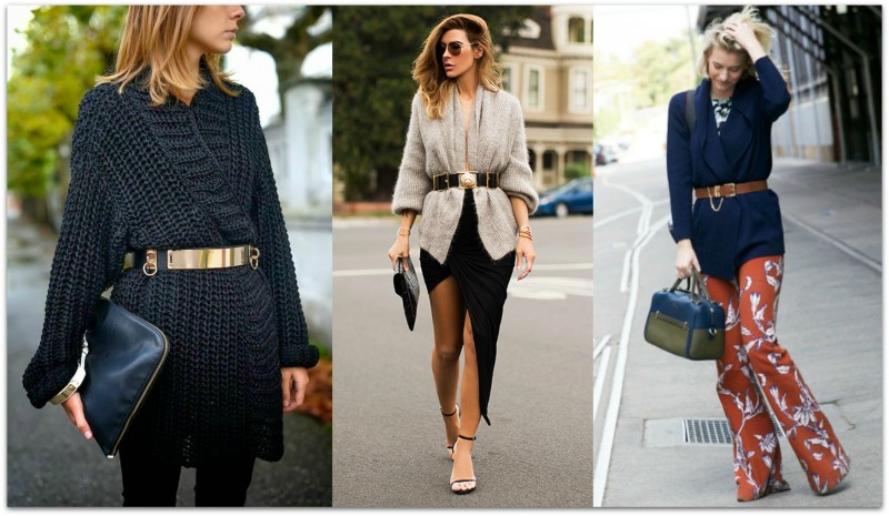
Cardigans are typically made of knit fabrics which are not usually associated with a tailored look, however, add a belt and the look instantly upgrades to tailored. An added bonus is that a belt helps to create a womanly hourglass silhouette. Accompany this look with sleek footwear and boxy bags.

How To Style A Cardigan_Belt Up22

Source: Image 1, Image 2, Image 3

Closed

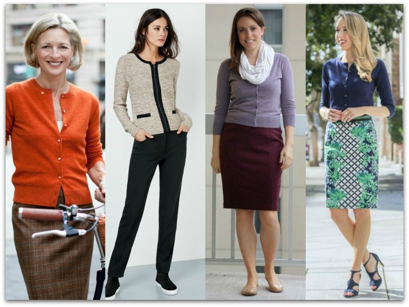
A cardigan buttoned all the way up or worn completely closed/fastened radiates a more formal/serious style sensibility. This is a perfect look for the office, providing a level of seriousness without looking too bulky or too structured. A buttoned-up cardigan can be used as an alternative to a collared shirt and paired with a pencil skirt or tailored pants.

Since a closed cardigan veers more toward simple style, you can jazz up this piece with bold tops and shorts, statement necklaces, scarves or belts. When wearing closed cardigans, it’s advisable to look for cardigans with interesting visual details like faux pockets, contrast piping, or fancy buttons — this will add more sartorial to your look while maintaining the formality.

How To Style A Cardigan _Closed Formality22

Source: Image 1, Image 2, Image 3, Image 4

Open

Wearing an open cardigan conveys a relaxed and friendly demeanor and casual chic appearance. Let the fuss-free and approachable vibe of this look lead you towards pieces that express the same aesthetic. Reach for flowing floral printed tunic tops, relaxed fit denim, simple yet chic flats, and feminine pleated skirts.  

How To Style A cardigan _Open2

Source: Image 1, Image 2, Image 3, Image 4

Under

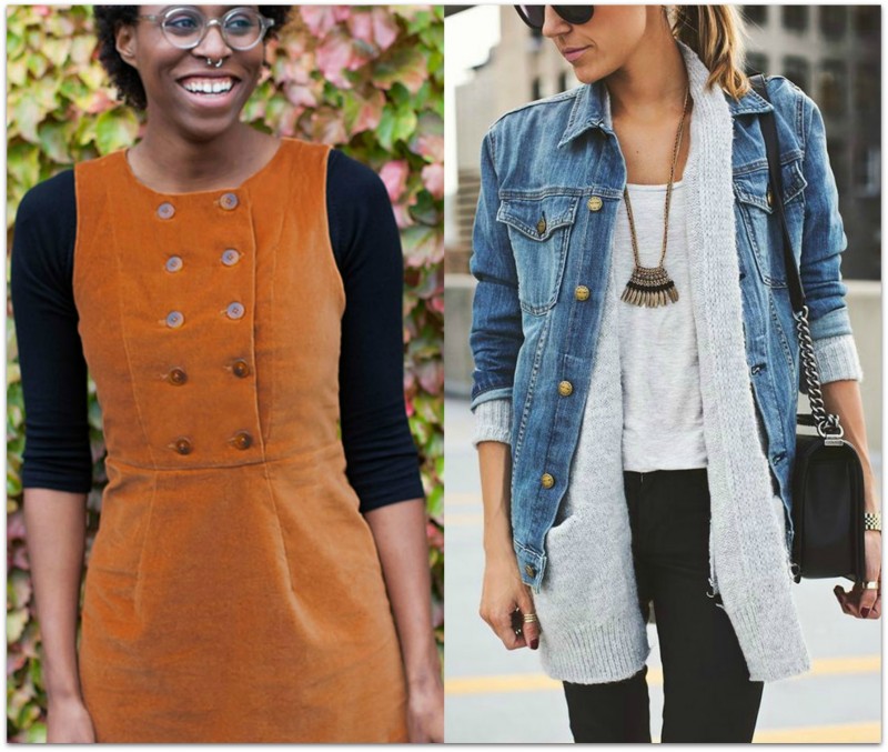
The key to making your cardigan (and wardrobe) work for you is looking for ways to expand the possibilities. One way is to do this is to layer it underneath other garments such a pinafore, sleeveless dress or jacket.

How To Style A Cardigan_Under22

Source: Image 1, Image 2

As a Pop of Color

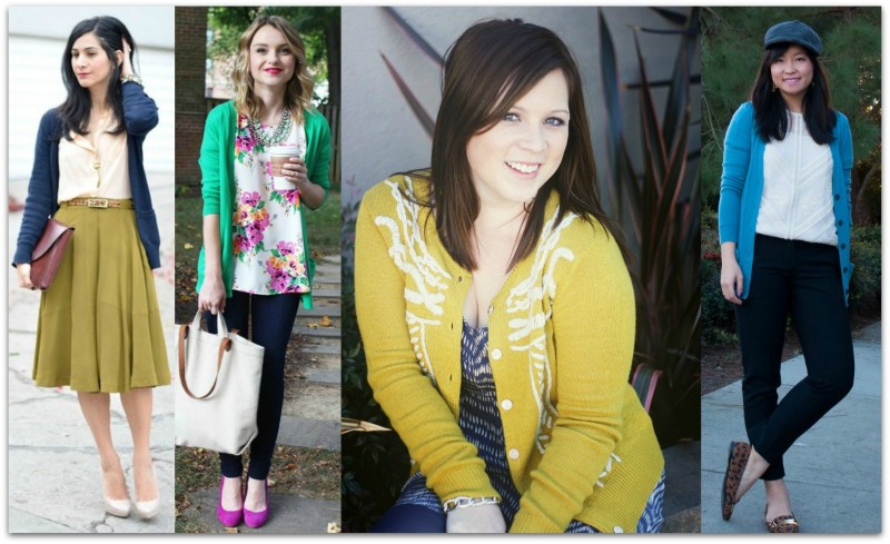
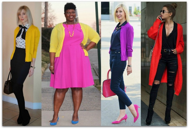
A bright cardigan is all you need to perk up your style, especially in summer. If you’re a woman who loves black and white, you’ll benefit even more from injecting a pop of color into your clothing rotation. Monochromatic is great, but it can get a little ho-hum, and there’s nothing like hot pink to break your streak of strictly neutral dressing. Color is one of the best ways to have fun with fashion!

How To Style A Cardigan_Color Pop22

Source: Image 1, Image 2, Image 3, Image 4

Ann2015Blue

If you enjoyed this week’s feature
please like it on Facebook or Instagram
or leave a comment/question below.
Thank you.
Ann Reinten AICI CIP
Author

ColorSense_part 2

COLOR SENSE: Part 2, Contrast

By | Colour, Coordination | 15 Comments

At some point, most of us come to the realization that the colors wear have an affect how we look, feel and how others react to us. Colors that compliment our skin, eye and hair color boost how healthy and vibrant we appear and can magically turn back the clock a few years by giving us a more youthful glow.

Following on from part 1, this time I want to talk about ‘Color Contrast.’

While a color analysis provides valuable information for selecting the colors that work best for you, there are other important aspects of color coordination within your range of best colors that is seldom taught.

To start, contrast is created when two or more colors are placed next to each other.

There are three contrast levels:

  • High: bright, loud, vivid contrast that makes you say ‘WOW.’
  • Medium: two or more colors where a mix of light and dark is seen.
  • Low: a mix of colors which are similar depth to each other and seem to blend together.

Contrast Circles

Each contrast level affects:

  • how well a garment reacts with the contrast between your hair, eyes and skin.
  • the perception of the size of the area over which the garment is being worn,
  • your image when wearing the contrast level.

Focus is naturally drawn to contrast. Once understood contrast can be used to:

  • highlight or hide an area of your body,
  • make a visual statement or blend in and observe,
  • be taken seriously, remembered and listen to, or be overlooked or discounted.

Each contrast level can be created in the following ways:

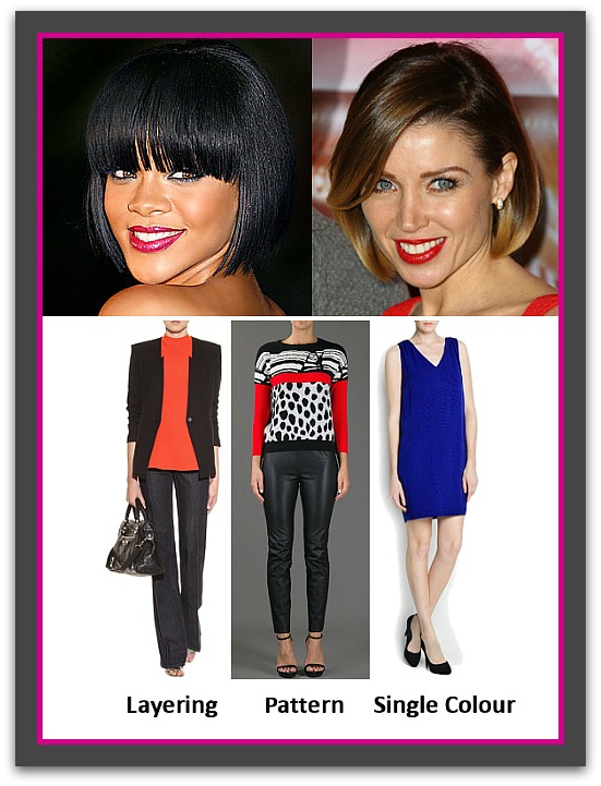
  • between colors within a pattern or print
  • between garments when layering
  • between a solid colored garment and your skin.

Contrast Grouping

Skin Deep

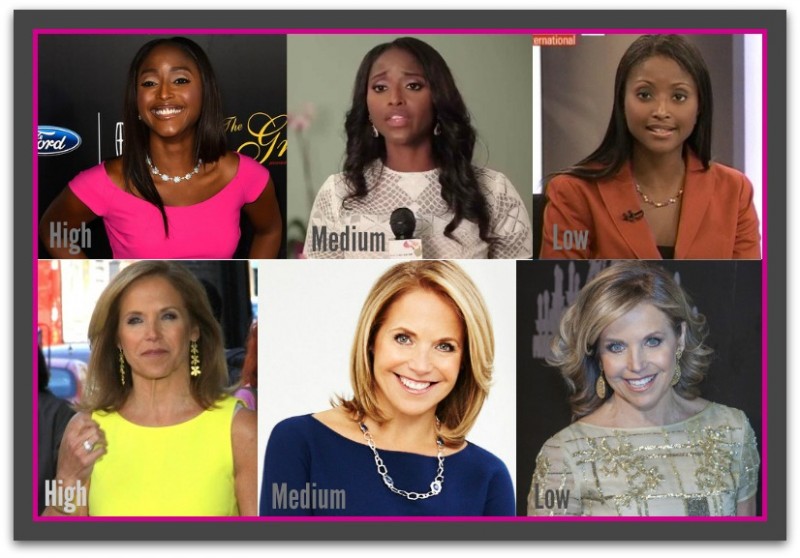
Also worth noting is that a person’s skin coloring dictated which colors are high, medium or low contrast. Notice Isha in the burnt orange jacket below (low contrast) and Katie in the oatmeal colored dress, also low contrast. If we placed the orange jacket on Katie, the contrast would be medium. Alternatively, if we swapped Katie’s oatmeal dress onto Isha it too would be medium contrast.

Constrast Comparison bewteen black and white skins

Top Row: Isha Sesay  Bottom Row: Katie Couric

High Contrast

High contrast is created when two colors combine to create a very bright combination – one that causes others to say or think ‘WOW.’ It may be a dark color with a bright color or two bright colors together i.e. purple and yellow.

High contrast is best worn by individuals who have a medium to high color contrast between their hair, skin and eyes, as well as bright looking eyes and skin (tends to be combination to oily). These color groups are:

  • Bright Winter / Cool, Clear,
  • Cool Winter / Cool and Clear,
  • Bright Spring / Warm, Clear and Bright.
  • Deep Winter / Cool, Clear and Dark

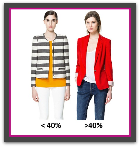
Women with a low contrast will find that high contrast clothing will be so bold that the garment, not they will be the center of attention – see >40% model below. 

Depending on the pattern and the colors used, the psychological effect this combination produces is one of power, authority, flamboyance, creativity or eccentricity. High contrast combinations are generally worn by confident, outgoing people and while the look will certainly get you noticed, it is not necessarily one that is approachable or people friendly. Often people will stand back and observe you for a while before deciding if you are someone they feel comfortable approaching. This contrast level is most effective at times when you need authority or to stand out and be noticed. Not recommended for job interviews or situations when you need to win people over to your idea or side of the argument.

High contrast exaggerates all pattern sizes, especially those that are medium to large.

High contrast also highlights the area to where it is applied; drawing attention to it and visually advancing the area making it appear larger. Therefore, it’s best worn over the smallest area of your body.

When layering, to be able to pull-off high contrast without blinding anyone keep the high contrast color less than 40% of the color seen – see <40% and >40% images below.

High Contrast Group

High_Contrast_percentages.

Medium Contrast

Medium contrast is created when various color depths are combined that are easy on the eye and harmonious.

It is a contrast level suits all individuals regardless of personal coloring or ethnicity.

The psychological effect this combination produces is one of confidence, professionalism, appropriateness. Medium contrast attracts attention in an approachable and people friendly manner. The look inspires others to notice, remember, listen to and taken you seriously. It is appropriate for all situations, locations, and occasions.

Patterns of medium contrast are best placed over the smallest parts of your body. When placed over an area that is large be sure to choose the opposing garment in dark color from the pattern as this will draw the attention away from the larger area and visually elongate and slim your silhouette.

Facebook1 (1)

Low Contrast

Low contrast is when colors of similar value (color depth) are combined. This contrast level is easy on the eye.

This contrast levels best suits individuals who have a similar contrast level between their skin, hair, and eyes plus a matte appearance to their skin.

These color groups are:

  • Soft Summer / Cool, Muted and Soft
  • Soft Autumn / Warm, Muted and Soft

On brighter individuals this combination may appear boring, drain them of color and be aging.

The psychological effect this combination produces is one of innocence, subtleness, and passivity. Low contrast while people friendly and elegant, is also almost invisible to others (especially in light combinations) and the wearer will need to either have already established their authority and position or else will struggle to be noticed, listened to or remembered. Give these facts low contrast is best left for after work hours.

Low contrast patterns are the easiest to wear even when the pattern size is large. This is because the subtly of the colors does little to increase apparent size. However, I would still recommend that if you wear the pattern on the largest part of your body that you select a color from the pattern for the opposing part of your body to ensure the sleekest silhouette.

Light, low contrast combinations are great for weekend wear and endows the wearer with casual elegance. Dark low contrast combinations create a evening elegance that is hard to beat.

Low Contrast Group2


Ann2015Blue

If you enjoyed this week’s feature
please like it on Facebook or Instagram
or leave a comment/question below.
Thank you.
Ann Reinten AICI CIP
Author

stripedbanner

A STRIPED AFFAIR

By | Coordination, Line and Design, Understanding Prints & Patterns, Wardrobe Savvy | 13 Comments

This week I’m changing up my feature up a bit by focusing on a pattern – stripes to be precise.

They are almost as wearable as solid colors and a must-have in any woman’s wardrobe. Their versatility allows multiple ways to coordinate them with your favorite garments and depending which stripe you use you can easily create either a relaxed vibe or a serious edge to your look.

And I’m starting at the beginning because I’ve often found that when you start with the historical aspect of a garment, fabric or pattern, it often yields many insights that make sense of their use in the present, and why we perceived a certain way when we wear them.

Historically, women have borrowed or have been influenced by many menswear items. Stripes were originally a major part of men’s suiting and casual wear, but many important historical and fashion figures have influenced the way they have been used within fashion.

Vertical Stripes

History

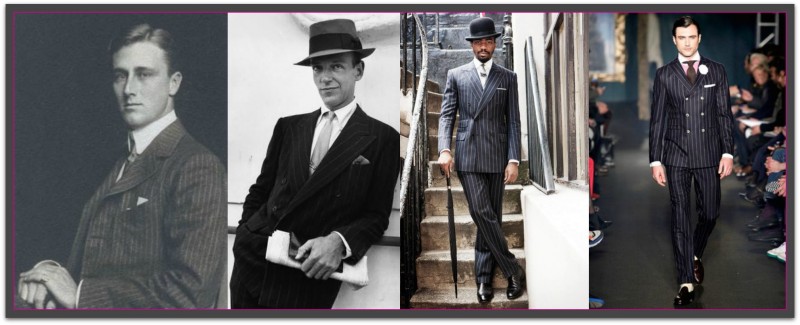
The world famous London Savile Row is considered by many to be the capital of menswear tailoring. Hugh Holland, the managing director of Kilgour French Stanbury, one of the stores on Savile Row, states that the pin stripes we know and wear today originated from bank uniform around the 19th century. London, being a commerce capital during that time, was definitely the place where fashions emerged. A striped trouser paired with a casual morning coat was the uniform of the financiers of the 19th century. More interestingly, each bank had a specific type of stripe so  their brand and employees could be easily identified.

History PinstripeSource: Image 1, Image 2, Image 3, Image 4

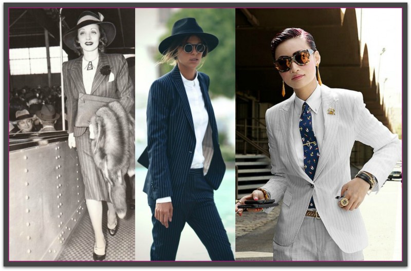
No one is really quite sure of the exact starting point when the vertical pin stripe was introduced to the public. However, there is another popular theory that the pinstripe came about in the glitzy decade of the 1920s where fashion was such a huge part of everyday culture and lifestyle. Inspired by the boating outfits from the late 1800s, the 20s showed off pin stripes in a fun and fashionable way. Pre-Gatsby era, formalwear was quite subdued so more casual suits came forward as a way to make menswear more playful and vibrant. Take a look at vintage photos of men in pin stripes suits and you’ll start to really understand what makes these vertical pin stripes so wearable and chic. The thinness of the stripe makes it work appropriate, but you can just as easily jazz up vertical stripes with bolder accessories and styling. Pin stripes wouldn’t be the first trend that women have adopted into their own fashion realm and it certainly won’t be the last, since fashion is always changing and borrowing inspiration from the opposite gender. Here are some perfect examples of women’s tailored suits, from vintage to modern:

women pinstripe1Source: Image 1, Image 2, Image 3

If you want to look toward current trends, bold and graphic stripes are the vertical stripe look of the moment. While historically, pin stripes are the reigning kind of vertical stripes, current trends and style have been dictating more graphic, statement-making large vertical stripes.

How They’re Perceived

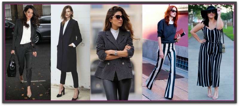
With a history associated with professional endeavors and formal events, the vertical stripe is seen as powerful, professional and authoritative. Variations of the stripe include pencil and chalk with each gaining their name from the width of the line created by the pin, pencil or piece of chalk. The narrower the stripe, closer together and more classic the stripe color, the more formal the impression they will create. If you are seeking the most professional look, opt for stripes in color pairings of neutral hues like black, navy, and white.

women in pinstripesSource: Image 1, Image 2, Image 3, Image 4, Image 5

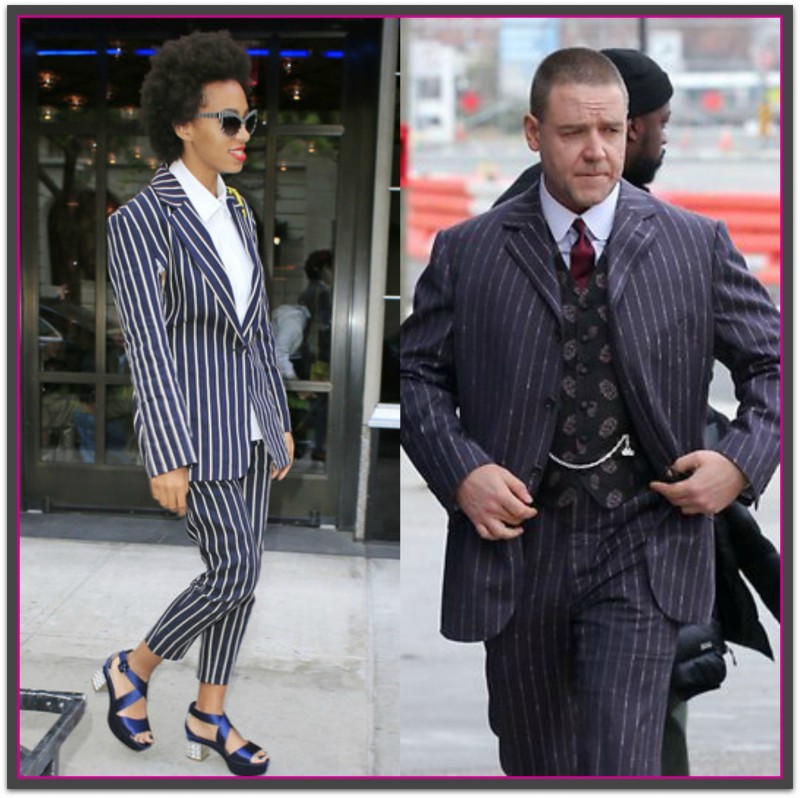
One last vertical stripe worth mentioning is the gangster stripe. Stereotyped more from movie myth than truth, the fact remains that if you wear it, you run the risk of being seen as theatrically contrived than stylish.

Gangster Stripes

Visual Effects and Styling Tips

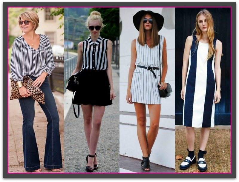
It’s virtually a no-brainer that vertical stripes are slimming. The vertical line naturally encourages the eye to travel up and down elongating and visually slimming the area. Here are some more vertical features you may want to look for if you want to increase the slimming effect:

  • One central stripe as a focal point of the garment
  • Many thin stripes close together
  • Low color contrast in between the stripes
  • Vertical stripes worn over your largest area
  • Long length vertical garments
  • Don’t wear vertical stripes over areas where you are curvy as the stripes will stretch out of shape.

Try to avoid wearing one prominent stripe to the side if you are wide, as this can make you look wider. A central stripe is best when you wish to look taller or slimmer. When opting for vertical striped pants, avoid fabrics that stretch as this will warp, hug, and expand over your fullest areas.

To read more about styling with vertical design lines see: The Vertical Advantage

Wearing vertical stripesSource: Image 1, Image 2, Image 3, Image 4 

Horizontal Stripes

History

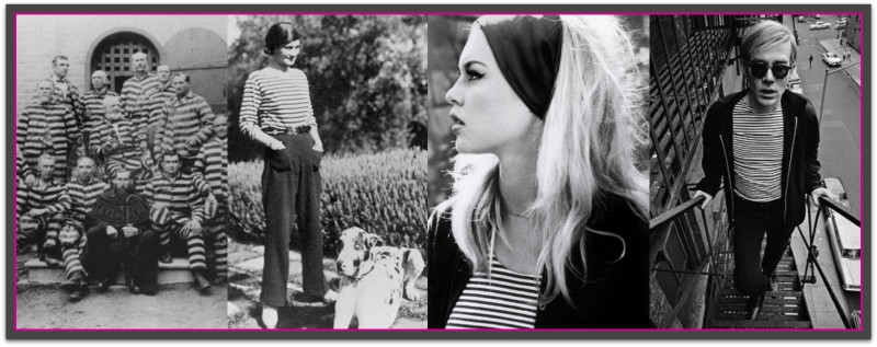
Dis you know that during medieval times, you could get sent to prison for simply wearing striped clothing? It’s true. Stripes were for prisoners, and well, evil people. We, along with the fashion industry, have definitely evolved from that belief. Now, stripes have moved on from their negative medieval connotations and have become one of the most coveted patterns for fashion.

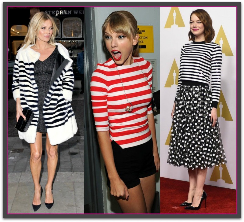
From the 1800s onwards, horizontal stripes became one of the fashion staples that we know and love today. Queen Victoria dressed her son Prince Albert in a striped sailor suit aboard the Royal Yacht, and from then on stripes were firmly in the public eye. The 19th century then saw the popularity of the horizontally striped Breton shirt worn by French navy men. Coco Chanel, however, gets the ultimate credit for bringing horizontal stripes into the 20th century when she sold it from her store. From then on, pop culture and fashion icons like Audrey Hepburn, Pablo Picasso, Brigitte Bardot, and Andy Warhol further popularized the striped Breton Shirt in the following decades. Nowadays, modern fashion icons like Kate Moss, Emma Stone, and Alexa Chung are huge fans of stripes, and are often photographed wearing this eponymous pattern and styling it in different ways.

History of Horizontal StripesSource: Image 1, Image 2, Image 3, Image 4

CelebrityStripes

Source: Image 1, Image 2, Image 3, Image 4, Image 5  

How They’re Perceived

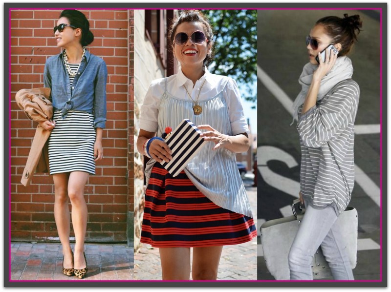
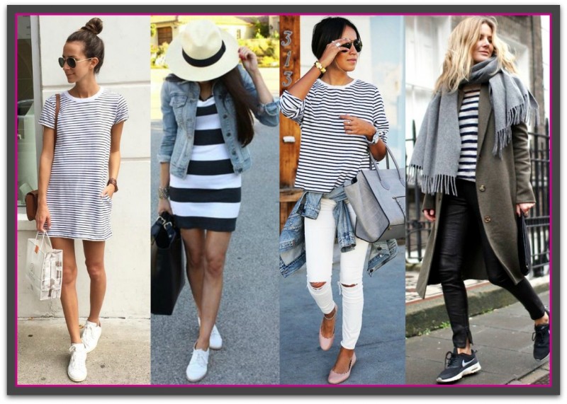
Definitely more laid-back than vertical stripes, horizontal stripes are the more casual and sporty of the two kinds of stripes. For business wear they are best left for your business casual days.

One of the most famous and frequent fashion comebacks is the Breton top and it can be relied on to give your look a chic, nautical image. While these stripes do have a definite sporty or casual stereotype there’s no need to feel trapped into the looks as there are many ways to dress the stripes up through the use of tailoring, color, sheen and shine, texture and accessories. 

CasualstripesSource: Image 1, Image 2, Image 3, Image 4

DressyHorizontalStripes

Glam up Your Horizontal Stripes Ideas

Source: Image 1, Image 2, Image 3Image 4Image 5  

Visual Effects and Styling Tips

Horizontal stripes can be a bit tricky, but don’t listen to people that say they aren’t flattering. Pulling off a pattern is all about styling and finding the right fit for your body and personal style. With the right elements, horizontal stripes can even be, dare I say it, slimming. Here are some tips to make sure that horizontal stripes slim you down:

  • Look for garments with many thin stripes close together
  • Choose low to medium color contrast between the stripes. Think monochromatic like navy and midnight blue stripes or red and maroon stripes
  • Ensure the garment is longer than it is wide (the middle photo below is too short).
  • For pants and skirts look for sturdier fabrics with some elasticity.
  • Wear the horizontal stripe over your smallest area.
  • Consider your body type. Full figured women can get away with slightly wider stripes while petites should opt for thinner lines.
  • Be mindful of the garment silhouette a striped item comes in.

Horizontal Styling Tips

Source: Image 1, Image 2, Image 3

To read more about styling with vertical design lines see: Horizontal Help.

Ann2015Blue

If you enjoyed this week’s feature
please like it on Facebook or Instagram
or leave a comment/question below.
Thank you.
Ann Reinten AICI CIP
Author


skirtsbanner

MAKE WAY FOR SKIRTS

By | Coordination, Figure Flattery, Wardrobe Savvy, Wearing Classics | 7 Comments

“A good sermon should be like a woman’s skirt:
short enough to arouse interest but long enough to cover the essentials.”
~Ronald Knox~

Skirts like pants are a great wardrobe expanders. The wide variety of shapes, styles and lengths; coupled with an almost limitless array of fabrics, colors, patterns and textures means there’s a skirt for every occasion, personality, age and body shape.

Fit is Paramount

Great fit is just as important as buying the right style for your shape.  Ignore the size on the label as there is no consistency of size between labels – correct fit is what matters most.  If the number on the label worries you – cut it off.

Constant creasing is often blamed on poor fabric quality when often poor fit is often the culprit.

When you are in the fitting room go through the following fit checks:

  • Expect that the skirt may need to be altered to fit you perfectly.  Alterations can make all the different to the look and comfort of the skirt. If they are required, have them done without delay. I’d go so far as to say, do not to take them out of your car unless they are going into the alteration store. 
  • If the skirt is fitted or straight, fit the hips first; generally everything else can be altered to fit.  
  • Bend, stretch and move – if you feel the need to pull-down or rearrange your skirt after sitting or walking, select another style or go up one size.
  • There should be enough ease for you to be able to place two fingers comfortably in the waistband and be able to slide the skirt 360 degrees around your body. 
  • Panty lines should not be visible.

Two Basic Shapes

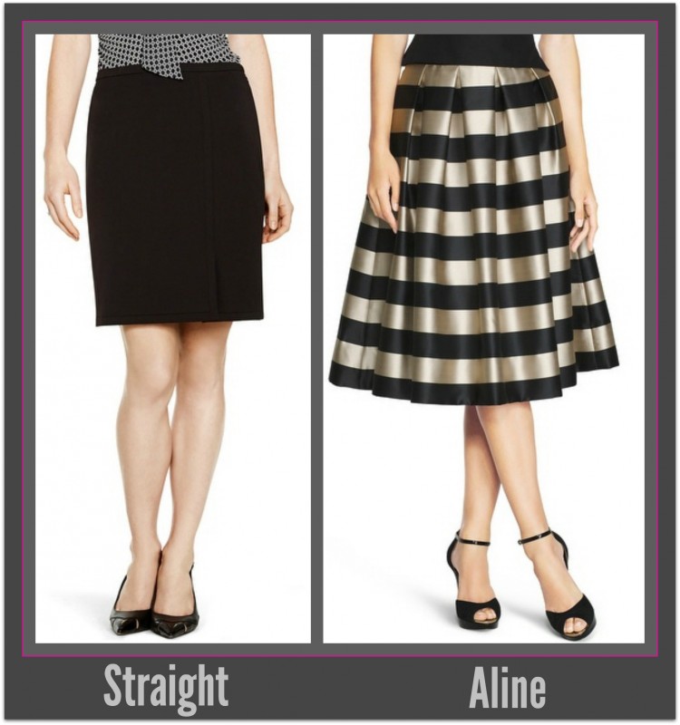
There are three basic skirt shapes:

  1. Straight
  2. A-Line

From these basic shapes all skirt styles arise.

Basics_StraightAline

Source

Straight

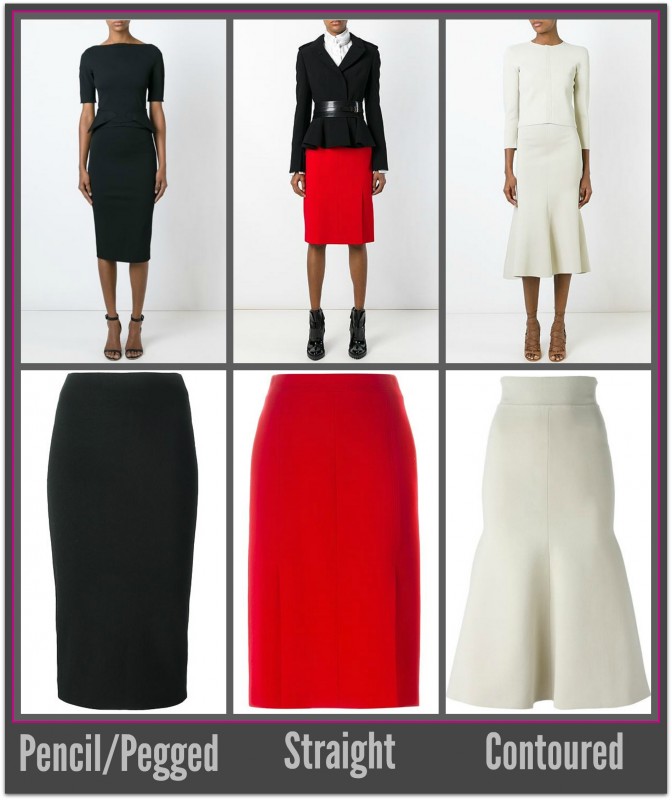
Seen every day in every situation straight skirts  and their derivatives classic and timeless. Their clean shape co-ordinates easily with a multitude of tops and jackets and when the hem is at, or just above the knee. As long as they are not too fitted/tight they are unobtrusive and appropriate for most business environments and flattering on most women.

Each can be transformed by fashion into many different looks through the use of fabric, fit and embellishments. From casual in a chunky knee length tweed, to elegant and formal in a calf length silk to a sensual number if a thigh high split is added.

The longer a straight skirt is the more it will restrict movement. To compensate for this vents or side-splits are added or they are styled as a wrap.

Classic styles derived from the straight skirt are pencil and contoured styles. As they becomes more fitted the look becomes sleek and sexy and as such are best reserved for non-business occasions.

Some straight styles include: tulip, wrap, sarong, tiered, fishtail, peplum and pleated.

Straight Skirt SetSource

A-Line

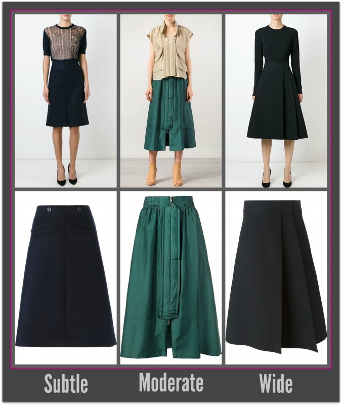
Named after their shape, A-line skirts allow unrestricted movement. They are more feminine and friendly than the traditional straight skirt. 

The wider the A shape the shorter in height you may appear and this visual shortening in turn can result in making the you appear wider/heavier.

The taller, more slender and long legged the wearer is the more flattering a full A-line skirt will appear. If you are not blessed with height, long legs or a slender figure opt for subtle A-lines and add medium to high heels and you’ll look every bit as good as your long legged friends.

Some A-line styles include: gathered, inverted front pleat, circle, wrap, kilt, godet, bubble and dirndl.

AlineSet

Source

Key Elements

Hemlines

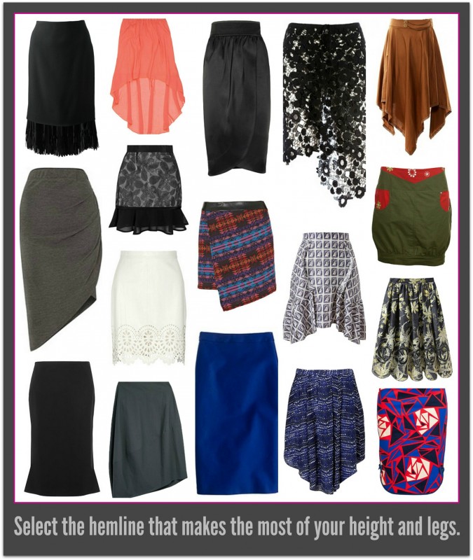
Today skirts can have many different shaped hemlines.  Straight remains the only shape that is classic – everything else will eventually fall out of fashion.

If your legs are not your best asset fancy hemlines will not be a good choice for you as they are often become the focal point of your outfit – highlighting your legs.  To counteract this add hosiery in a color that will minimize the color contrast between the hemline and your legs.    

hemlinesSource

Waistbands

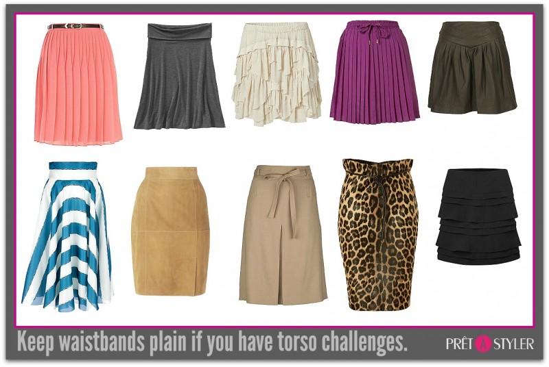
Like hemlines, waistbands are best plain or not present as in the case of waistbandless skirts.  If you have any mid torso challenges only the plainest of waistbands will be the ones to choose. Ties, belts and fancy waistbands all require short or tucked in tops and will add awkward bulk if any tops are worn over them.  

Waistbandless skirts give a clean line and elongate the torso however; they do have a tendency to stretch over time.

WaistbandsSource 

Length

Your best skirt length will depend on:

  • the length of your legs,
  • if you have any leg challenges i.e large calves, knobbly knees etc.
  • the style, toe shape and height of your shoe
  • the color contrast created between your hemline, legs and shoes.

Long skirts look best on tall and long legged women. They can work for almost everyone else if medium to high heels are worn.

Skirts which skim the top of the knee are always current, appropriate and flattering on almost every woman. If you are concerned about the look of your knees or legs, wear for hosiery that blends with the color of your hemline, legs and shoes.

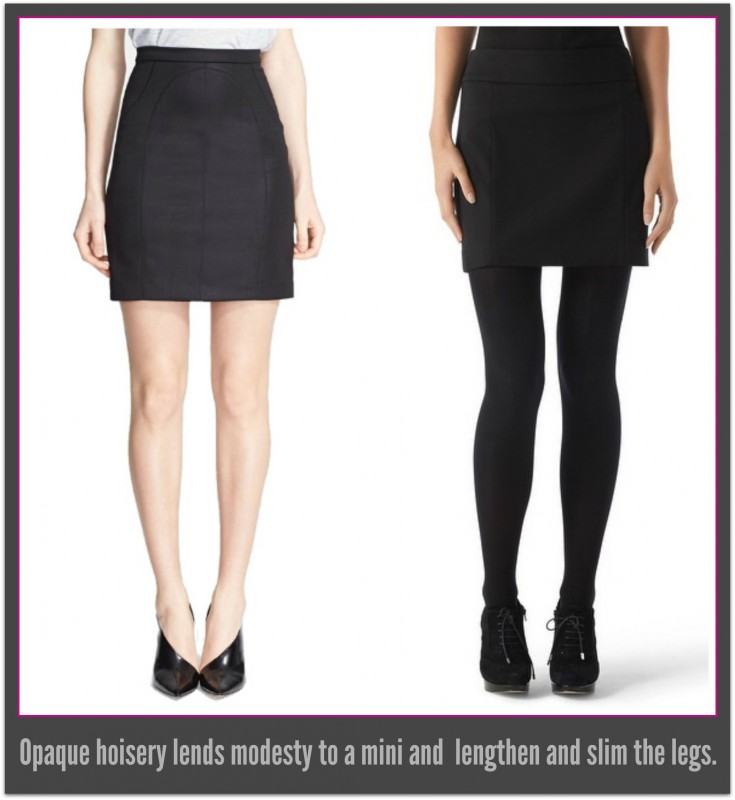
When mini shirts are in fashion, for modesty opt for skirts that are longer than they are wide. By adding opaque hosiery a short hemline can be made to appear more modest and flattering.

Experiment by combining different hem lengths and shoe styles, heel heights and hosiery colours. A multitude of challenges can be camouflaged with skillful coordination. 

hosiery

Source

Color

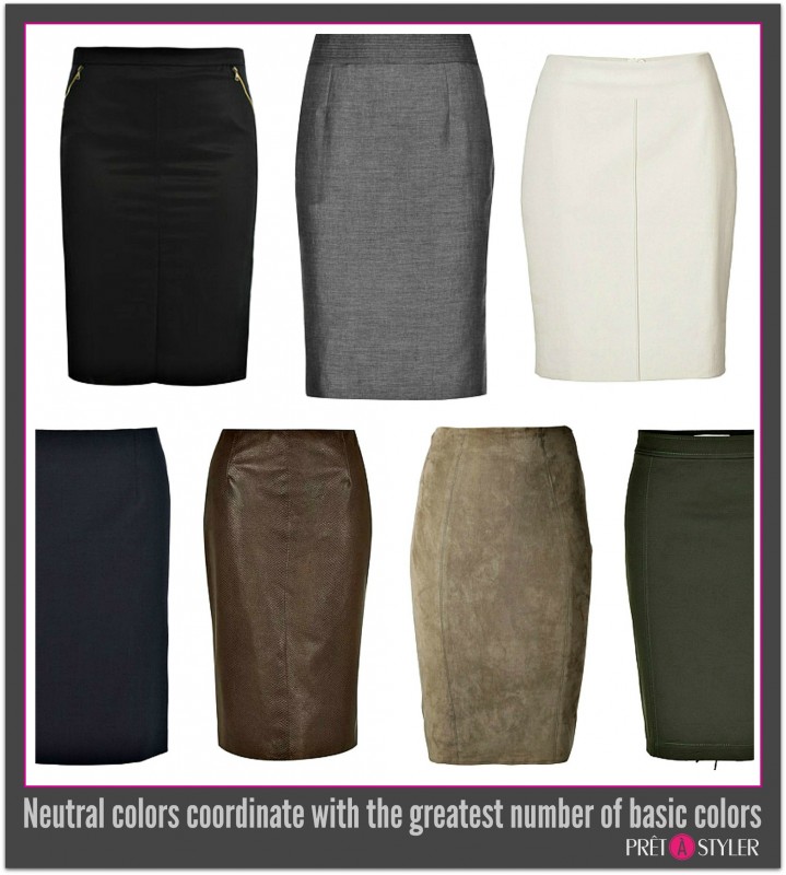
While skirts can be any color it is only the neutral range of colors that are truly versatile. Colour affects both your apparent proportions and weight. A light or bright coloured long skirt will focus attention on the lower half of the body making the wearer appear shorter and wider. Darker colors recede and visually slim the hips, thighs and backside.

Short skirts in light colors appear to be shorter than they really are and are best worn slightly a little longer to compensate, while dark colored short skirts have the opposite effect and thus can be worn slightly shorter. The more color difference there is between your skirt and legs the more attention will be focused on your legs, especially at the hemline.

neutralcoloursSource

Pattern and Texture

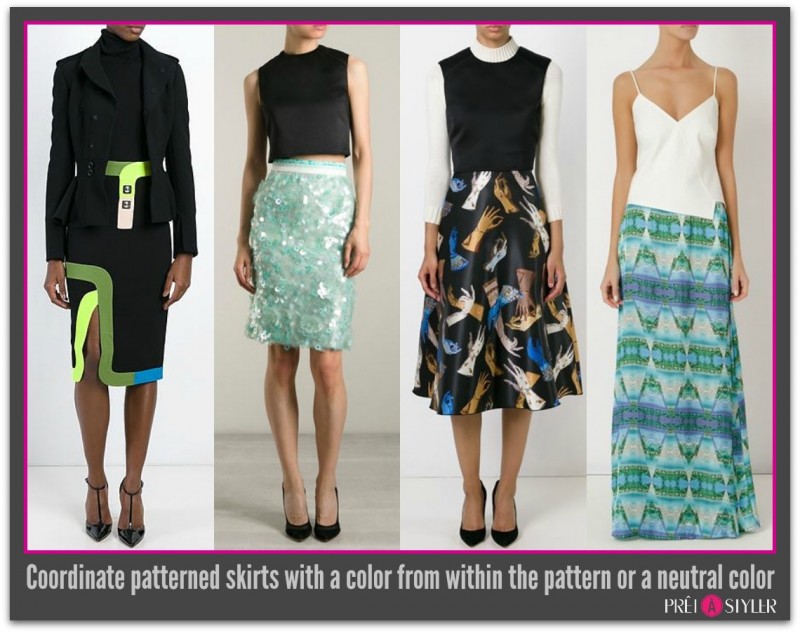
Skirts with bold patterns, particularly checks and wide stripes can be difficult to pull-off if you are not slim or tall. If patterned skirts are your thing and you have a full lower body for opt colors and patterns that are subtle and match with a top that carries one of the colours upward, or wear white with a statement necklace.

The use of evening fabrics will transform a skirt from day wear to evening wear.

Texture tends to increase perceived weight and in most cases immediately places the skirt into a new image. For example a straight skirt in high quality, lightweight wool can move freely from the office to home to evening wear, whereas if it is in tweed immediately it will take on a country, casual air relegating it to the weekends. Shiny textured surfaces in the same way render the skirt too glamorous for most work environments.

Pattern Coordination_Skirts

Source

Final Points

  • Choose lengths that best suit you; do not be persuaded by a designer’s whim or a girl friends nagging to wear anything else.
  • Lined skirts last longer and look better – buy them whenever possible.
  • Wear jackets/sweaters and skirts that are well proportioned to each other. Long over short or short over long. Skirt and jacket combinations that are exactly 50/50 are in most cases uninspired and boring.
  • Shoes with low vamps (exposes lots of foot), fine to medium soles and heels, and slightly pointed shoes will all make legs look slimmer and longer.
  • Discover what styles suit your shape and you’ll find shopping and looking great everyday easier than you ever imagined.
    Need Some Style Advice? My Private Stylist is the only online style program that will teach you about all the aspects of all garments and accessories that will best suit you.
    Shop Online Effectively with PrêtàStyler, the world’s first and only personal curated fashion mall. It’s a mall filled with styles perfect for your shape.

Ann2015Blue

If you enjoyed this week’s feature
please like it on Facebook or Instagram
or leave a comment/question below.
Thank you.
Ann Reinten AICI CIP
Author

Banner

HOW TO CREATE AN OUTFIT

By | Coordination, How To..., Wardrobe Savvy | 16 Comments

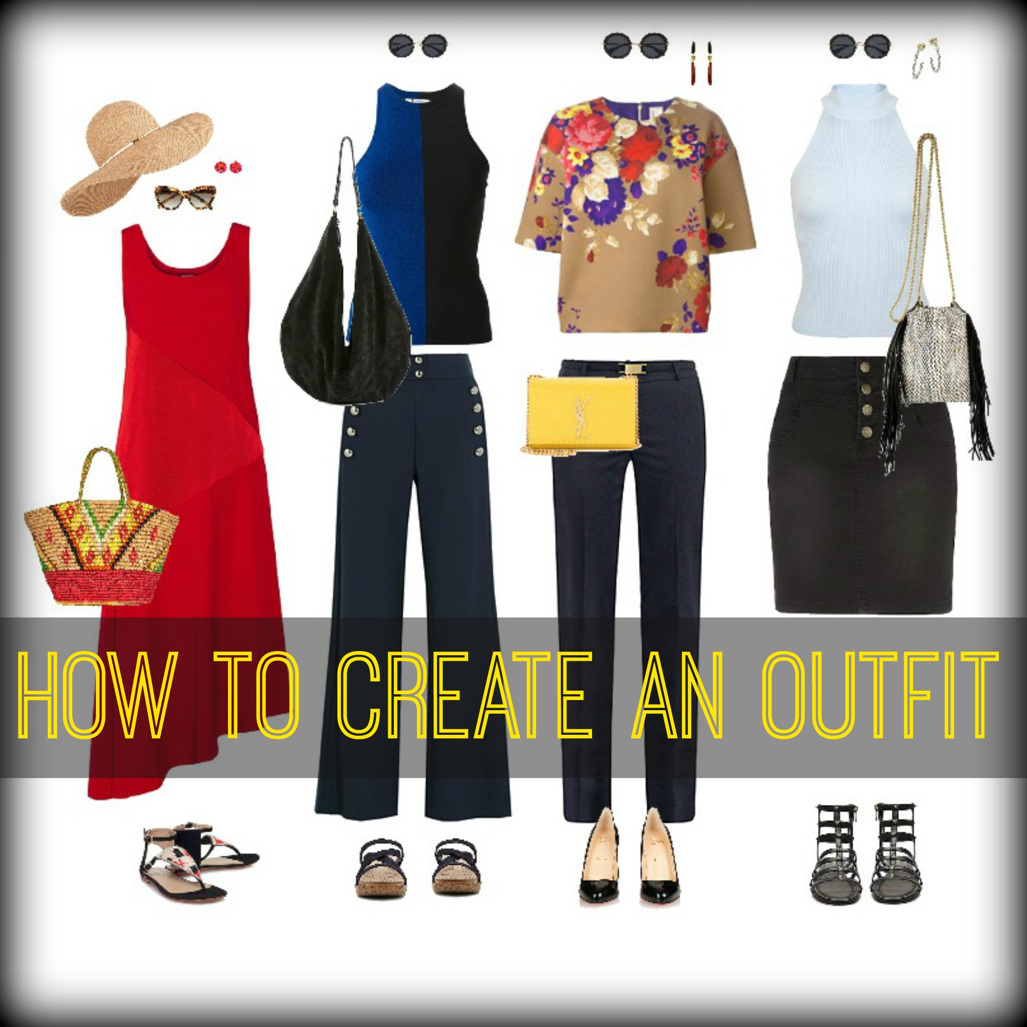
Getting dressed is a task that most women take for granted. They get up, stare into the wardrobe and pick out the first thing that springs to hand. Some end up looking great and others…well, not so much.

What you wear has a huge influence on how you feel and behave day to day. Socially and business savvy women know that getting dressed and choosing the right outfit is critical to the way the day will unfold.

When you look skillfully dressed, you feel more powerful, more confident and other people give you more notice and more respect. Knowing how to build an outfit is an essential skill to ensure you project the image you want and live the lifestyle you choose.

What you wear and how well you’re groomed speaks volumes about you and we are all unconsciously assessing others via their appearance every day. So it makes sense to look our best every day and that starts with the ability to create figure flattering and visually pleasing outfits.

Thoughtfully crafting outfits from the options in your wardrobe may seem like a daunting task but it’s really as easy as 1, 2, 3. In time, these steps will become second nature to you and building an amazing outfit will be a cinch.

#1. Think ahead9545e7309d8eafc3e63ed869f8e8b7df

It’s always easier to plan what you’ll be wearing the night before. When you have your outfit laid out and ready, it will make your morning much less stressful. This is a great bedtime ritual to make sure that your mornings start on the right note. Laying out your outfit the night before also affords you the time to explore a lot more sartorial possibilities.
Ask yourself:

  • What will I be doing?
  • Where will I be going?
  • What will the weather be?
  • Who will I be seeing?
  • What’s the level of dress that will be required?
  • What impression do I want to make? 

These questions are key to choosing the right outfit for your day. Don’t forget to lay out your accessories too. This ritual/habit will take the hassle out of your mornings and take the guesswork out of dressing up.

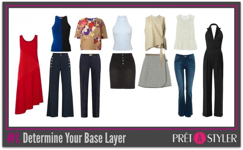
#2. Decide on your base layer

It is easier to put together your look once you’ve decided on the basic elements of your outfit. Here are the simple possible combinations for your outfit:

  • Skirt + top
  • Pant + top
  • Dress

The base layer’s look will of course be decided by the occasion or event you’re building the outfit for. The base layer will also decide factors like underwear, accessories etc. If your base layer is simple, that’s the time to get more creative or bold with other aspects of your look. If one or more base layer elements is a statement piece, that’s your cue to simplify the rest of your ensemble. 

BaseLayers1

#3. Lay the right foundation

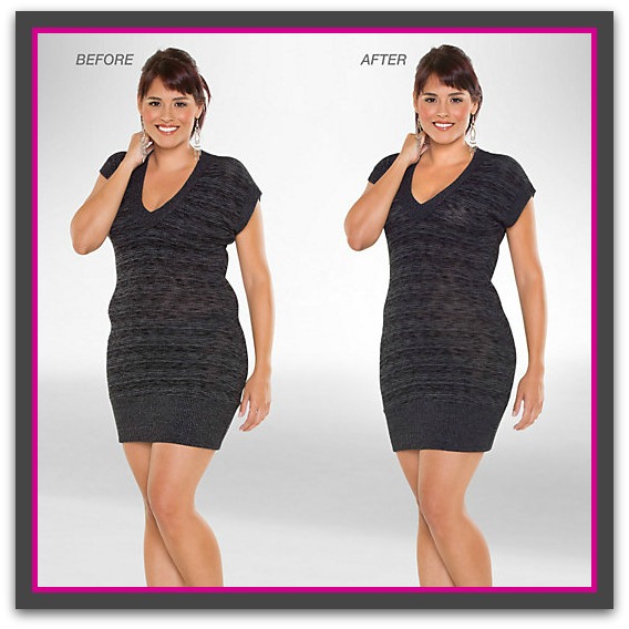
The right lingerie or shapewear will make an enormous difference. You may think that what you wear underneath doesn’t show or is irrelevant—that’s where you’re wrong. Your underwear affects how clothes sit or drape on your body. Shapewear is a worthy investment in this department since it provides an excellent foundation for your clothing. It will smooth any bulges and it will make sure your clothes fit perfectly. The right underwear has the same effect, so invest in your bras and panties, ladies. Trust me, it will pay off. The right shapewear and underwear will kill wobbles and perk up your chest area. It will make you look your best. If you want to know more, click this link for my in-depth feature on Shapewear

018675-1200x1500-BeforeAfter-2Source 

#4. Layer as desired

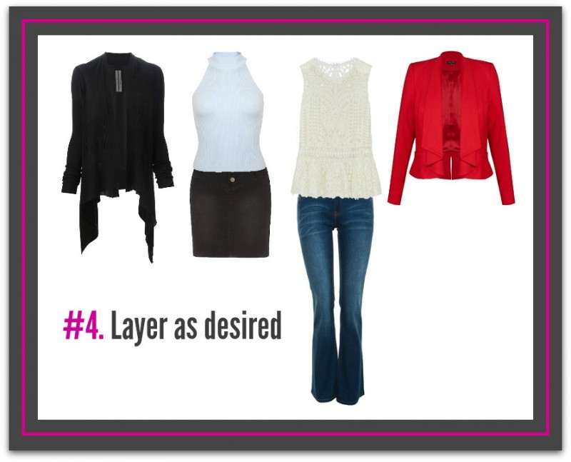
Layering is a great way to increase the chicness of your look. So whether it’s for fashion or function, layering is necessary to building an effective outfit. 

  • For formality
    • In business settings adding an extra layer to cover bare upper arms will result in a more professional image. 
    • More formal settings are more about fashionable layering. For professional environments, adding a blazer to your look will result in a more polished and formidable appearance. For formal events like parties etc., layering with embellished jackets or colourful scarves is a great way to stand out and increase the stylishness of your cocktail dress or evening separates. 
  • For warmth
    • i. If you feel you are on the larger side look for light layers of extra warm fabrics e.g., cashmere. Fabrics like cashmere or Merino wool provide the warmth and insulation you need without adding extra bulk to your frame.

ii. Layering for warmth may be functional, but that doesn’t mean you shouldn’t be trendy about it. Cozy cardigans in trendy prints like polka dots, stripes, or plaid is a brilliant way to add an extra dimension of style to your look. 

Layer1

#5. Shoe off

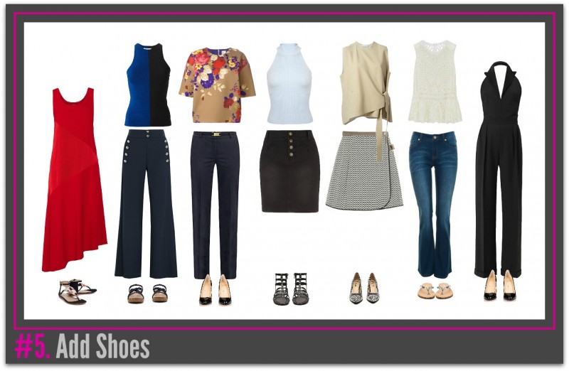
Any style conscious woman will tell you that a shoe can make or break an outfit and it’s true. Nothing can ruin a great outfit quite like a cheap or bad pair of shoes can. A stunning evening dress doesn’t look right with cork wedges, while a day of errands can get sabotaged with a pair of uncomfortable stilettos. Choose shoes that go with the overall images and vibe of your look. It is also important to know when to sacrifice comfort for style and vice versa. A day of walking should, of course, necessitate a comfy yet chic pair of sneakers while a fancy evening event is the right moment to put style above all else, and slip into a pair of amazing high-heeled pumps. For more footwear knowledge, go to my feature called, “Well Heeled.”

Add shoes1

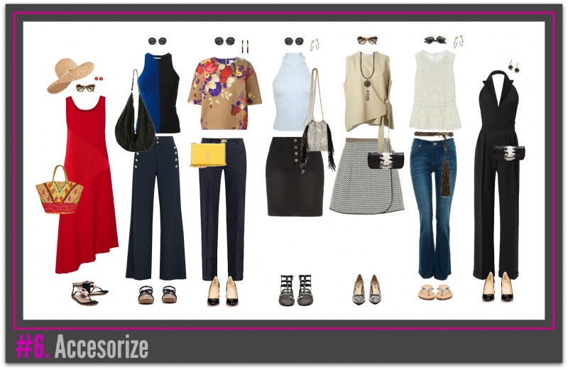
#6. Accessorize

Accessories are so much fun! This is the part where you can get playful with your look and experiment a little bit, all within the bounds of good taste of course. Accessories are also a great way to integrate current trends into your look, and it’s also the outfit element where you can insert more of your personality. Embellishments such as jewelry, scarves, and hand bags can add air of uniqueness to your look. Here are some things to consider when accessorizing your look:

To attract attention to your best area

Think about which areas of your body you want to highlight and consider accessorizing there. If you have an enviable waist, wear a statement belt. If you want to draw attention to your face consider wearing a statement necklace. You get the idea.

Complete the look

An outfit isn’t complete without accessories. Think about a basic white tee and jeans. Worn by itself, it seems so drab. But add a long gold necklace, a printed scarf, and/or some colorful bangles and your humble white tee and jeans combo is ready for a night on the town.

Add some fashion influence

Accessories are look-at-me pieces that instantly communicate your fashion sensibilities. Whether you’re a trendy or classic girl, your accessories will reflect what your style is to a T.

Pull all the items together into a cohesive outfit

Don’t just put together accessories randomly. You should also consider how the accessories relate to your base layer and the rest of your look. All items should look harmonious.

If you’d like more information on accessories, go to this link. 

Add Accessories1

#7. Count your points

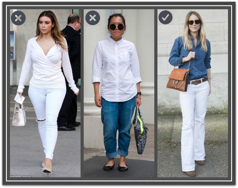
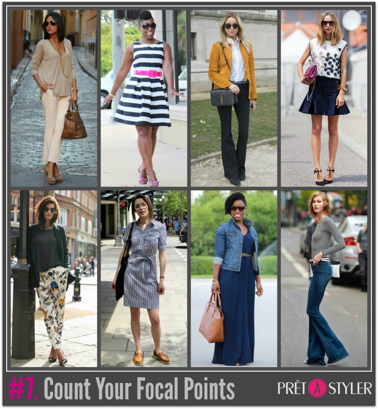
At this stage your outfit is complete the only thing left is to check your focal points to ensure your out fit is visually pleasing and figure flattering. In the following image, all 3 outfits consist of a pant and top. The first two appear lacklustre because each has only 2 focal points (top and pants). The 3rd has a belt that adds a much-needed 3rd focal point (top, pants and belt).

  • A focal point is anything that draws your eye to it.  

Aim for 3 to 4 focal points in one look. Less can be boring and more focal points may start to look too busy. All the outfits in the photo below meet this number. 

Bad GroupFocal Points

#8. Check yourself out

While it may be tempting to step out of the house unchecked, don’t do it. Some of your outfits may look better on the hanger or in your head than they do in reality. Always check your appearance in a full-length mirror before leaving the house. You can even take a mirror selfie while you’re at it. If you have doubts about something, trust your gut and remove it. 

log

#9. Log your outfit

It’s so easy to forget all the different outfits you can make. It is super helpful for your style journey to log your outfit to see how your looks change and progress, and to help keep track of looks or pieces that you like and don’t like. You can note down the items that make up each outfit while keeping a photo diary. Keeping an outfit logo is now made easier than ever with social media hashtag and apps that keep track of your #OOTDs (that means “outfit of the day”).

recordSource

Ann2015Blue

If you enjoyed this week’s feature
please like it on Facebook or Instagram
or leave a comment/question below.
Thank you.
Ann Reinten AICI CIP
Author

BannerGreyMatters

HOW TO FIND AND WEAR YOUR BEST GREY

By | Colour, Coordination, Wardrobe Savvy | No Comments

Is grey the new black?

Probably not but it should be here’s why…

Grey:

  • works for more personal colorings than black
  • is kinder to complexions when you are over 50
  • is more versatile than most other neutrals and lends versatility and timelessness to a wardrobe
  • is a color that easily transfers from the office to casual outings
  • pairs perfectly with all colors
  • can be worn all year round

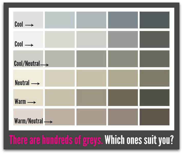
Not all greys are equal.

There are many greys in various temperatures, discovering your best grey is a great place to start.

Shades of grey1

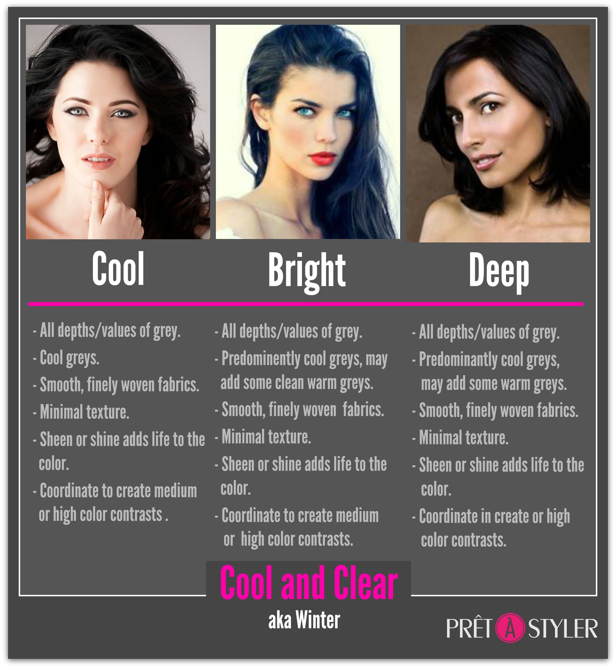
There’s a Grey for Every Coloring

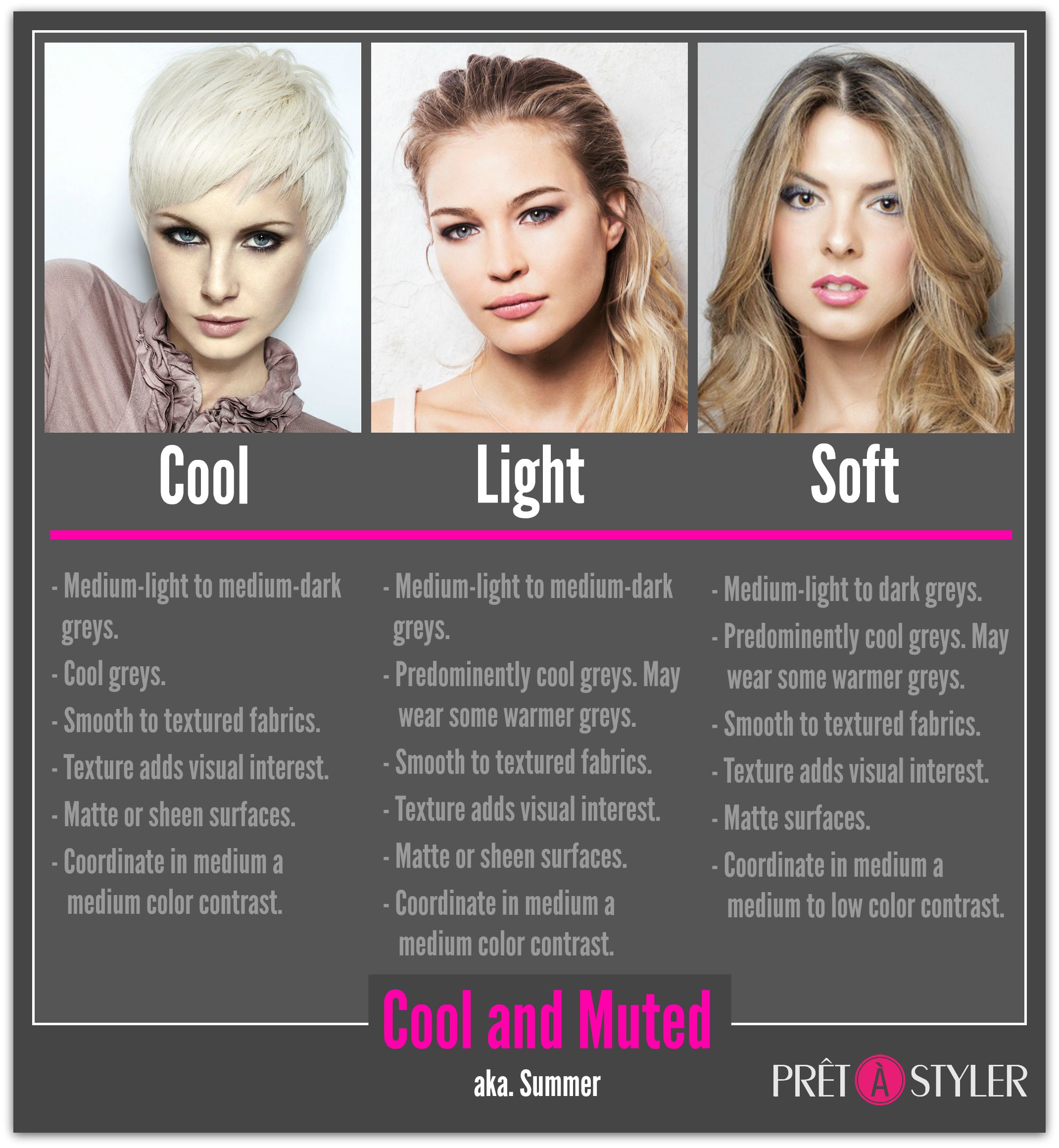
Grey_Cool and Clear

Grey_Cool and Muted

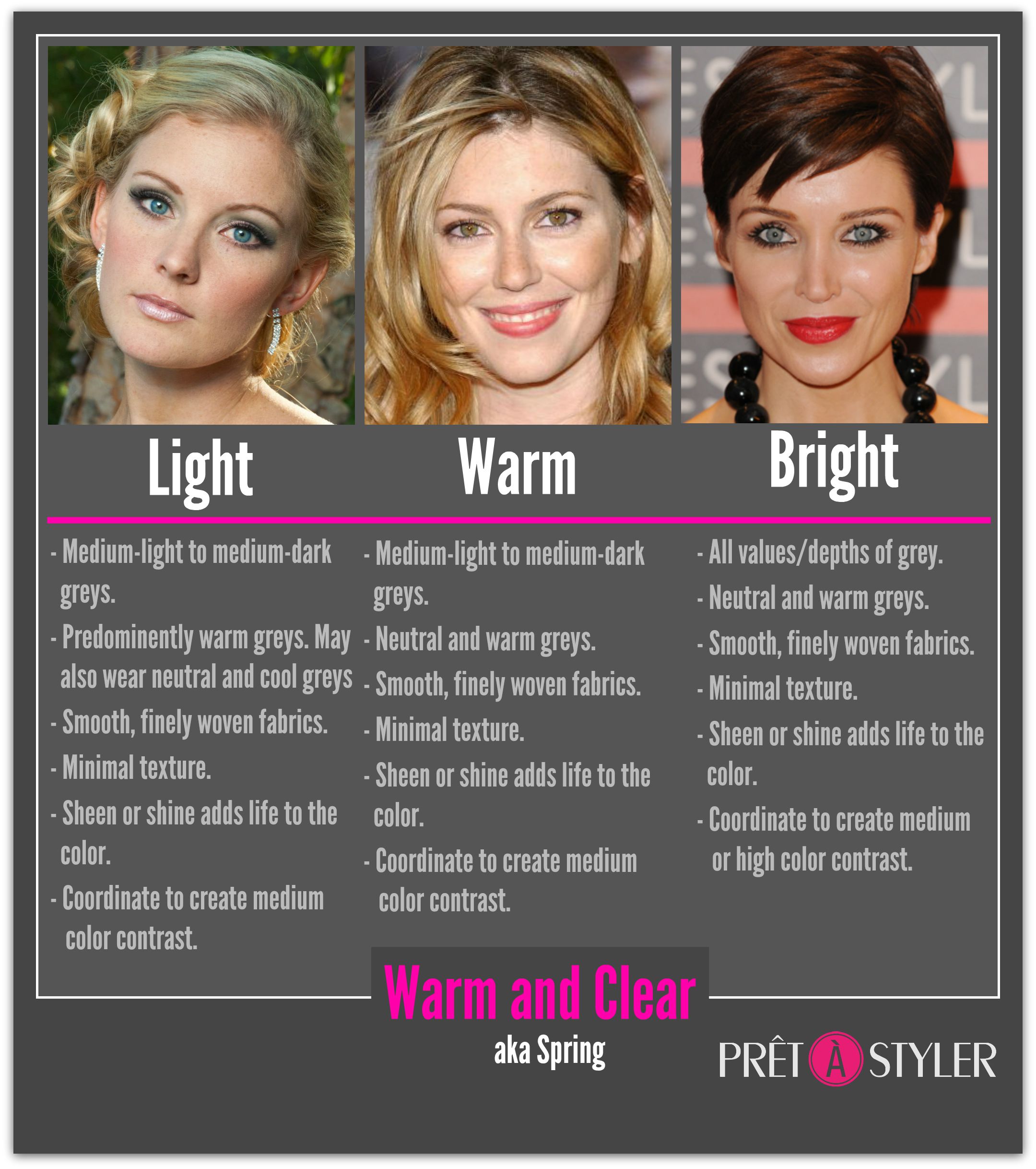
Grey_Warm and Clear

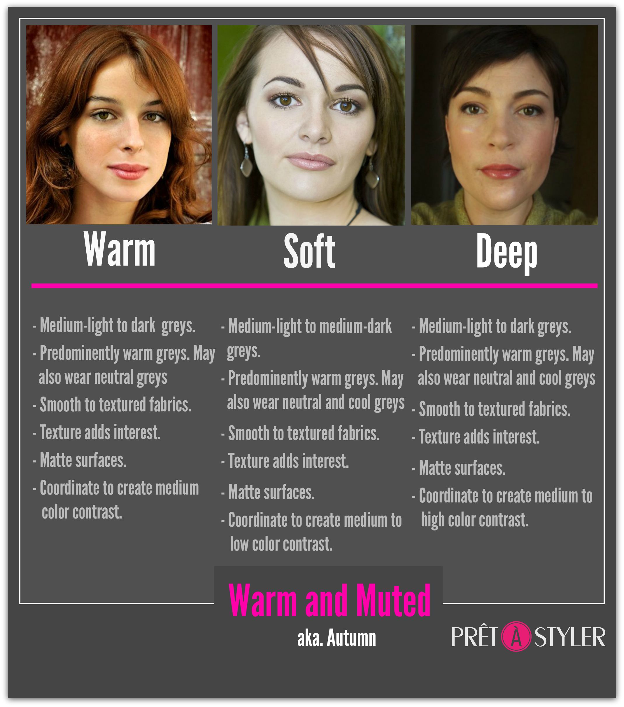
Grey_Warm and Muted

The Basics

  • Stick to one temperature of grey. Mixing different temperatures of grey can be tricky.
  • Wear darker greys around the problem areas in our body, and lighter colors around the areas you want to highlight.
  • Choose fabrics and silhouettes that reflect the current season.

Seasonal shapes and fabrication

Source: Image 1, Image 2, Image 3, Image 4

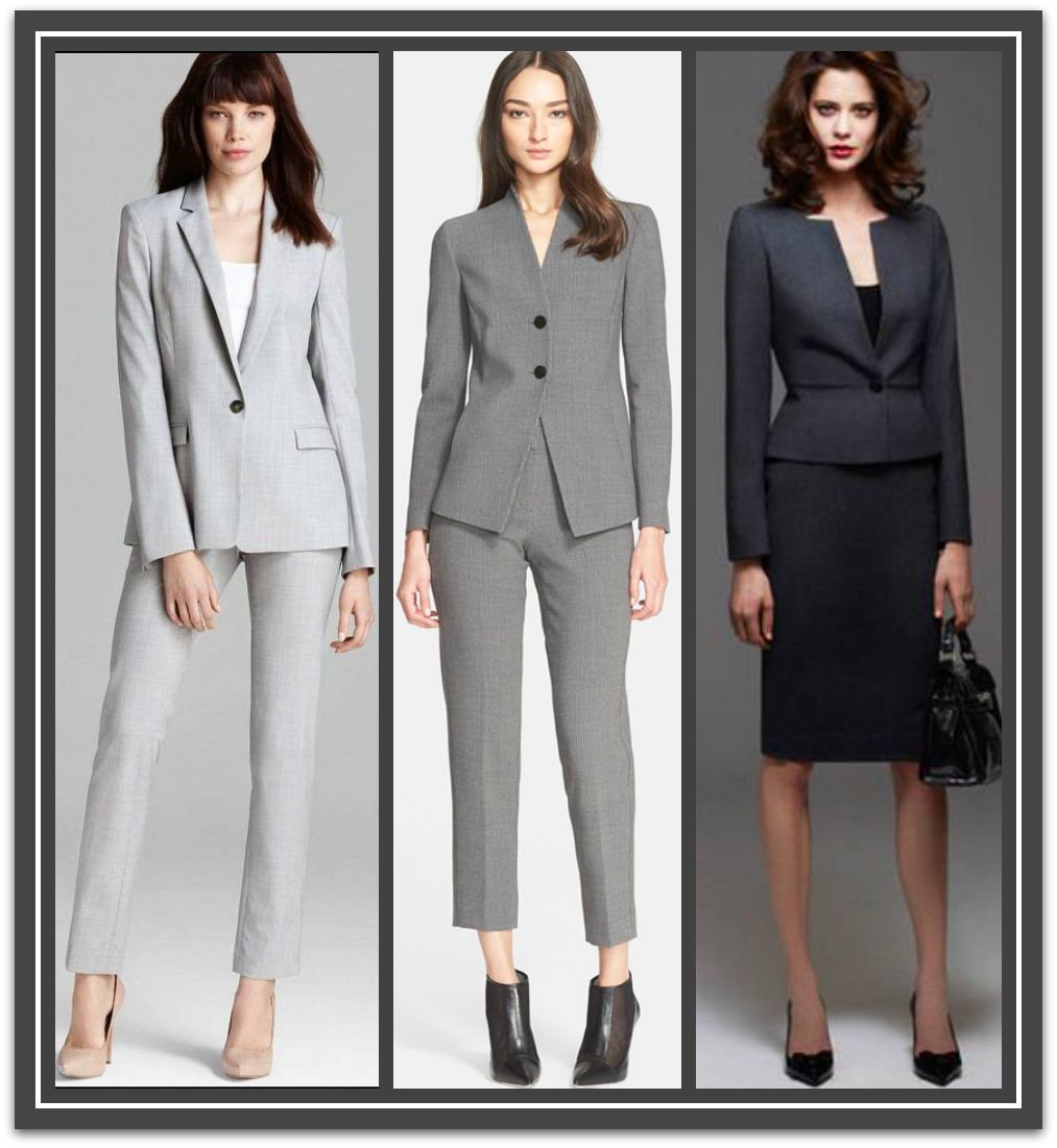
  • Lighter shades are perceived as more casual than dark shades. To raise your authority wear medium to dark greys

Vales of grey

Source

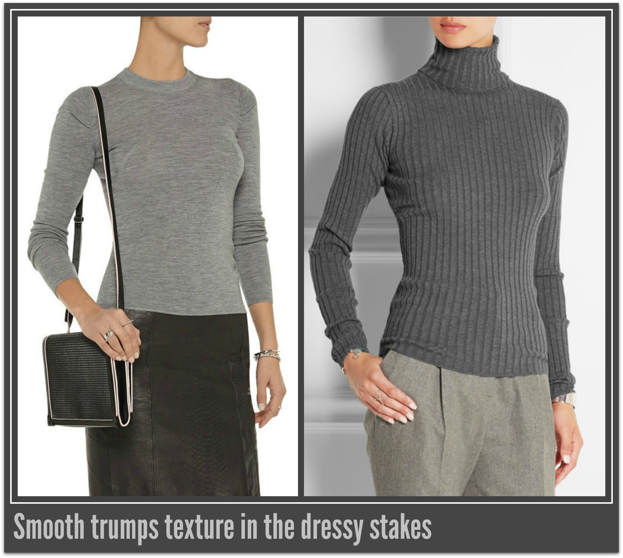
  • Greys in fine, smooth fabrics are dressier than those that are textured. Use this to tip to increase the formality of light grey. Structured shapes will also add to the formality/authority.

TexturevSmooth

Source

  • Grey marle has its origin in sport, making it the most casual version of grey and best left for non-business/casual occasions.

Marle

Source: Image 1, Image 2

Monochromatic Outfits

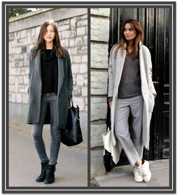
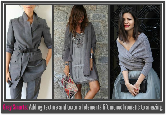
All grey outfits have the potential to look boring, to prevent this coordinate grey outfits garments in different depths of grey. This will unify you look and showcase your color knowhow. Max out at three depths, one light, one medium and one dark.

Grey Levels

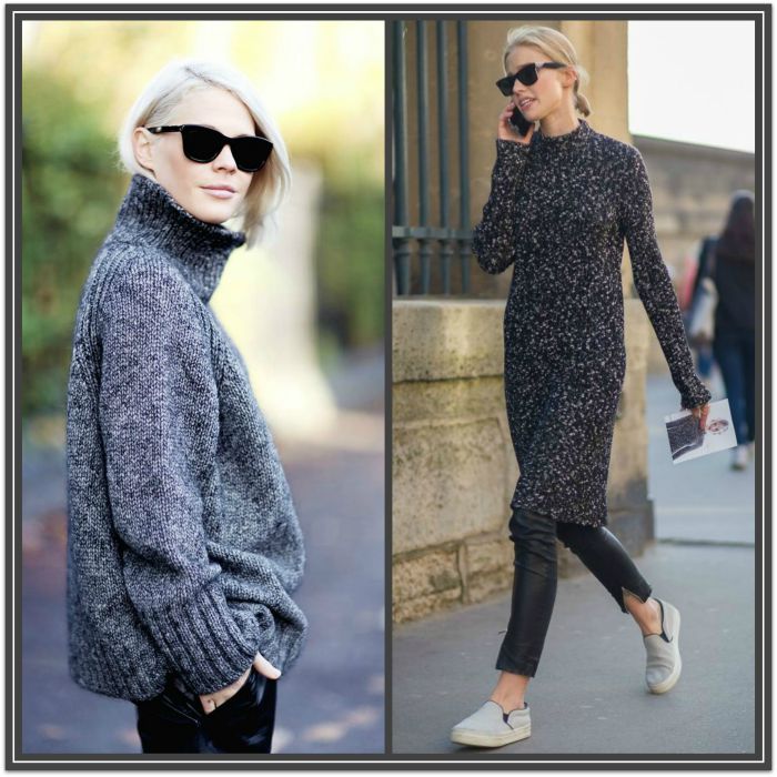
Add texture or textural elements to create visual interest e.g, tweed, mohair, pleating, draping, print, fur etc.

Textural elements

Source: Image 1, Image 2, Image 3

Mixed Color Outfits

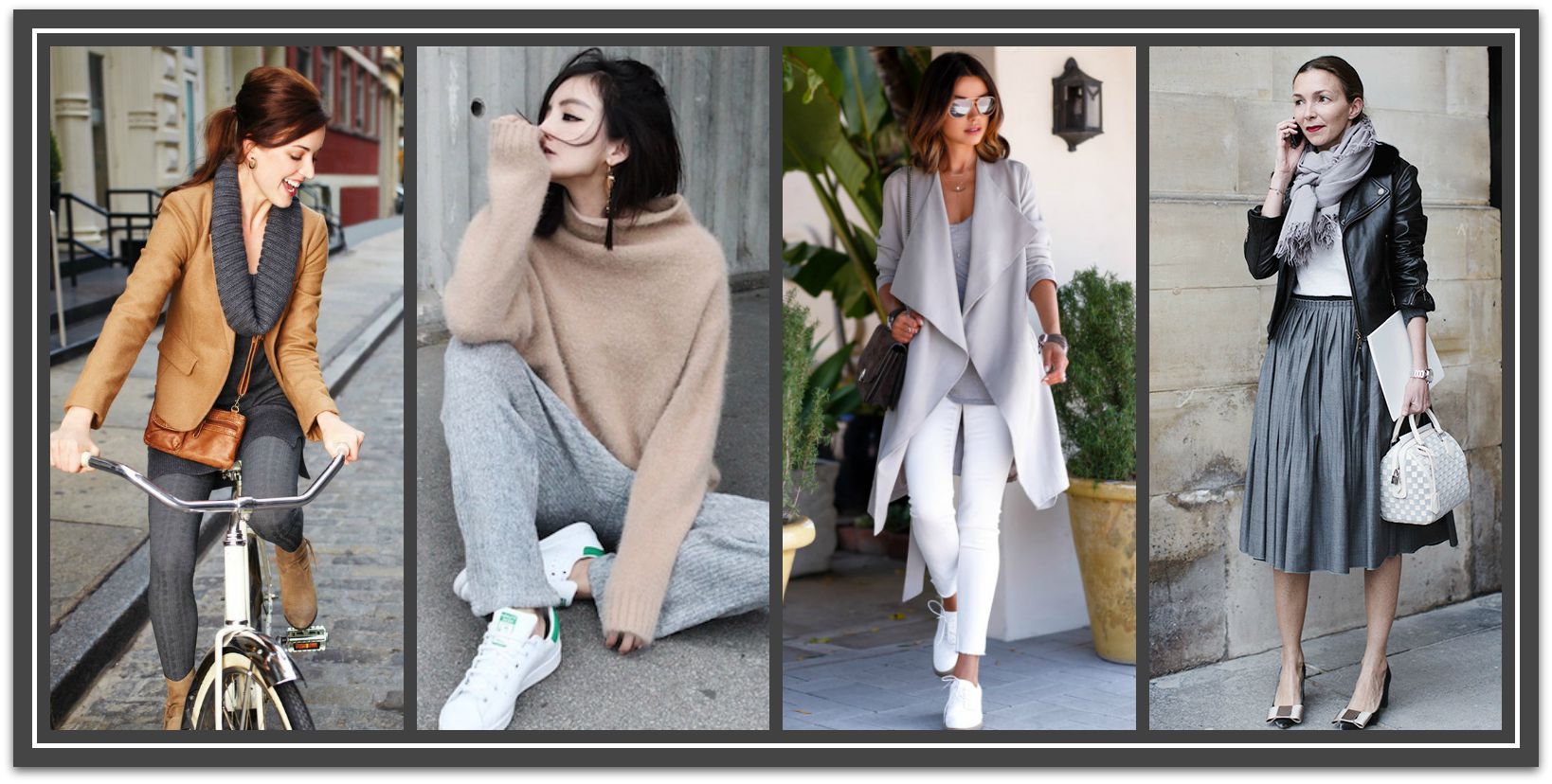
Mix with other neutrals

This creates a minimalist and modern aesthetic. Black, camel and white all play very well with gray, and give you a hundred chic points for looking sleek and effortless. Overlaying a black garment with a grey item can soft black’s sometimes harsh effect.

grey and neutrals

Source: Image 1, Image 2, Image 3, Image 4

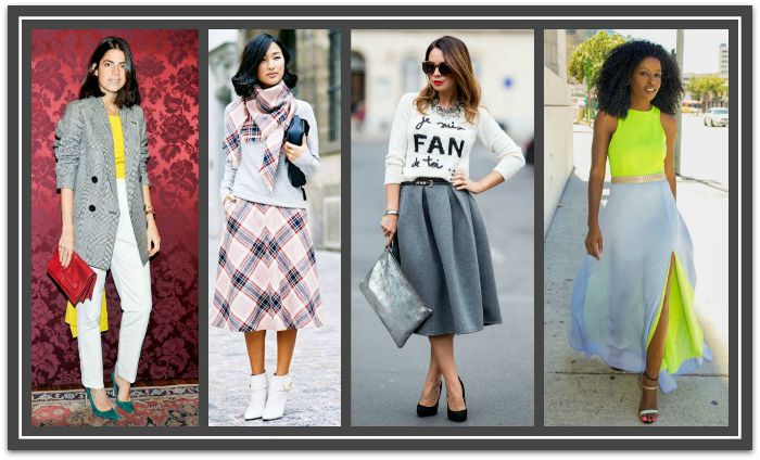
Pop a Color

From a subtle peek of bright color, to an elegant matching pink lip and heels combo, or even a shocking red maxi skirt, grey is the perfect color to serve as a canvas for a splash of strong color.

grey+Color

Source: Image 1, Image 2, Image 3, Image 4

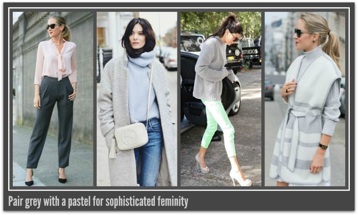
Pastel Paring

Pastels always turn heads when juxtaposed with tones of grey. The mix is elegant and feminine but don’t limit yourself to wearing it in the spring, these light colors are just as appropriate in fall/winter too.

Pastle pairings

Source: Image 1, Image 2, Image 3, Image 4

Turn Down the Volume

Greys are great for toning down a loud all-over print, impactful graphic or bold colored outfit.

Create Subtley

Source: Image 1, Image 2, Image 3, Image 4

Want More? He’s an interesting piece on the psychology of wearing grey.

So now that you know a little more about how to wear grey to look amazing will you be giving it ago?

I’d love to see you wearing grey outfits – why not post your photos on our Facebook page.  Add #MeInGrey

how to wear floral prints

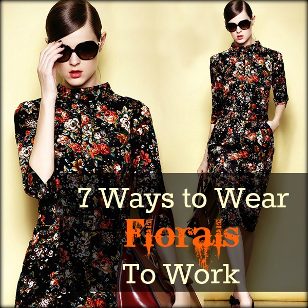
HOW TO WEAR FLORAL PRINTS TO WORK

By | Coordination, How To..., Work Style | 6 Comments


Have you thought of wearing florals to work then backed off because you feared they may look too girly or unprofessional? 


 Florals like all prints and patterns have a set of characteristics subliminally linked to them that when worn transfers to the wearer. Floral prints are normally linked with femininity, passiveness, frivolity and non-serious endeavors and as a result have often been avoided for business wear – especially for more serious professions such as finance and law.

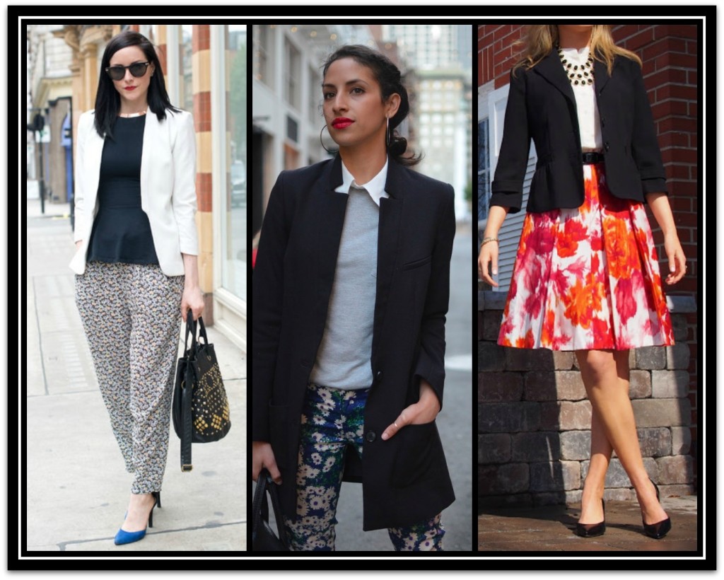
However, contrary to conventional wisdom, you can wear floral prints in a business casual environment and not suffer the stereotypical afflictions or sacrifice your take-charge image at work. The secret lies with selecting the right floral prints and/or implementing some smart styling.

There are three potential outcomes to avoid when wearing floral prints to work.

These are looking:

  • Too feminine: the outfit is overall too pretty or too light colored.
    If you desire is to be seen as serious business or professional woman use the power of color psychology and stereotypes to get your intent across. Dark colors are perceived as more powerful than light colors and curved shapes and floral designs take a backseat to diagonal, horizontal and vertical lines. Also keep avoid adding other girly elements when wearing florals i.e, ruffles, bows. frills and lace etc  
  • Too overwhelming or distracting: the outfit is all floral, the print is too large or too colorful.
    The larger and/or more colorful the floral the less seriously you risk being taken.  Traditionally the patterns worn for business by men have been dark and small and this has leaked over into the world of women’s professional wear. With the acceptance of business casual wear these boundaries have been expanded but stray to far and you do run the risk of being seen as a lightweight.
  • Too informal: not enough skin is covered or there is insufficient tailoring / structure to the garment.
    In the workplace, the less skin exposed, the more seriously you will be taken. A female exposing an excess of skin runs the risk of being seen as using her sexuality to gain an advantage.
    If you wear florals and an unstructured garment you’ve immediately altered the tone of your look to casual and feminine. 

The following tips will assist in overcoming these issues.

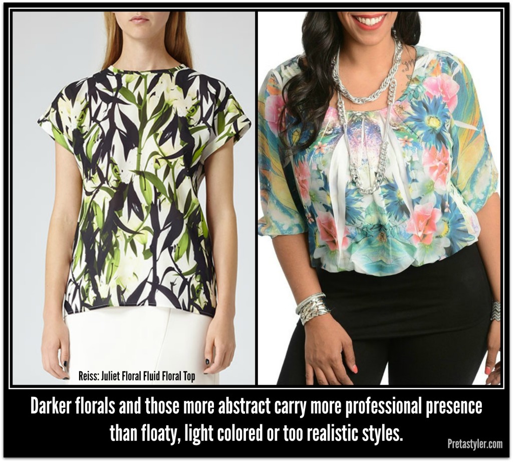
Forgo Realism for Stylistic or Abstract Prints

Too feminine will definitely be the result if the print is too realistic looking (especially if in a watercolor print). Instead opt for an abstract, stylistic, graphic or digital style. The angularity and modernity of these type of floral prints will give your overall look an impression of progressiveness and creativity – think edgy instead of girly.  You may even want to consider pop art/mod prints since the 60′s are such a hot trendy decade at the moment. 

Look for floral prints with angles to give extra edge to the print.  

Graphic prints

 Source: Image 1, Image 2,  Image 3.

AbstractversesRealistic

Like the Reiss top?  Check PretaStyler to see if it suits you. Place Reiss in the search box.  Price $170

Embrace The Dark Side

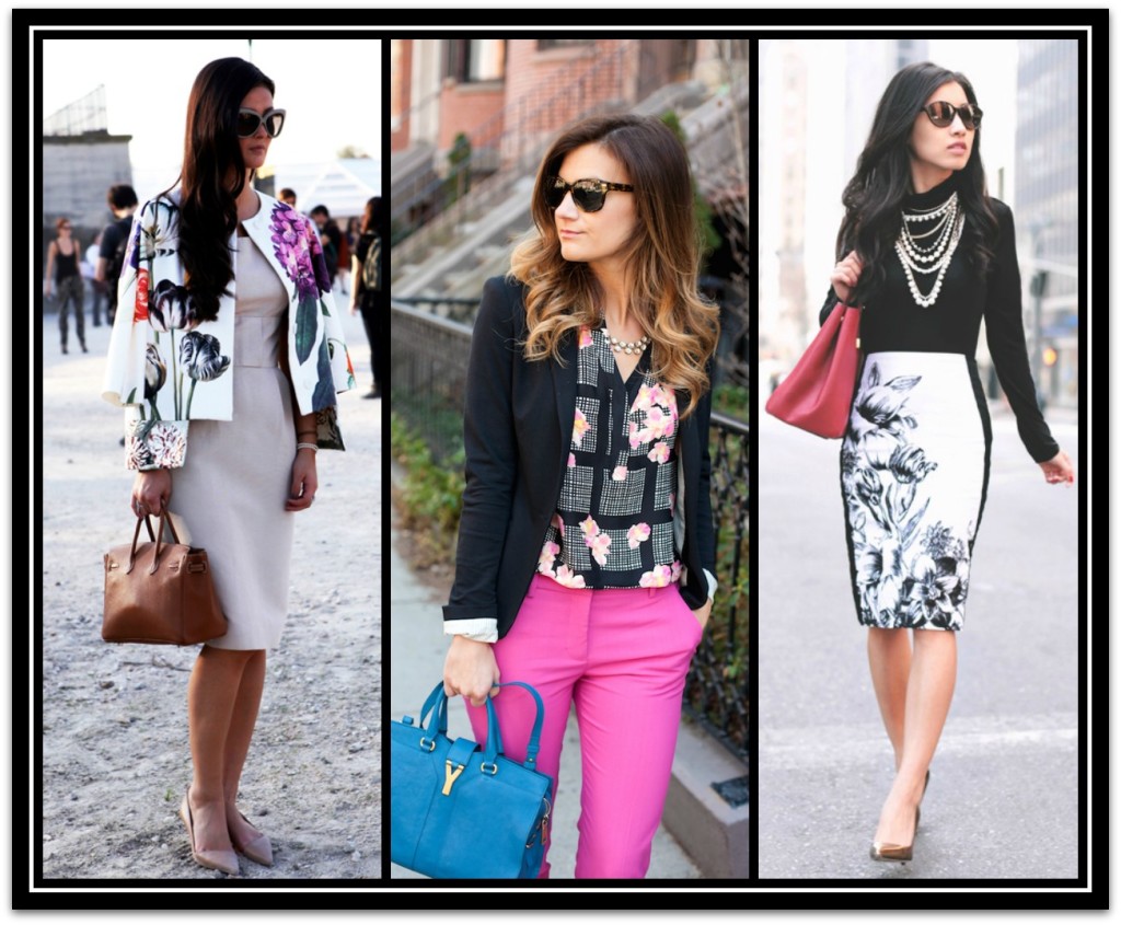
Dark colors are seen as more serious than light colors. As a result floral prints set against a dark background have more gravitas than those on a light background.

Dark florals are especially suitable for the colder months. For maximum impact and visual presence, wear your dark florals with moody colors like plum, burgundy and midnight blue as accents.

Dark Backgrounds

Source: Image 1, Image 2, Image 4 (PretaStyer)

Go Minimal

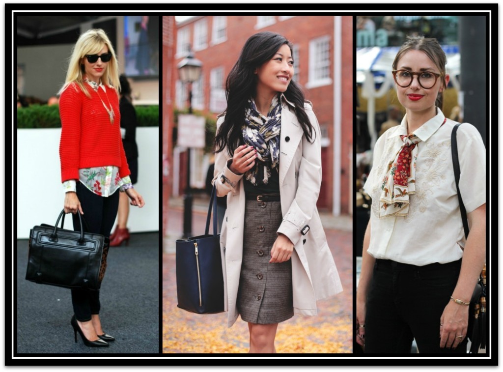
Adding a dash of floral to your work ensemble will endow it an unmistakable feminine edge and can be just the thing to soften an otherwise severe look. You can use anything from a peep of floral emerging from a sweater, to a scarf or maybe even your handbag. A floral top is one of the easiest items to pull off as part of a professional outfit. You can pair it a blazer, vest or cardigan.

Minimal

Source: Image 1, Image 2, Image 3

Opt For The No Fail Floral Combo

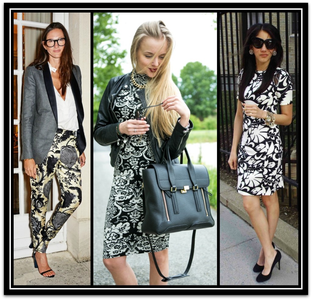
Black and white is a color pairing that you cannot really go wrong with. You can trust this classic combo to hold you in good stead at the workplace, most especially when you select a floral print done in black and white.  A floral print in monochrome will definitely be just as commanding as your standard pinstripe for the office. Being done in black and white, the femininity of the floral is toned down a bit and its inherent design sensibility and modern look is played up even further. 

Black and WhiteSource: Image 1, Image 2, Image 3.

Blush on a Solid Canvas

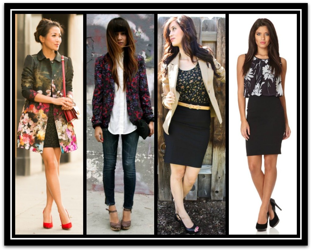
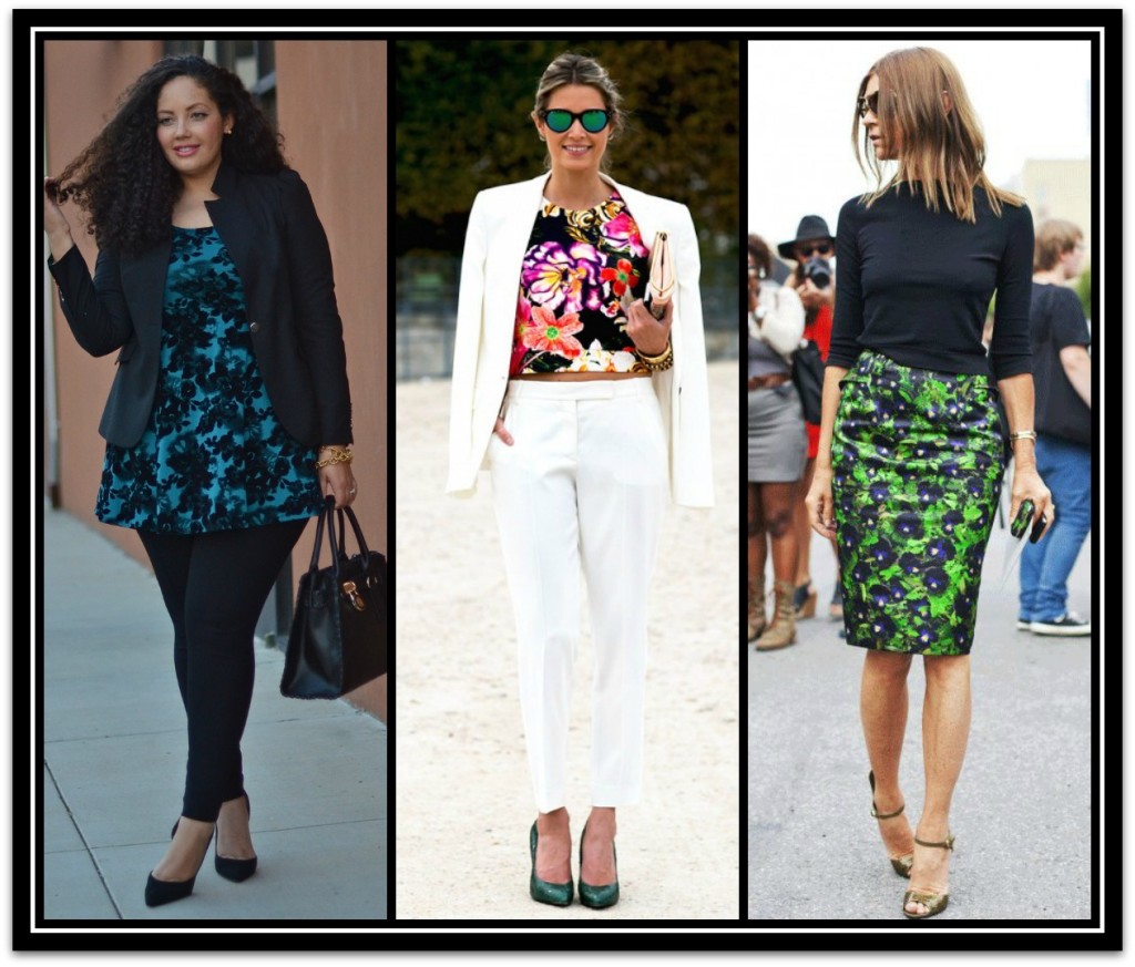
Work is not the time to experiment with fashion or show your creative side. Wear one floral item at a time and anchor it with a strong, solid color. Tradition business colors of charcoal, black, white and navy are always a great choice and will provide a stark contrast to the floral. An added bonus to this is that the floral print pops even more against a solid canvas of color. For the summer, all white is your route to looking both fresh and polished at the same time. A white pant-suit is the ideal setting in which to showcase your floral print of the day. 
A Solid Base

Source: Image 1, Image 2, Image 3.

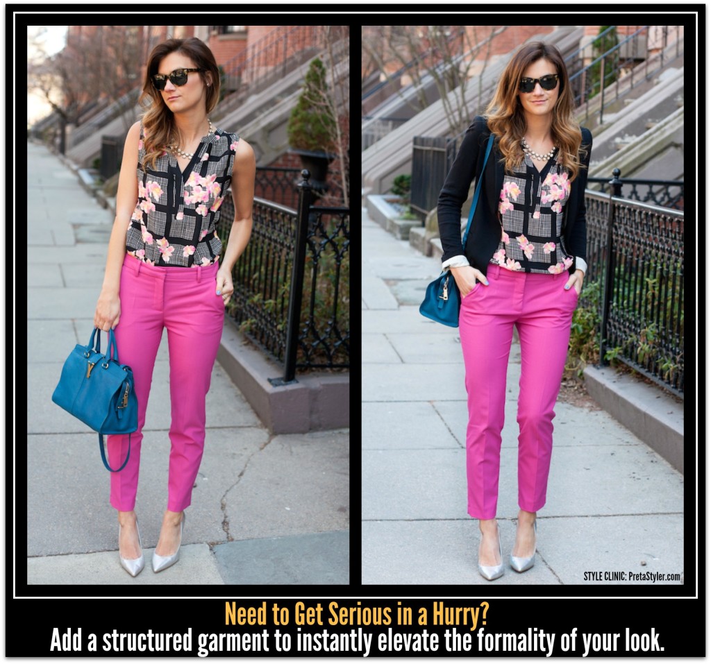
Add a Structured Topper

When in doubt, opt for a statement topper with a lot of structure. This is a no-fail way to dress up anything including floral prints. Whether it’s a cropped boxy jacket with strong shoulders or heather gray cape, the hardness of the form and silhouette of outerwear balances the softness of floral print impeccably.

Get SeriousSource 

Statement TopperSource: Image 1, Image 2, Image 3

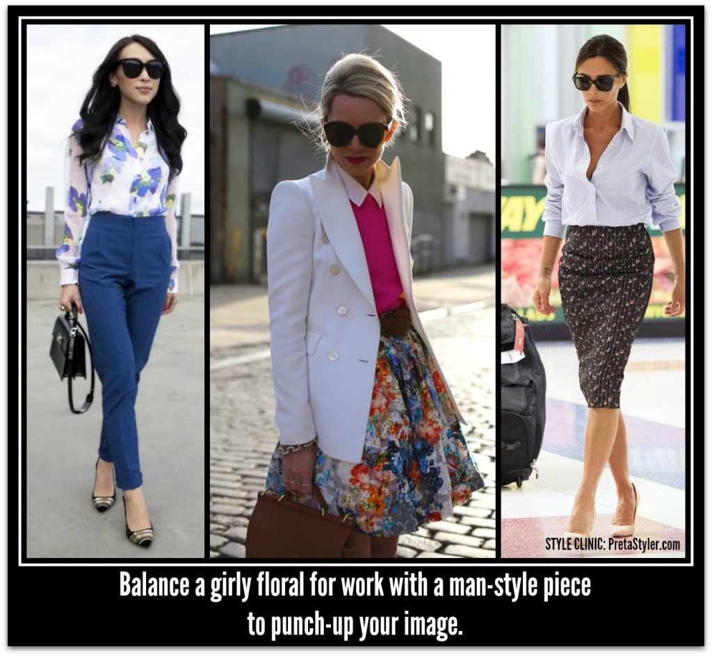
Pair with ‘Man-Style’ Pieces

Pull your florals into line by pairing them with man-style pieces. A tailored dress shirt, jacket or pants will instantly elevate your look and have you set to take on the day.

Also pay close attention to how your clothes fit; you may even want to consider having your pants and blazers altered to fit your body. That being said, you can pretty much get away with wearing any type of floral print (within reason, of course) if you wear it layered under an excellently tailored ensemble. 

Manstyle PiecesSource: Image 1, Image 2, Image 3

Think Conservative, Think Polished

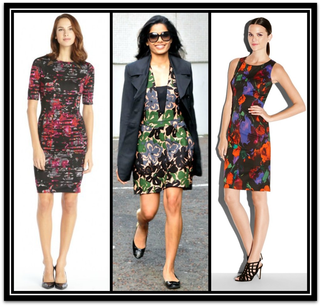
Floral dresses in the workplace call for a sleek and conservative silhouette that is paired with a dark modern floral print. You can both tone down a bright floral dress and give some edge to a dull print solid colored, neutral jacket or blazer.  Keep lengths appropriate and accessories understated.

Floral Dresses

style tips and tricks

RESTYLE IT: style tips for when your outfit isn’t working

By | Coordination, Figure Flattery, How To..., Wardrobe Savvy | One Comment

We’ve all been there; standing in front of a mirror staring at out reflection and wondering what the heck is wrong with this outfit. In frustration you either say ‘stuff it’ and carry-on with your day or go back to an outfit you know works.

When I train image consultant one of the first makeover techniques I teach is to look carefully at the person and the outfit to work out what it is exactly, that appears to be the problem. Is it the fit, the length, the color, style, coordination or something else? Only when you can recognize the problem can you fix it.

In reality all it takes to make most outfits work is a few key styling elements.

Is it the style?

Not everything is going to suit your shape. Unlike men, women can be a million unique shapes and the first rule is ‘know thyself’. It will save you money, time and frustration – knowledge is power.

Solution: Either invest in a personal image consultation or an online program such as My Private Stylist. It is only then will you gain the knowledge needed to shop quickly, effectively and with success.

Another aspect to style is ‘personality’. An outfit can suit all your physical characteristic and look fabulous to everyone else but if it is not in harmony with your personal style then it can look and feel all wrong to you.

Solution: Take the time to Personal Style Expression Quiz. When you can identify the styles are perfect for your personality your mind’s eye will be forever on high alert and you’ll notice more of styles when you are shopping.

Is it the shape?

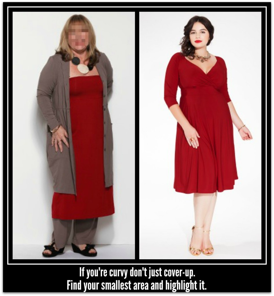
Do you have a curvy shape? If you do, you’ll look best in garments and outfits that reveal some shape; this is most evident with dresses. Find the smallest area of your torso and highlight it. Shapes dresses can sometimes work if they are soft and flowing but will seldom be as flattering as dresses that are curvy.

Solution: if you are an hourglass, triangle or inverted-triangle body shape, look for ways you can add shape using a belt, cinched sweater or trying a knot in the dress. Alternatively, your local alteration service may be able to create shape by inserting darts or taking in the side seams.

h

Is it the fit?

If a garment does not fit you, the results are always bound to disappoint. Too tight and too loose are equally problematic.  

Solution: if the item is too tight and there is sufficient seam allowance to let it out then by all means do so if you absolutely love the garment and it is one that suits your shape. Otherwise donate it to charity.  If it too loose investigate ways to give it shape (see above point) or have it altered.  

Does it reveal lumps and bumps?

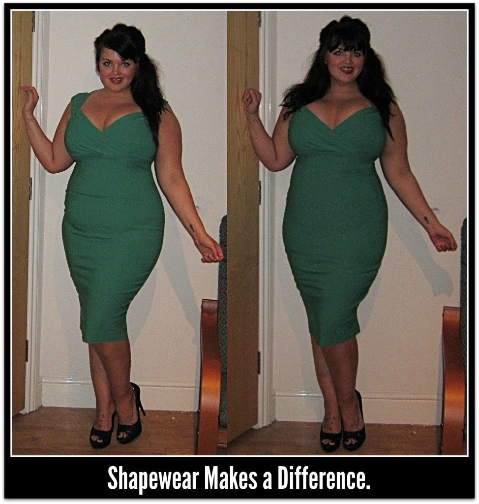
The truth is, many women (me included) do not have a firm torso or thighs.  It can happen from a lack of exercise, after childbirth or the ageing process. When this occurs the lack of firmness will reveal itself through the garment, especially if they are too tight/small.  

Solution: Shapewear.  With the exception of the too small garment, shapewear will be your panacea.  Today they can be found varieties for a multitude of garments and in ultra-comfortable fabrics.  From camisoles to leggings and full body suits you can tame the bulges and wobbles in minutes.  Important: ensure you purchase the correct size for the best look and comfort.

2

Photo Credit

Is it the vertical proportions?

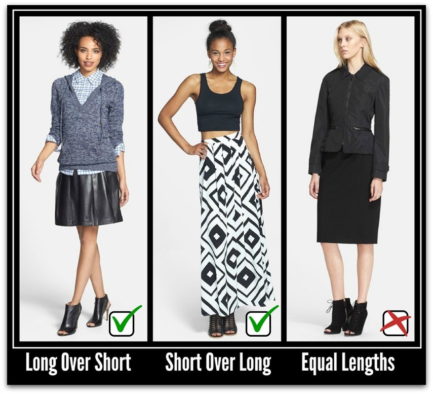
This is the first of the secrets that stylists and image consultants know that I’m sharing today.  Vertical proportion is one of those element that if you don’t know about it you will not see it.  Outfits are most visually appealing when they are comprised of unequal lengths i.e. long over short or short over long.  Outfits comprised of equal lengths can appear unfinished or boring.  

Solution: If this is the problem study your outfit to work out how you can create uneven proportions.  It may be through the addition of another garment, accessory or changing the way you are wearing the garments i.e., wearing the top untucked instead of tucked in.

3

Is it the horizontal proportions?

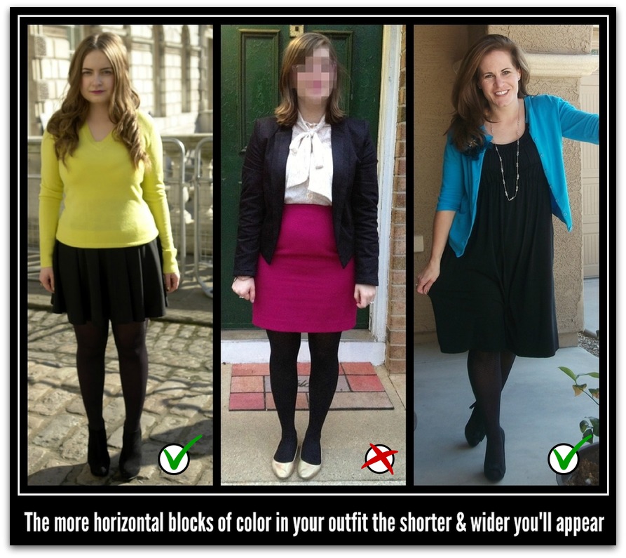
This can be the issue if you feel fat in the outfit and the culprit is usually color blocking.  The more you cut your body up in horizontal blocks of color the shorter and wider you will appear.

Solution: the fewer blocks of color in your outfit the better – 2 is usually enough. Keep the darker colors to the areas you are largest. 

colorblocking

Is it the coordination?

Maybe your outfit is lacking visual appeal through a lack of appealing coordination.  This is often the cause when you feel the outfit needs ‘something’ but have no idea what.  In most cases it will be when you are wearing two solid colored items.

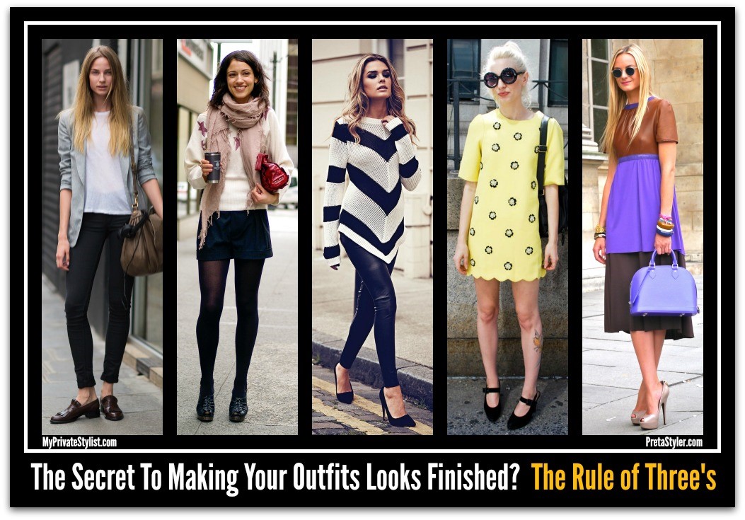
Solution: there is a styling rule called the Rule of Three’s where an outfit looks complete when it comprises of 3 visual elements.

This can be

  • Three garments i.e, jean, top and sweater/jacket/waistcoat etc.
  • Two garments (different colors or distinct shades of same color) and one accessory i.e., scarf, pendant necklace or belt. Note: the accessory must be on the outfit (bag, shoes, small necklaces, earrings and hats don’t count).
  • Two garments where one is patterned, has a motif, has sheen/shine or noticeably textured.
  • One garment where it has two different embellishments.

5

Is it the color?

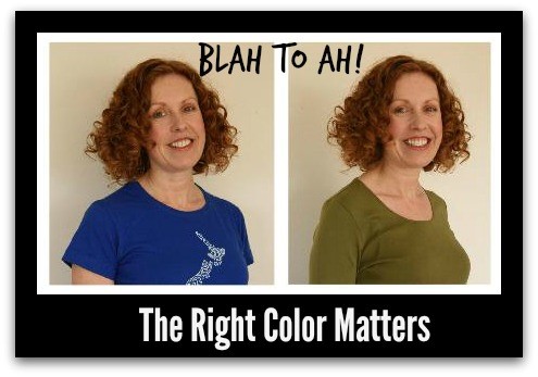
The cutest outfit in the world which doesn’t suit your personal coloring won’t do you any favors. Successful style means wearing garments in appropriate colors for your skin tone/hair color. These colors must also contrast appropriately with one another to enhance your coloring and size.

Solution: Get a color consultation to find out your colors (Winter, Spring, Summer, Autumn; Clear & Cool, Warm & Muted, etc.)! You will also learn about contrast levels and how to make them work for you a well as lots of other fashion style tips.

6

Photo credit: Jane Liddelow - Style Makeover HQ

Does it work for your age?

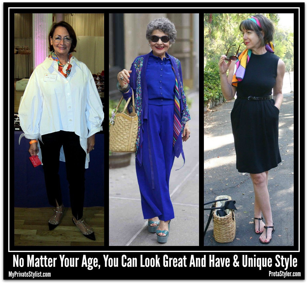
This has to be one of the most frequently asked questions I’ve had from clients over 40. Just because you can fit into the item does not mean you should wear it.

I’m all for looking youthful but there is a threshold. My best advice is your outfit should match your perceived age as gauged by your face, not just your body.  The main danger is revealing too much main via the hemline length and the depth of necklines, followed by bare upper arms and over fitted garments.

As we age, simplicity and elegance is a good direction to follow. This by no way means you need to lose your creativity or individuality.  You may not be able to wear all the latest fashions but you can add trend accessories, colors and influences into your wardrobe.

Solution: if you are concerned the hemline is too short or the neckline too low; you’re probably right. Sometimes it’s easy to add a top underneath but harder to add length.  One way to hide the short hemline is to add opaque hosiery; you’ll be amazed at how much this will help.

Adding a sweater, jacket or wrap is the easiest way to camouflage aged, thin or heavy upper arms. 

i

Is it too much or not enough?

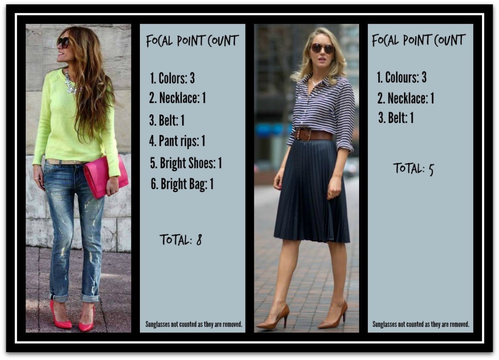
Focal points are areas within the outfit that attract your attention.  Placed in the wrong place and they can highlight an area you’d prefer to hide. Too many and your outfit will look too busy, too few and the outfit is bland.

A pleasing outfit has no more than 3 focal points and since they will attract attention they should be located on the parts of your body you think your best.

Solution: ensure you focal points are placed over areas of your body you’re happy for others to see.  When at work, focal points are best kept above your bustline.

To avoid too many or too few count up the focal points within your total appearance. Pull back and remove items when the number is over 5 for work and 8 for non-work outfits.  Add a few when the number is 2 or less.

Here’s the list – add 1 point or more, as directed:

  • Each color in your outfit (shades of one color, count as 1 point),
  • Colored or patterned hosiery (excluding black and neutral),
  • Shoes if a color other than a neutral. Add a point if embellished,
  • Belts if in a non neutral color, large or embellished, 
  • Boots if a color other than neutral.  Add a point for over the knee or embellished,
  • Earrings which are large or bright,    
  • Necklaces, 2 points if they are large, bright or exotic,    
  • Hats, head-wear and hair accessories,
  • Handbag (excluding neutral colors).  Add extra point if it is oversize,
  • Coloured nails if very bright +1, very long +1,
  • Contrasting buttons, trims, buttons, belt buckles. 2 points if the item is large or very bright,
  • Scarves, bows, ruffles, monograms or any other eye catching embellishment not yet mentioned,
  • Red or unusual coloured or styled hair.

j