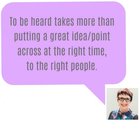
We take so many things in our world for granted. Take colour for instance, have you ever stopped to consider the impact it has on your world and in your life?
Far beyond making what you wear appear more interesting colour can:
- make us appear younger or older,
- larger or smaller,
- healthy or ill,
- smarter or dull-witted
- it can sway the thinking of others,
- change moods
- cause actions and reactions.
That’s pretty amazing when you stop to consider it and a natural tool we can harness to look better and get more out of our social connections.
In today’s feature, I’m going to cover some of the most impactful elements of colour in relation to the clothes we wear and the makeup we apply.
First off, there are a few important things to know when understanding the relationship between you and your best colours.
- The more qualities a colour has that match the qualities of your skin, the more flattering the colour will be.
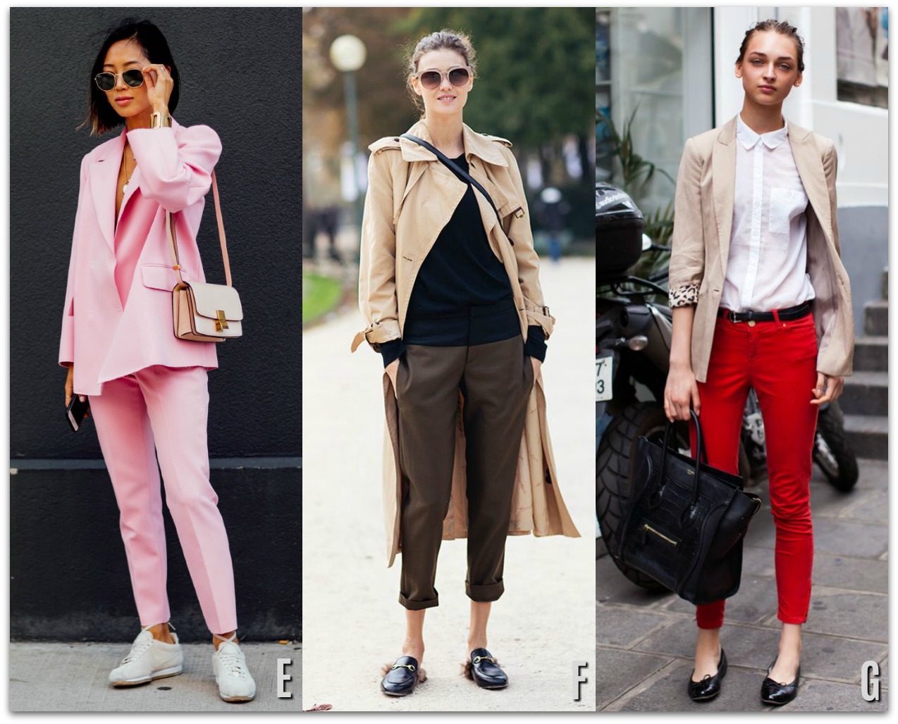
- The colours you wear above your waist mater most when it comes to making your skin, hair and eyes look best. Colours worn below the waist need only be considered has to how they will alter the perception of size.
- You can wear almost any colour if you know how to bend the rules in your favour.
A colour analysis through a trained professional is the only reliable way of discovering your best colours.
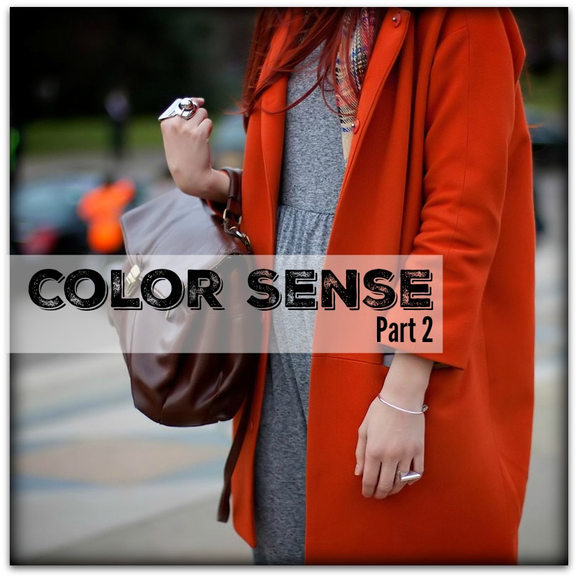
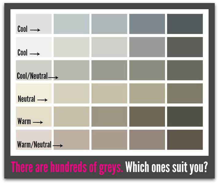
Relative Temperature
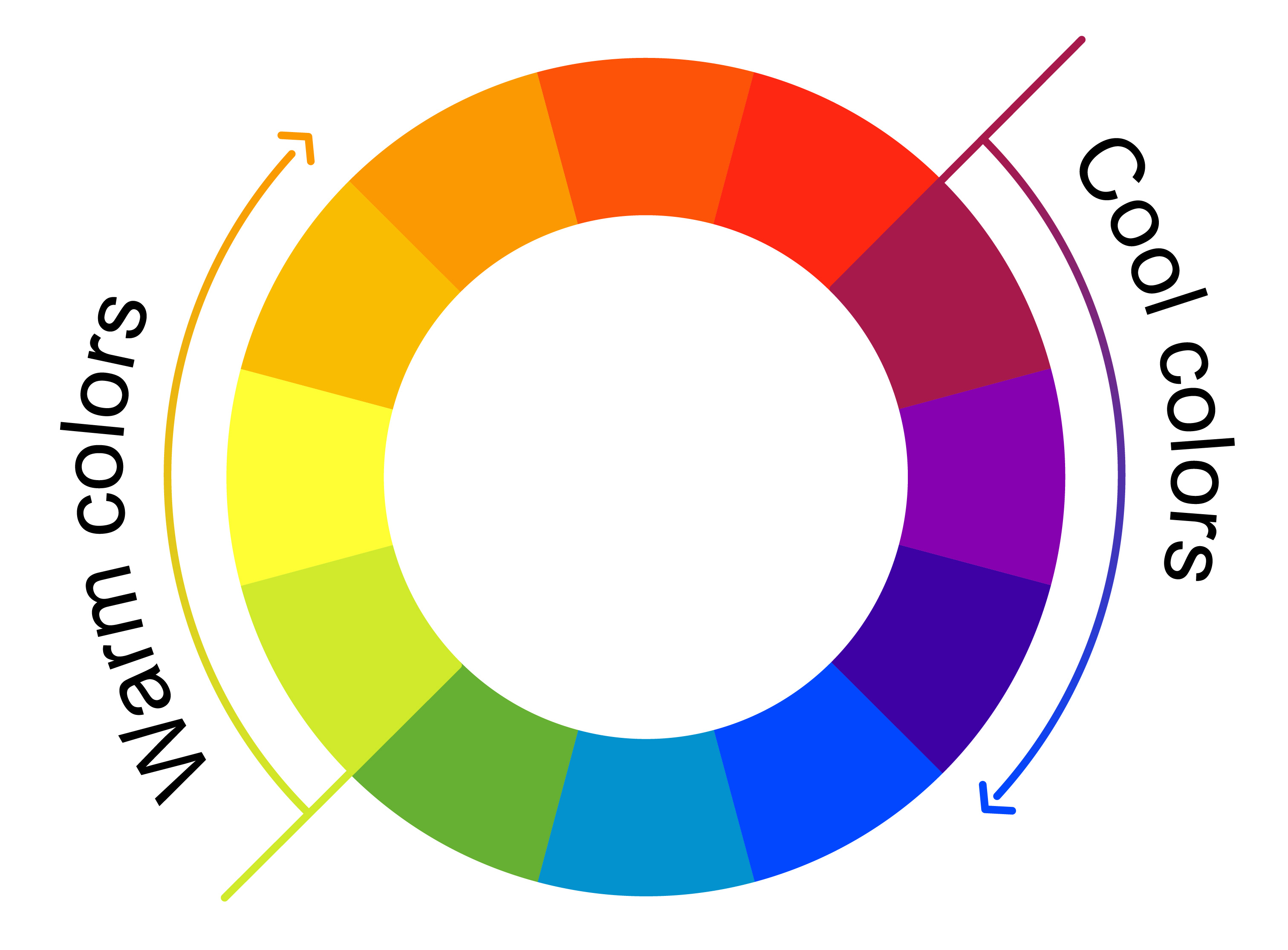
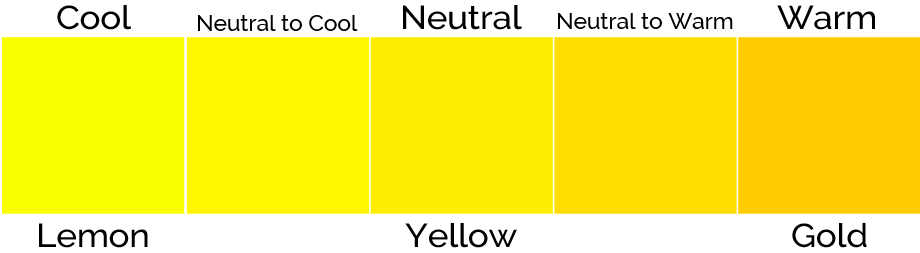
The basic colour wheel can be divided into cool and warm segments with the cool colours containing more blue/violet undertones and the warm containing more yellow/orange. However, as colours from either side of colour get added the perception can change i.e. a cool colour can appear warmer and vice versa.
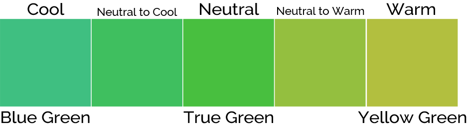
Green and yellow are great examples.
With green (the colour with the largest gamut) you can easily see how the hue can move from cool to neutral to warm as it has more blue or yellow added to it.
Yellow, a colour with the second smallest gamut and considered warm becomes cooler as green is added and even warmer when orange is added.
Colour analysis is based on Relative Temperature (how warm or cool colour is as it is influenced by warm or cool colours that sit either side of it).
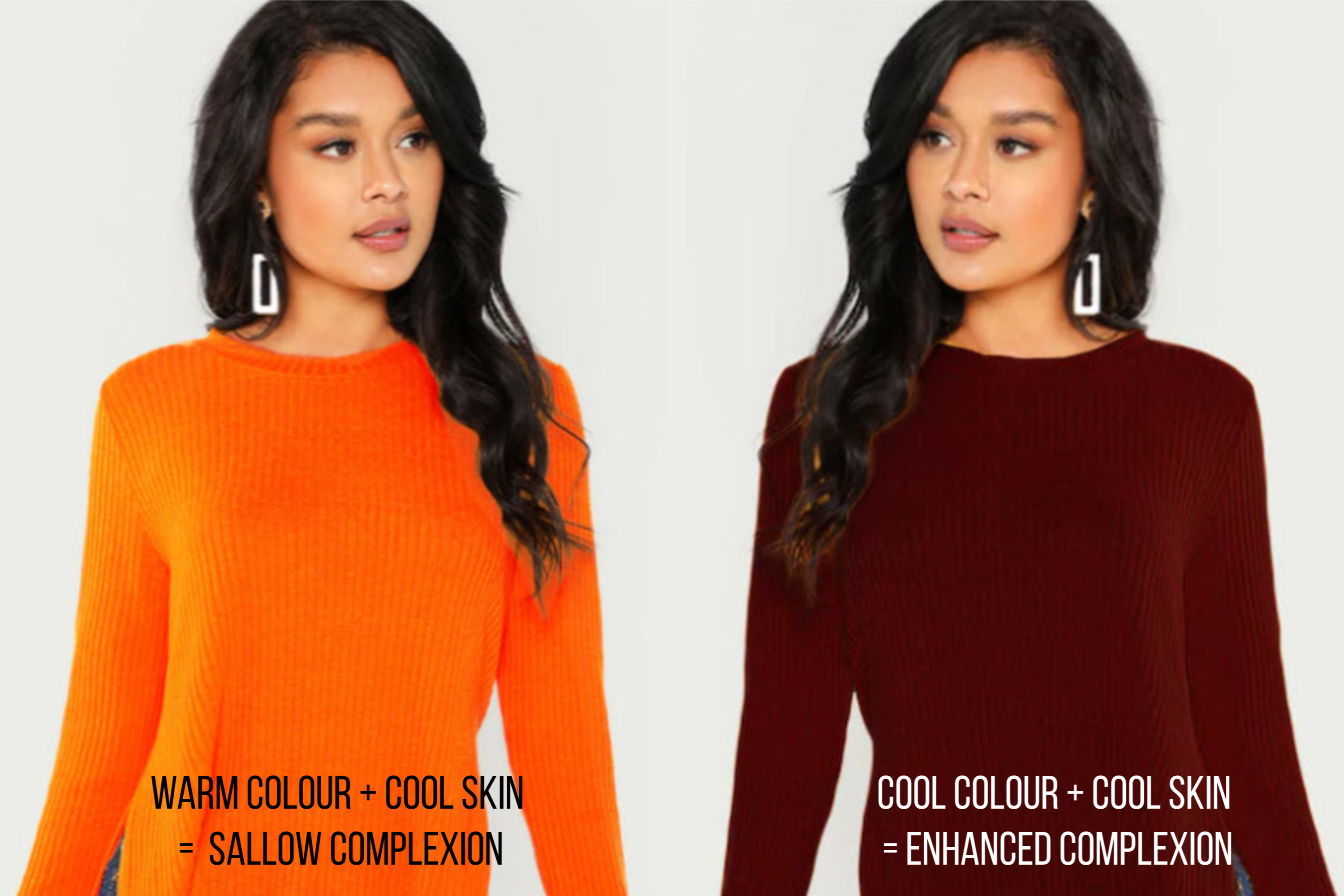
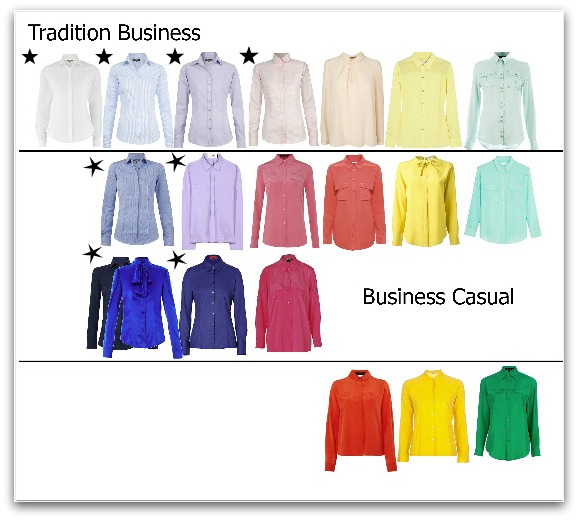
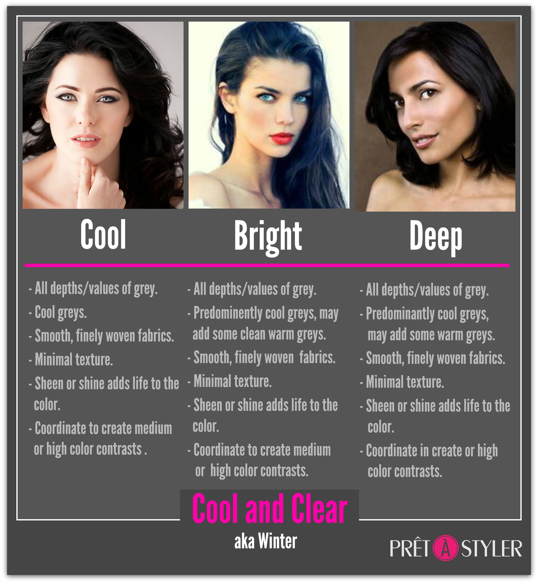
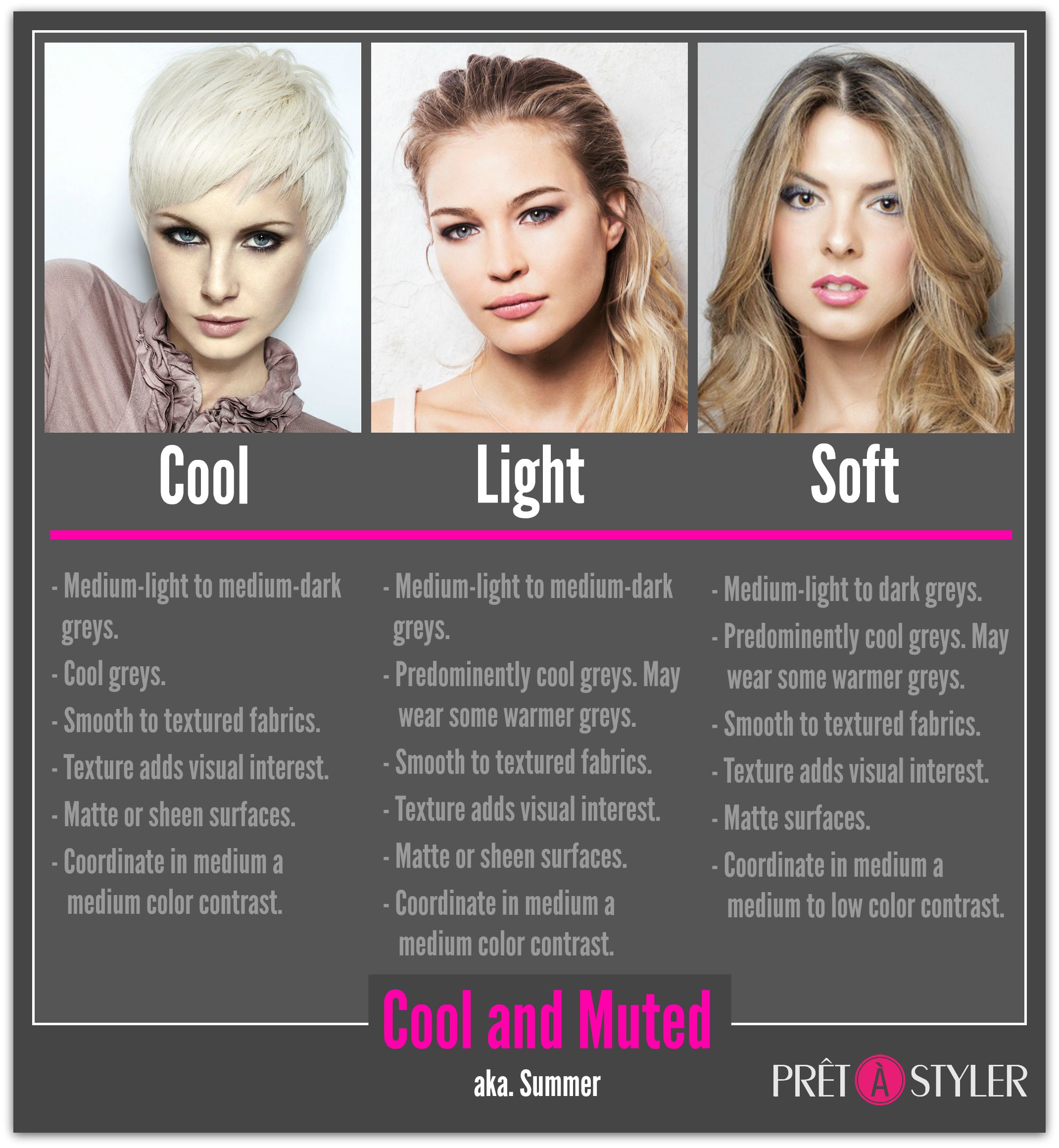
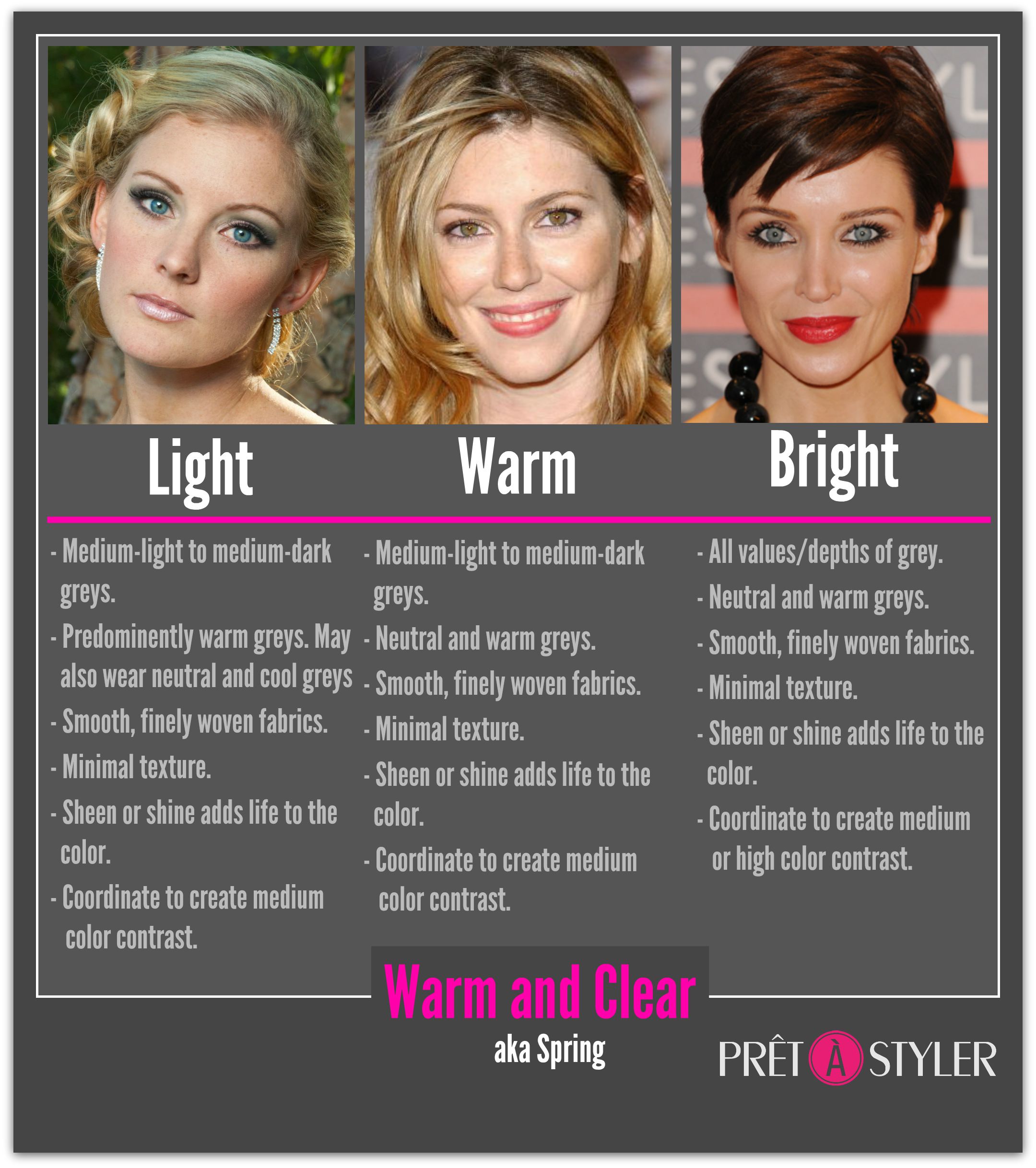
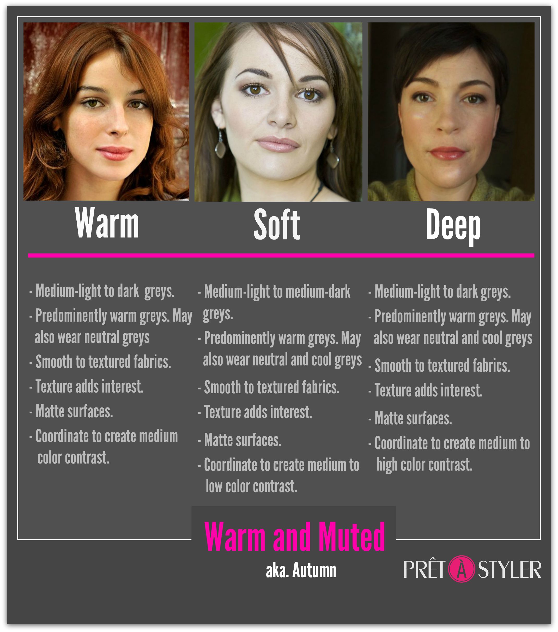
In most cases, a person’s skin can be determined to be primarily cool or warm. Colours that are more neutral are those that are easiest to wear for the greatest amount of people. If your undertone is primarily cool, then colours that are cool to neutral and sometimes even neutral to warm will suit you depending on your colour direction. Colour directions such as DARK cool, BRIGHT cool, LIGHT cool, LIGHT warm, SOFT warm and SOFT cool span between warm and cool colours.
It’s also worth noting that dark and very light colours can be deceiving as these depths tend to appear cool.
Intensity
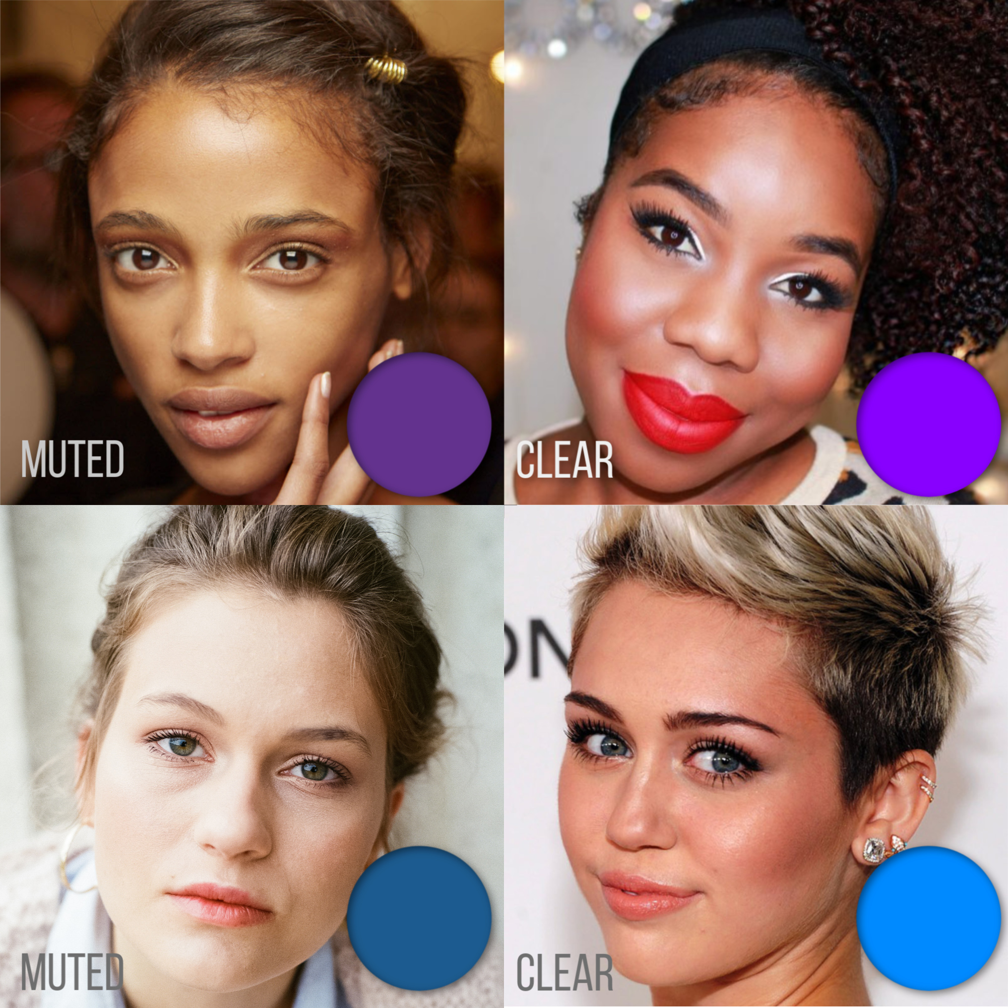
This quality of colour refers to how clear/pure/saturated or muted/muddy/desaturated a colour appears. This is an element that I’ve found most women get right naturally. Many clients I’ve worked with tend to have garments in the right intensity but the wrong temperature for them.
Clear colours are crisp and clean. It’s easiest to see pure colours when they are light to medium in depth.
Muted colours are smoky, soft, greyed and there are, of course, colours that look neither obviously pure or muted and these like neutral temperature colours are easy for many people to wear well.
Colour directions such as COOL clear, BRIGHT cool, DARK cool, WARM clear, LIGHT clear, BRIGHT clear wear Clear colours best while COOL muted, LIGHT cool, SOFT cool, WARM muted, DARK warm and SOFT warm are best with primarily muted colours.
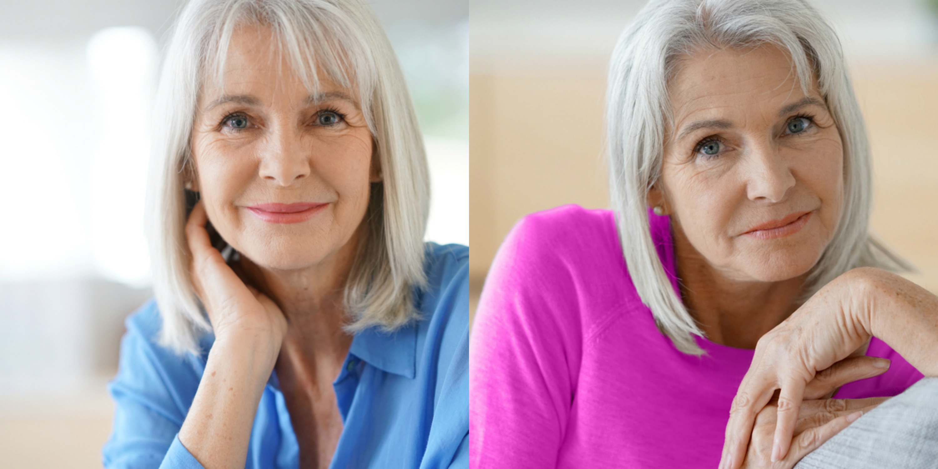
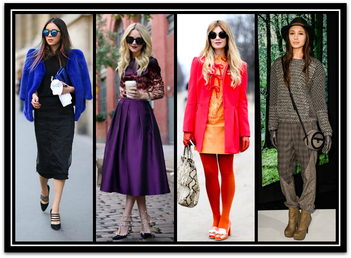
The grey-haired woman below is COOL muted and looks overwhelmed by the bright clear pink while the blue is less intense and more flattering on her.
Like temperature, dark and very light colours can be deceiving as these depths tend to appear more pure/clear.
When it comes to human skin the same elements are present although we rename Pure, Clear.
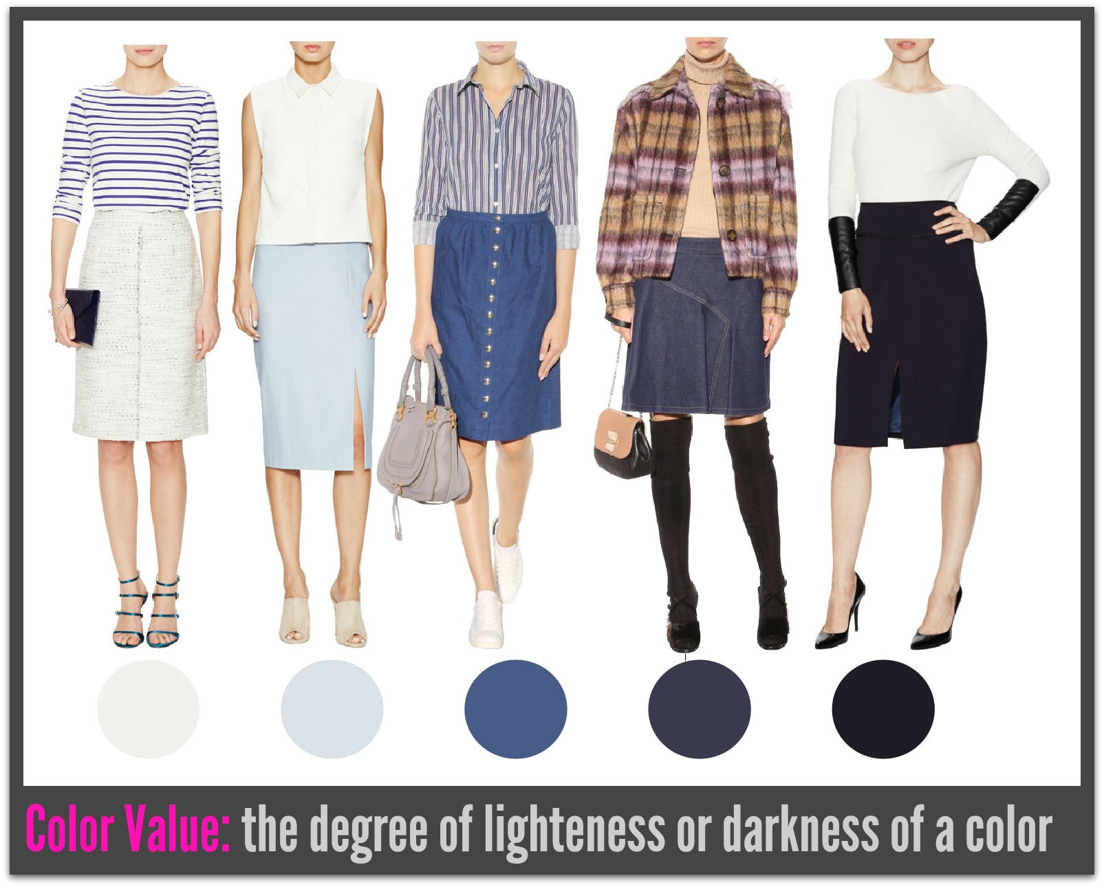
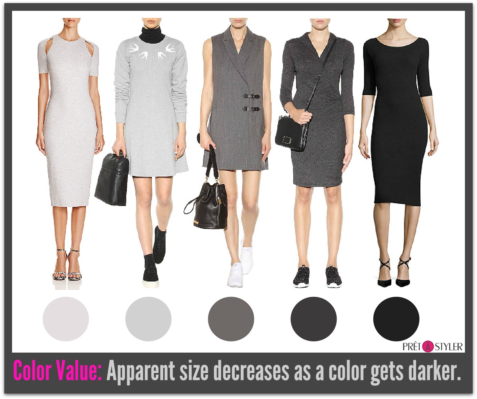
Value
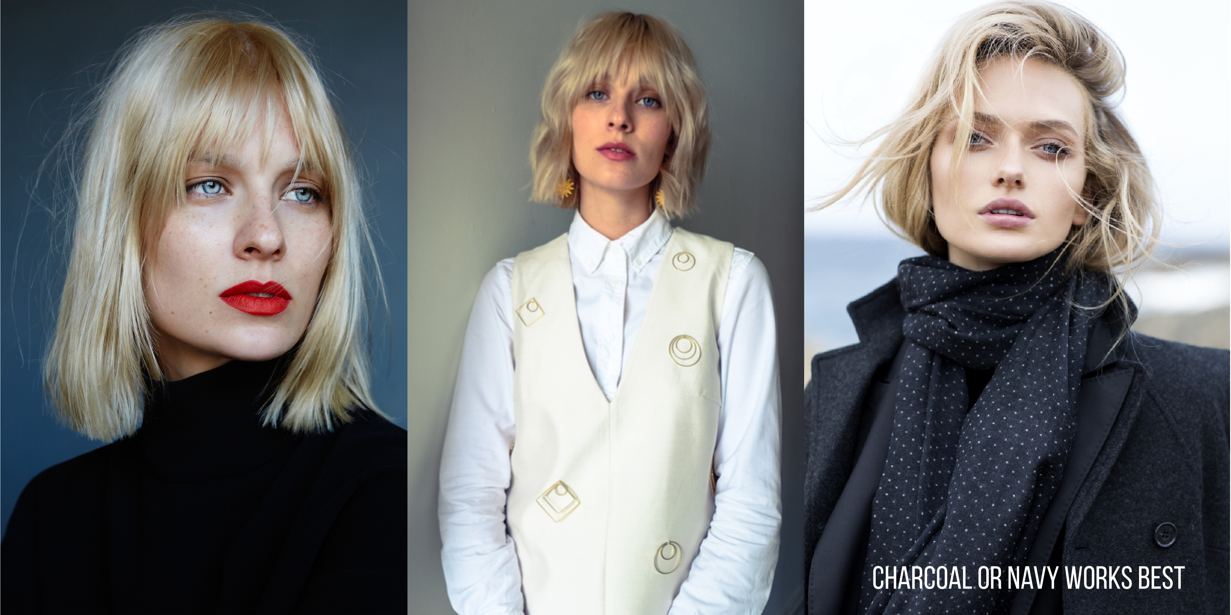
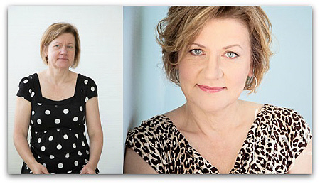
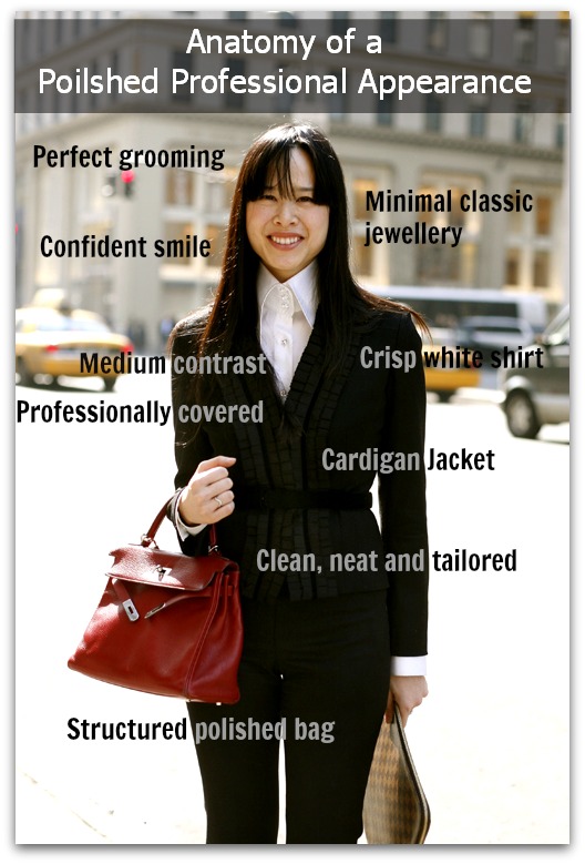
Also known by some as Depth is how light or dark a colour is. Your personal skin value, contrast and colour direction will determine your best colour depths/values. For example, women who are light in colouring tend not to wear very light and dark colours well and are best staying within medium-light to medium dark for clothing and makeup. In the images below the black turtleneck is harsh/stark against the model’s skin and hair and can be especially draining is she is over 50. Charcoal or navy is a far better choice for women who have pale skin and eyes.
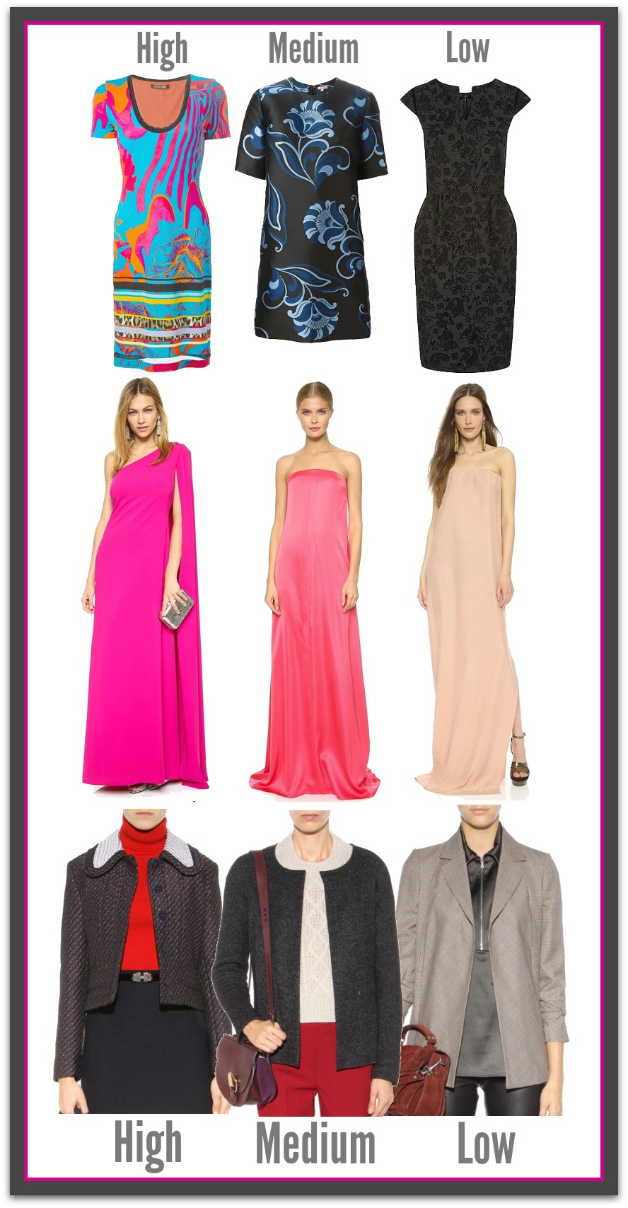
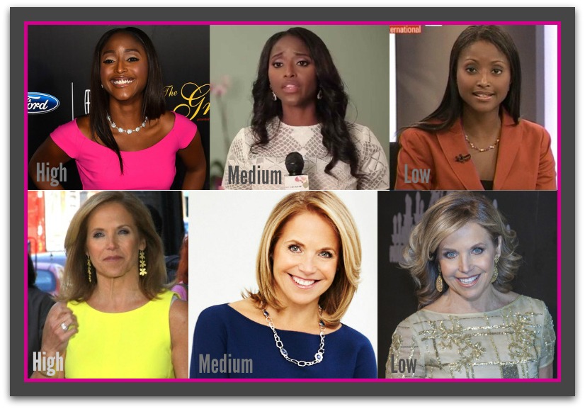
Impact Contrast
Contrast is all about how you combine your best colours for the very best result. Various levels of contrast are achieved by placing colours of different depths and Intensities next to each other. It is slightly different from the contrast taught in art lessons when it comes to high contrast.
Don’t they all combine well since they are the person’s best colours I hear you say?
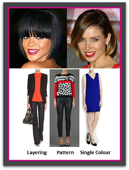
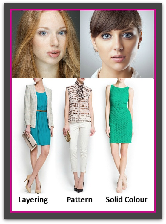
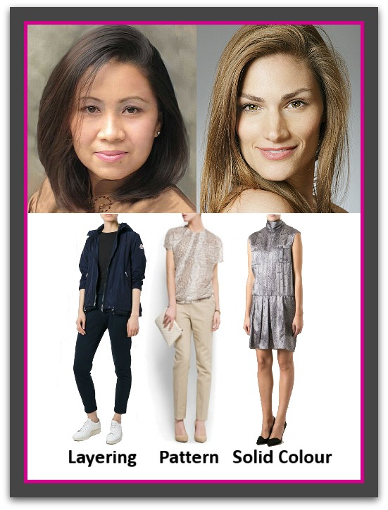
The answer is yes and no. An individual’s best colours all coordinate well with each other, but they may not look that great when worn on you in all circumstances. For example, we can wear a single solid colour near our face, two or more colours when layering i.e. a top, vest and statement necklace or a print comprising of various colours.
Confused? Don’t be, it’s simple really and depends on your colour direction. For example, the woman below has the ID colouring of a Cool muted and has both these colours in her range. While both are in sync with her skin the cocoa coloured outfit while calm and elegant does little to enhance her overall colouring (skin, hair and eyes) because it is too close in depth/value to her skin colour. Understanding which contrast level best suits, you from your colour range makes putting together a versatile, mix and match wardrobe much easier.
So, what are these contrasts?
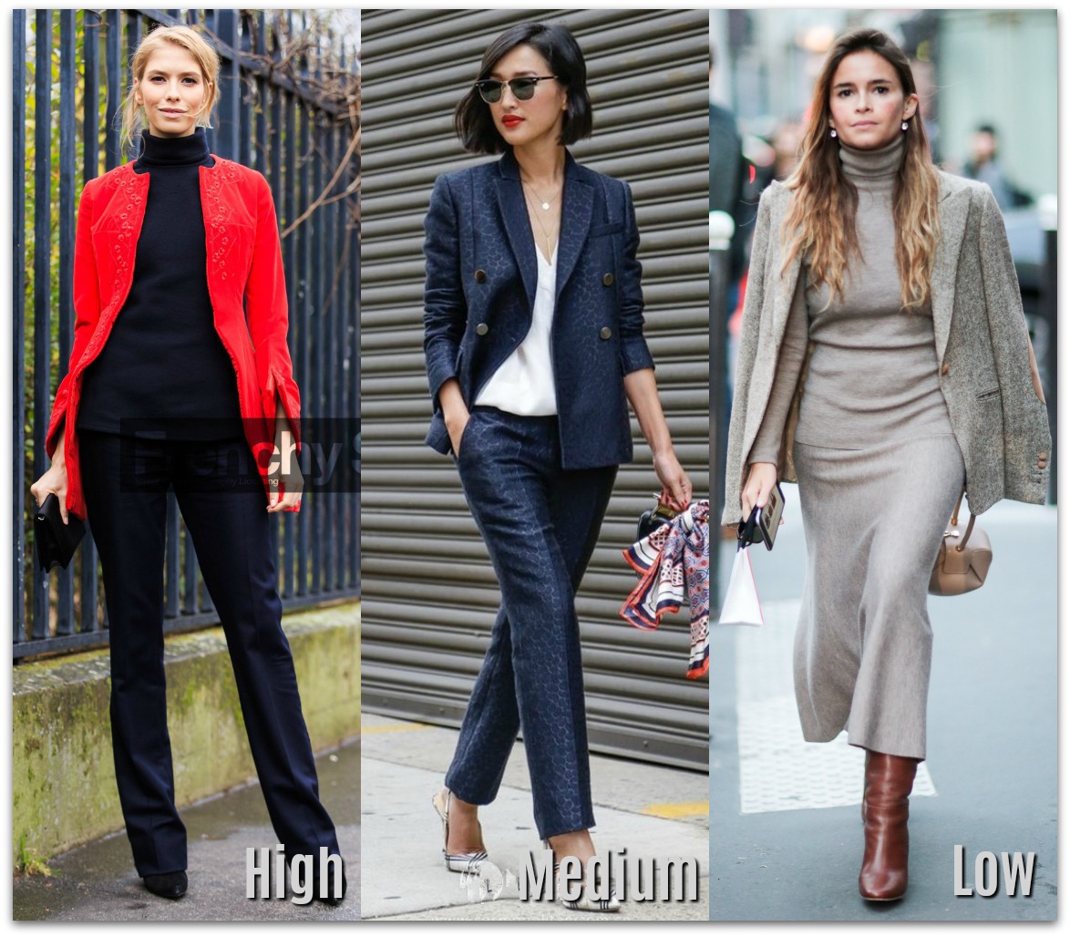
Low Impact Contrast
This is when colours of the same or similar depth are placed next to each other. Take the example above of the model in the light cocoa coloured top against her skin. It’s a colour from her range but worn next to her face provides little visual impact.
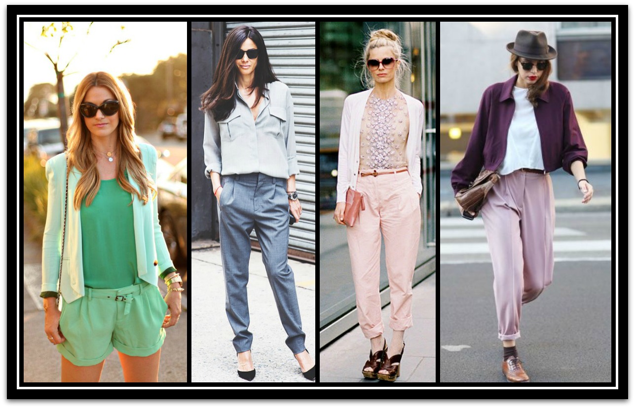
The same occurs when considering prints or layering garments, colours like: like a burgundy sweater and a forest green jacket or a lemon top and linen vest. While the colours are different the Depth/Value of each is almost the same and depending on your colour direction may do you no favours.
Low contrast is effective for times you want to blend in and listen then take part or be noticed.
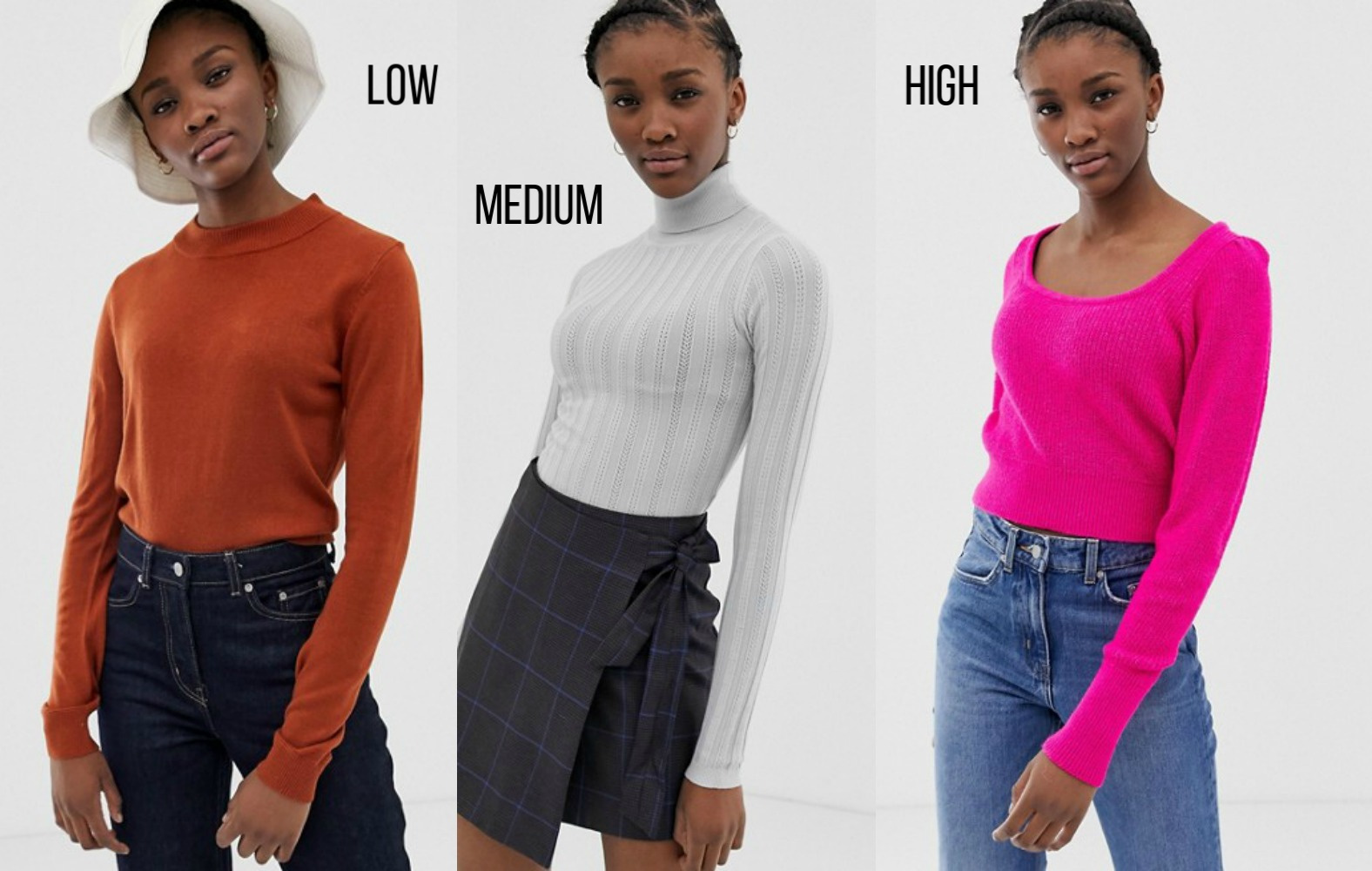
Medium Impact Contrast
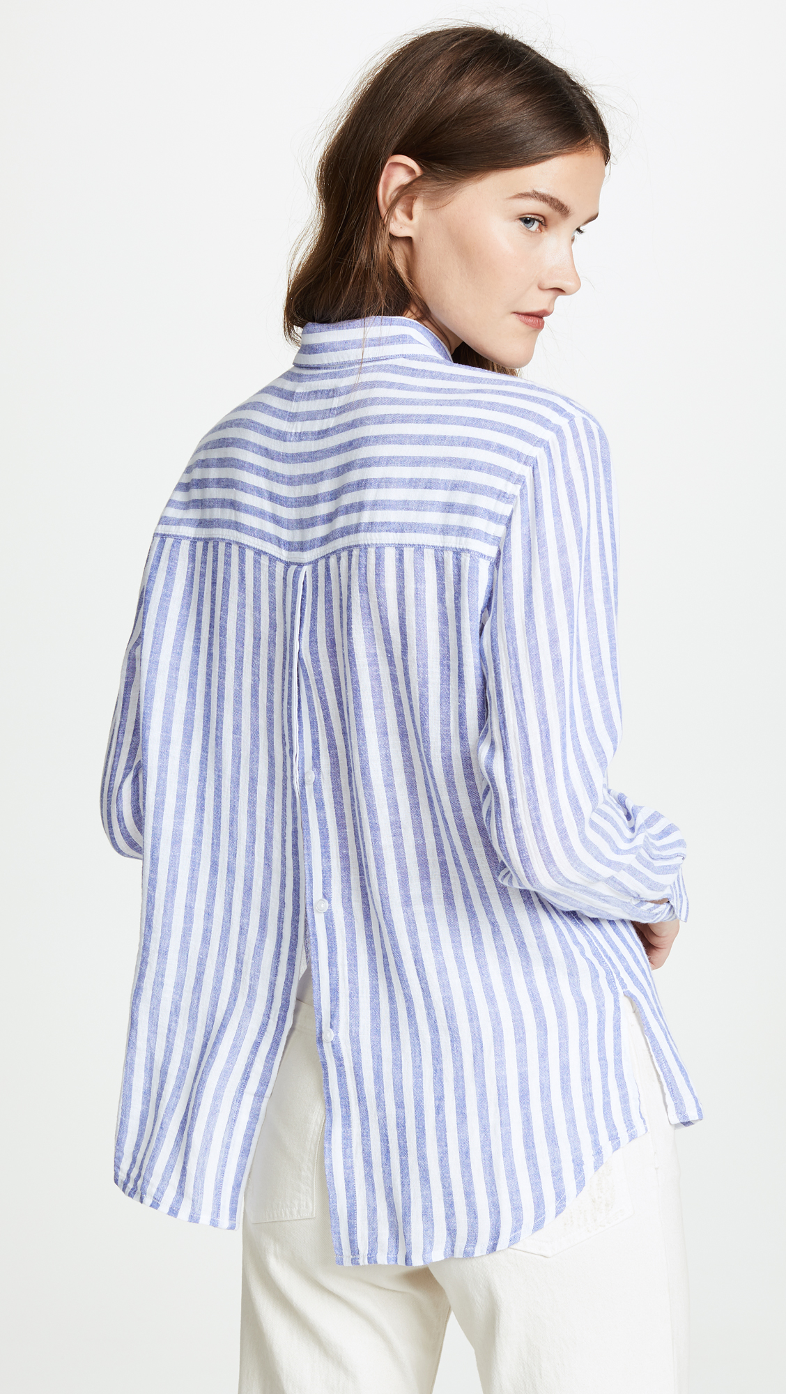
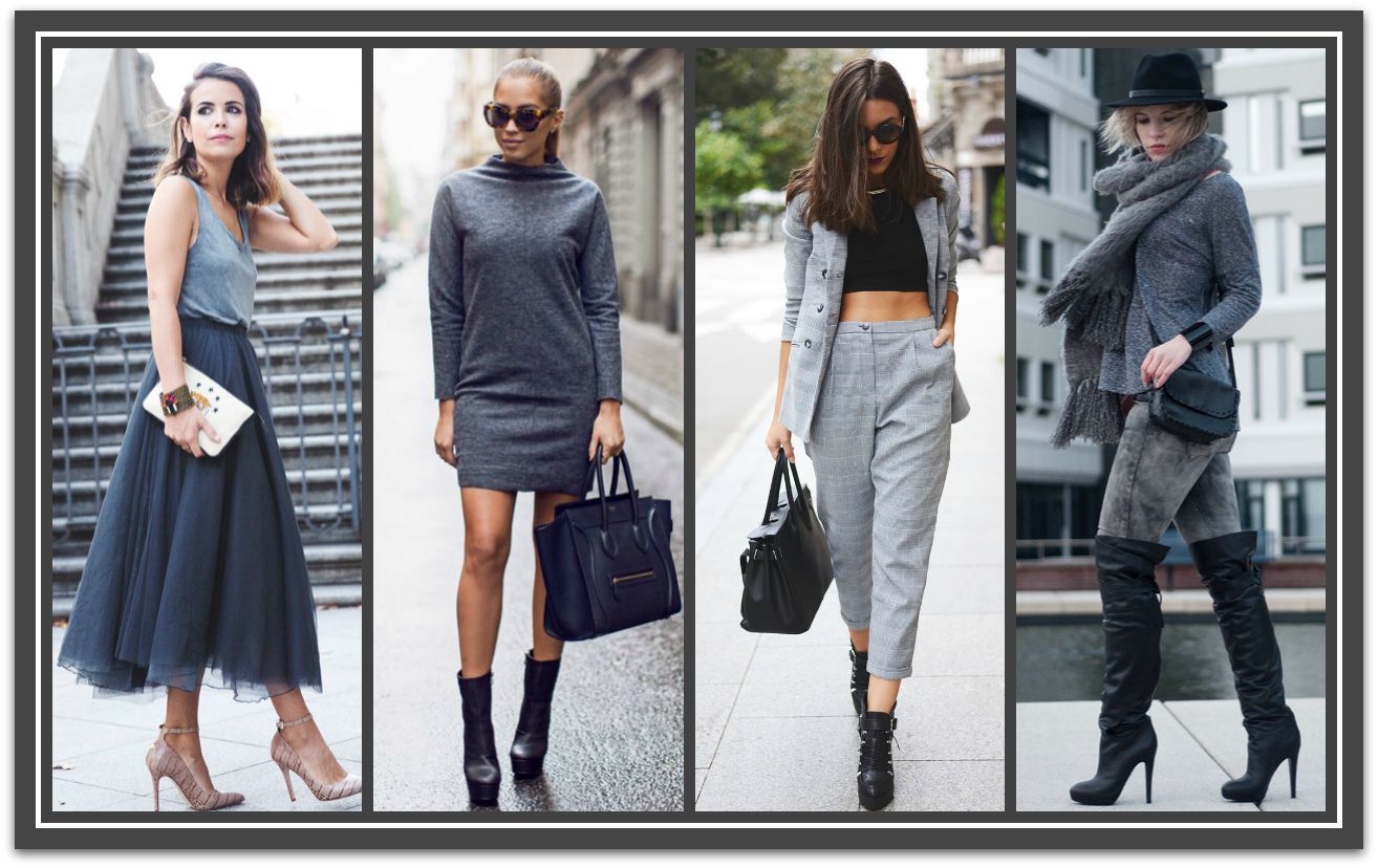
This level of contrast is created when you can discern a distinct difference in value/depth between colours this is occurring in the image below where the model is wearing blue. The colour not only lights her face it also makes her appear more alive and youthful,
Medium contrast is noticeable and approachable and great for times you want to be noticed and shine.
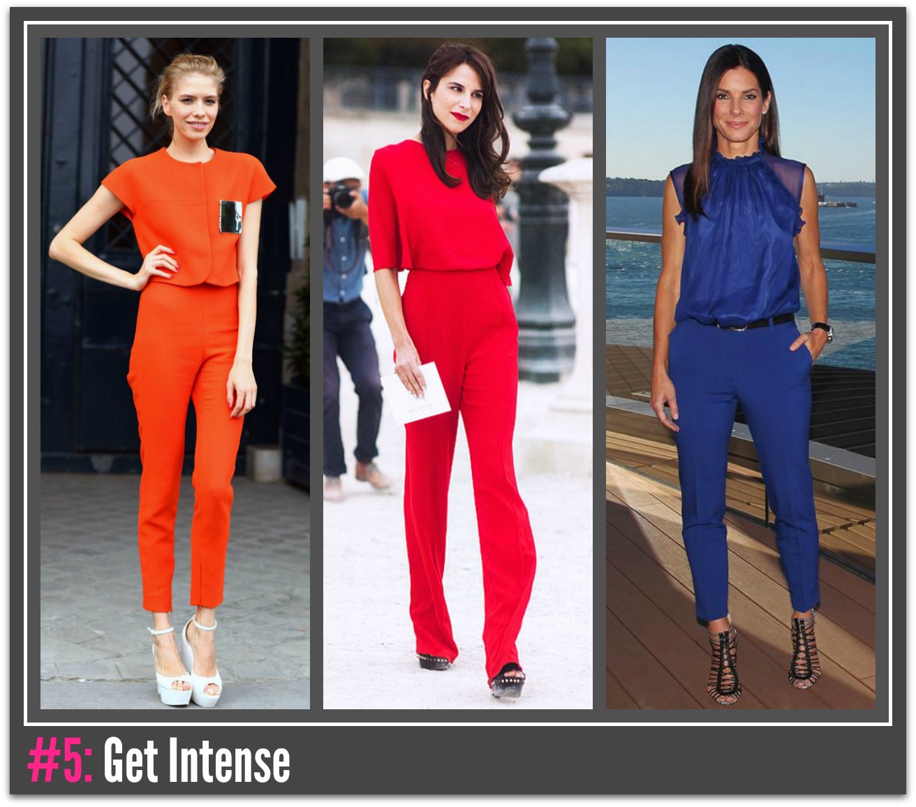
High Impact Contrast
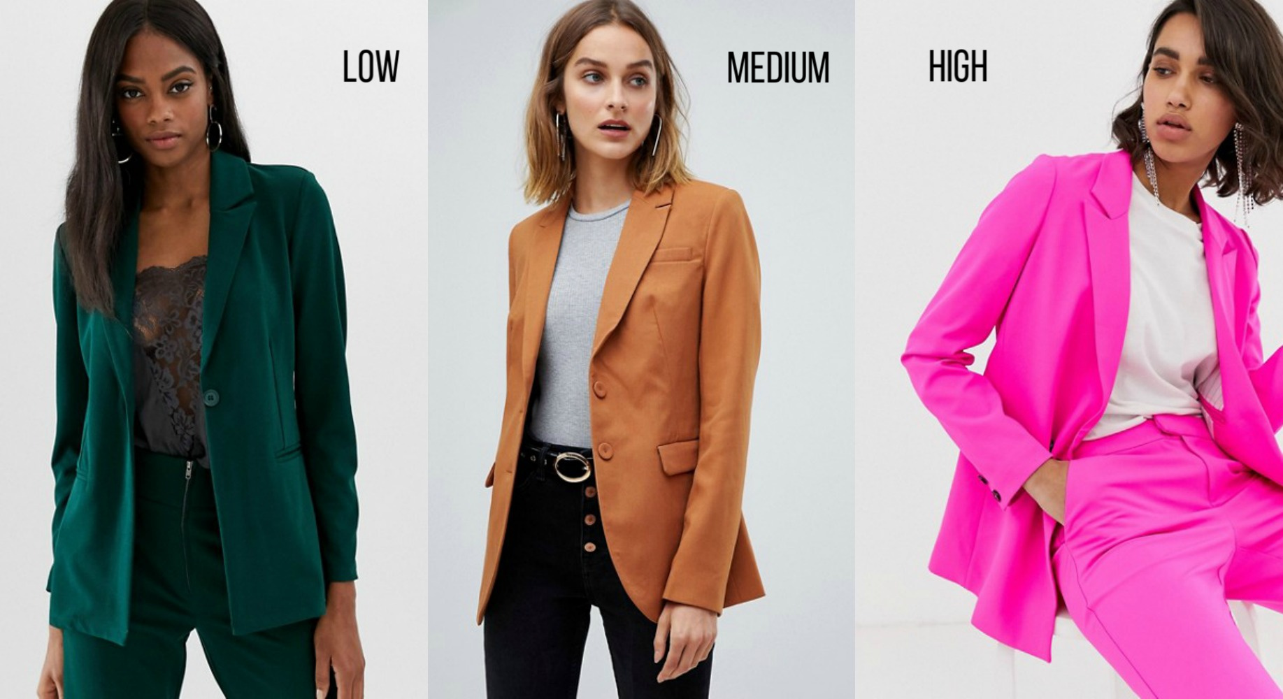
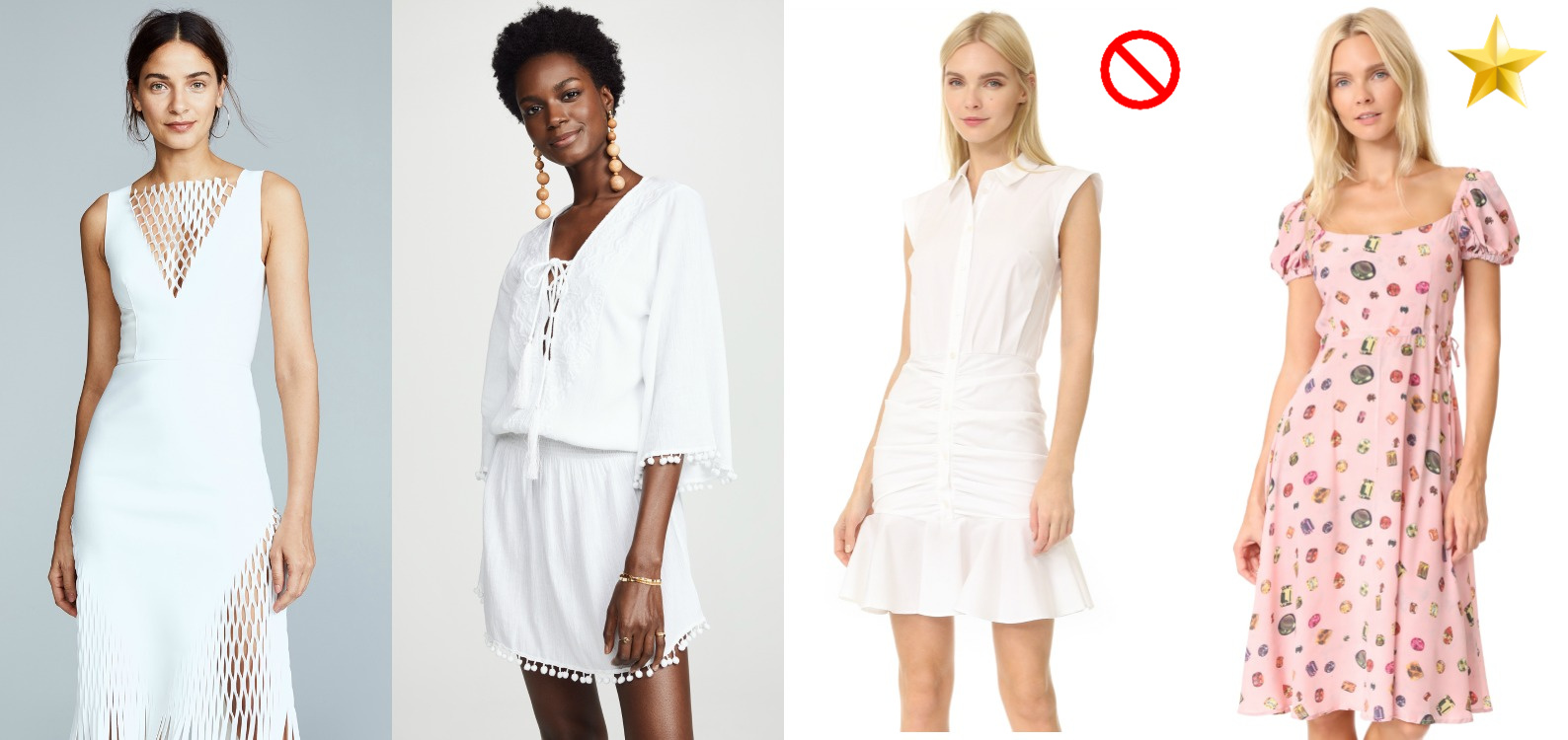
These are colour combos from your colour range that are very different in brightness, not just value/depth. They are colour combos that make you say WOW. High Impact can be achieved from most people’s range of colours but just because you can, doesn’t mean you should. Some colour directions will be overpowered by a colour near their face, in a print or through coordinating layers if the result is high contrast. – see the example pink top below. Directions like BRIGHT cool and BRIGHT warm wear high contrast best.
High contrast is most useful when you want to stand out and be noticed, though it’s so strong you’ll need to approach people as they may not feel comfortable to approach you first.
Don’t stop at clothing when you consider impact contrast, the same effects can be applied to your makeup and hair colour.

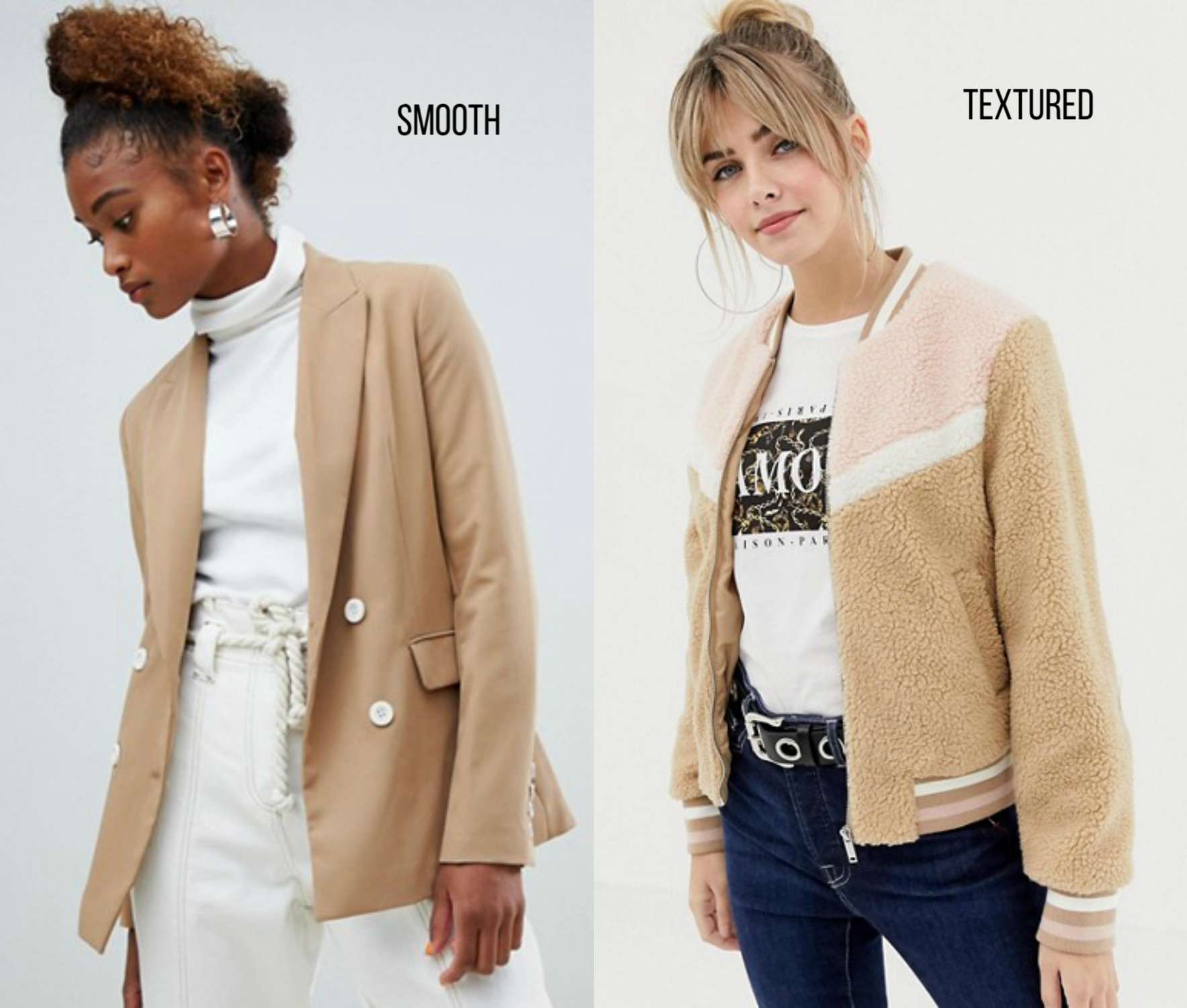
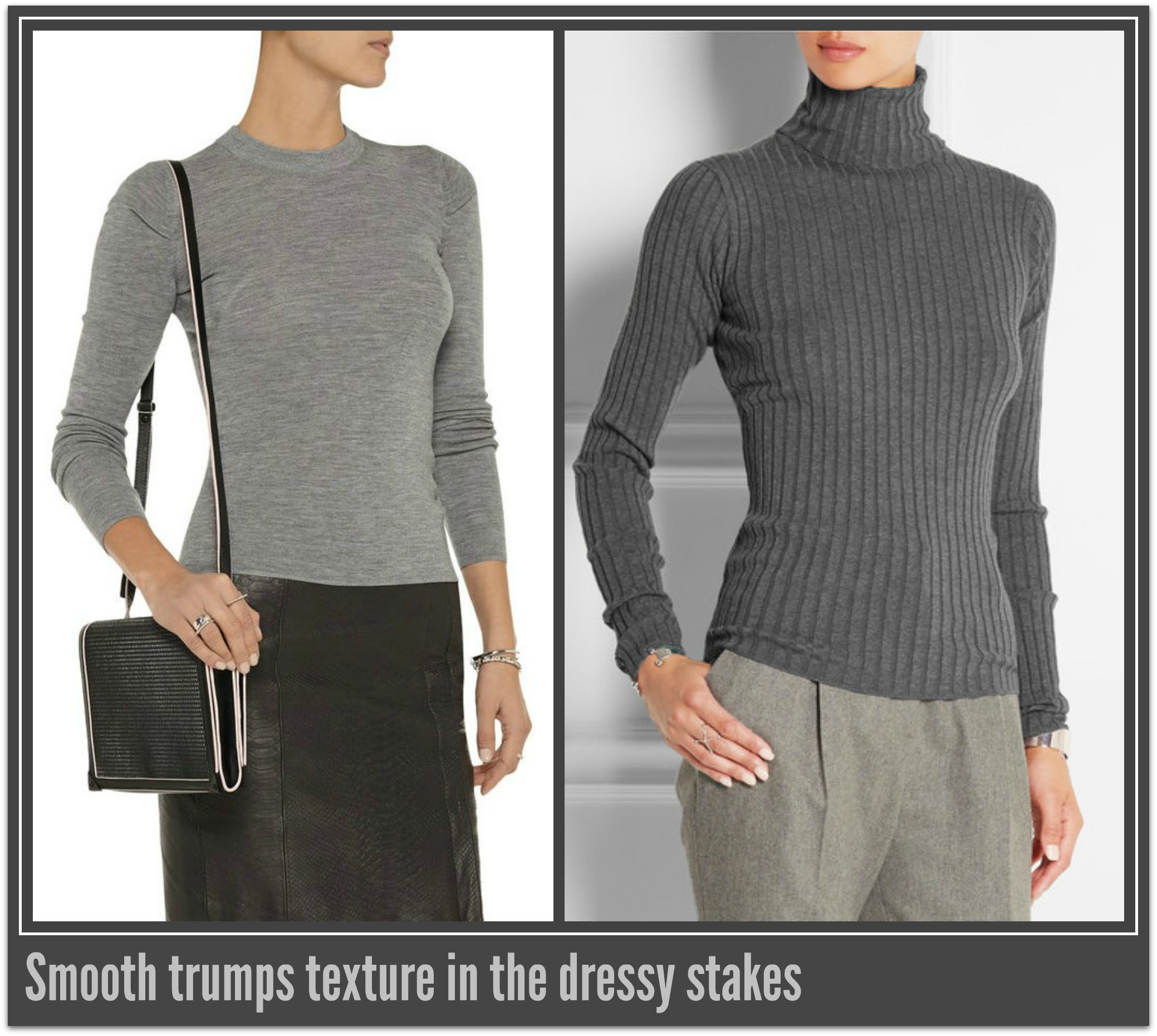
Surface
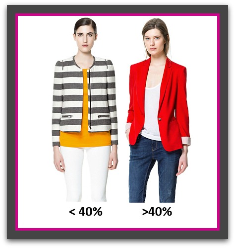
The colours we wear are often affected by the fabric they are in; smooth fabrics allow the colour to show in its full intensity will textured surface tend to mute colours down a little. Colour directions who are primarily Clear i.e. COOL clear, DARK cool, BRIGHT cool, WARM clear, BRIGHT warm, LIGHT warm are all best wearing smooth/fine to slightly textured fabrics while directions who are primarily Muted are best in slightly to very texture fabrics.
As a side note, the more textured a fabric is the more it will attract dirt.
Reflectivity
This is how well a fabric surface reflects light, think cotton, reflects no light/is matte and satin which reflects a lot of light and is shiny. While everyone can wear matte surfaces, colour directions who are Clear look amazing when they add shine; this could be a shiny top or a glossy lipstick,
Women with more muted colouring i.e. COOL muted, LIGHT cool, SOFT cool, WARM muted, SOFT warm and DARK muted, are best avoiding high shine as it can look at odds with their more toned down, matte skin. Think matte lipsticks and textured garments.
Garments with a surface between matte and shiny are said to have ‘sheen’, think silk, and lucky for everyone it suits everyone and is a great way to add a little elegant glamour.
SIDE NOTE: sheen and shiny fabrics in close-fitting garments will show every scary little lump and bump you may have so be sure to done shapewear to create a smooth finish to your silhouette. Alternatively, select garments which skim your body.

Discover Your Best Colours
If you would like to discover your best colours and receive a fabulous Image innovators Colour ID swatch and ebook please contact the consultant you purchased your My Private Stylist program though, search our consultant directory or contact me on ann@imageinnovators.com
A colour analysis is a wonderful way to ensure you shine every day and it’s a way to ensure you create a versatile wardrobe that mixes and matches effortlessly.
Click here if you are interested in becoming an image consultant, to work as a colour consultant or just learn colour analysis.

If you enjoyed this week’s feature
please like it on Facebook or Instagram
or leave a comment/question below.
Thank you.
Ann Reinten AICI CIP
Author


Recent Comments