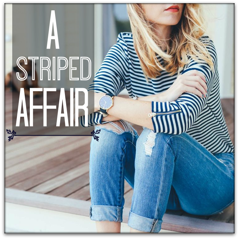
This week I’m changing up my feature up a bit by focusing on a pattern – stripes to be precise.
They are almost as wearable as solid colors and a must-have in any woman’s wardrobe. Their versatility allows multiple ways to coordinate them with your favorite garments and depending which stripe you use you can easily create either a relaxed vibe or a serious edge to your look.
And I’m starting at the beginning because I’ve often found that when you start with the historical aspect of a garment, fabric or pattern, it often yields many insights that make sense of their use in the present, and why we perceived a certain way when we wear them.
Historically, women have borrowed or have been influenced by many menswear items. Stripes were originally a major part of men’s suiting and casual wear, but many important historical and fashion figures have influenced the way they have been used within fashion.
Vertical Stripes
History
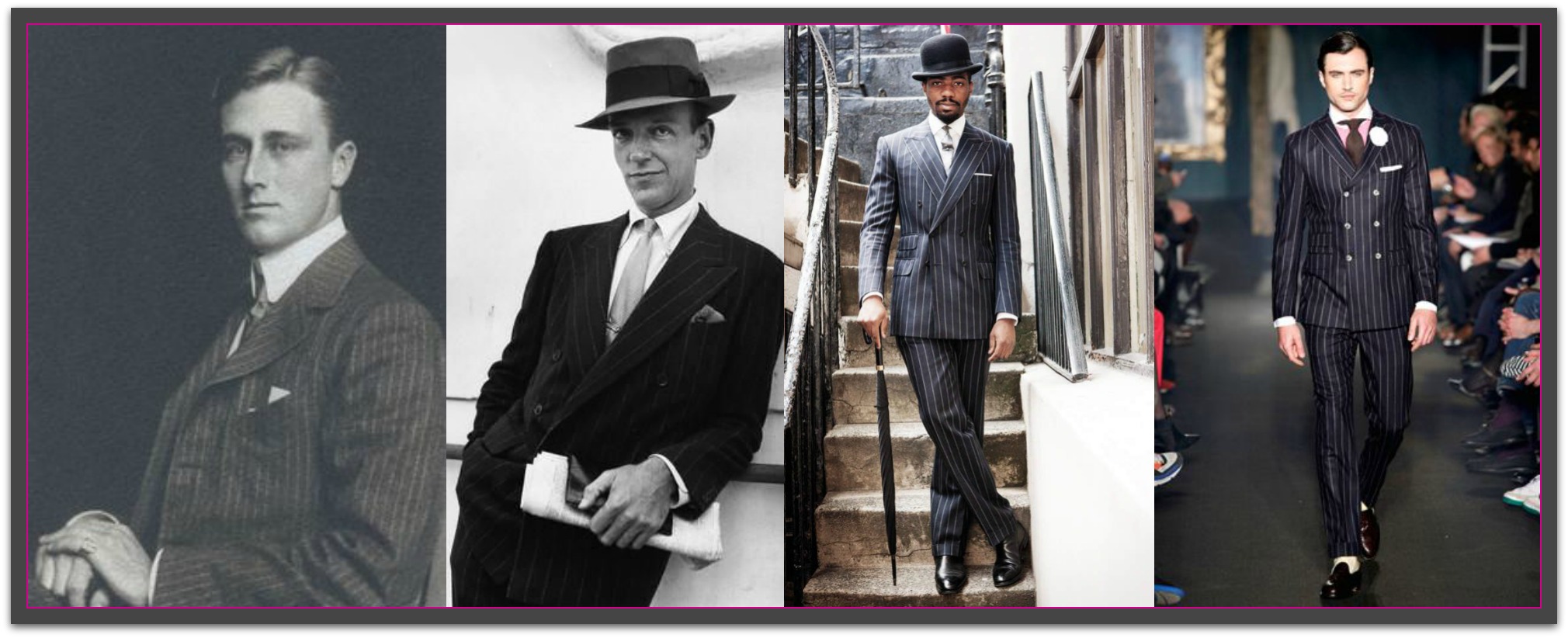
The world famous London Savile Row is considered by many to be the capital of menswear tailoring. Hugh Holland, the managing director of Kilgour French Stanbury, one of the stores on Savile Row, states that the pin stripes we know and wear today originated from bank uniform around the 19th century. London, being a commerce capital during that time, was definitely the place where fashions emerged. A striped trouser paired with a casual morning coat was the uniform of the financiers of the 19th century. More interestingly, each bank had a specific type of stripe so their brand and employees could be easily identified.
 Source: Image 1, Image 2, Image 3, Image 4
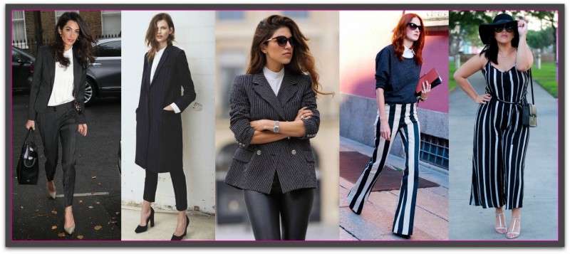
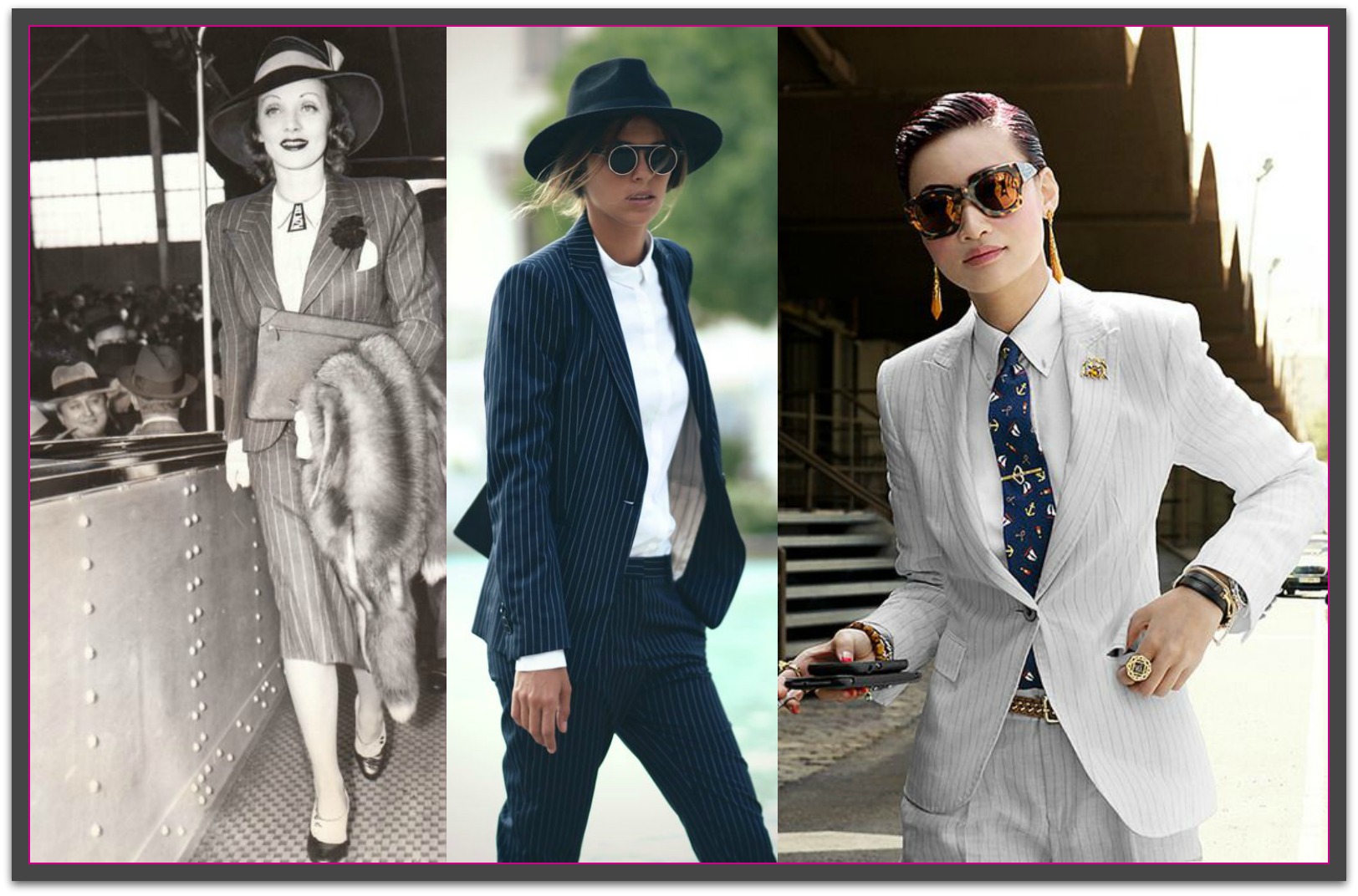
No one is really quite sure of the exact starting point when the vertical pin stripe was introduced to the public. However, there is another popular theory that the pinstripe came about in the glitzy decade of the 1920s where fashion was such a huge part of everyday culture and lifestyle. Inspired by the boating outfits from the late 1800s, the 20s showed off pin stripes in a fun and fashionable way. Pre-Gatsby era, formalwear was quite subdued so more casual suits came forward as a way to make menswear more playful and vibrant. Take a look at vintage photos of men in pin stripes suits and you’ll start to really understand what makes these vertical pin stripes so wearable and chic. The thinness of the stripe makes it work appropriate, but you can just as easily jazz up vertical stripes with bolder accessories and styling. Pin stripes wouldn’t be the first trend that women have adopted into their own fashion realm and it certainly won’t be the last, since fashion is always changing and borrowing inspiration from the opposite gender. Here are some perfect examples of women’s tailored suits, from vintage to modern:
 Source: Image 1, Image 2, Image 3
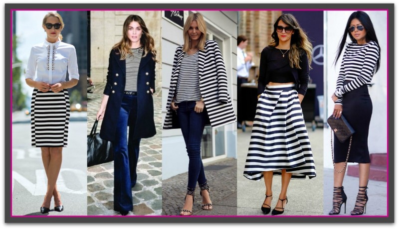
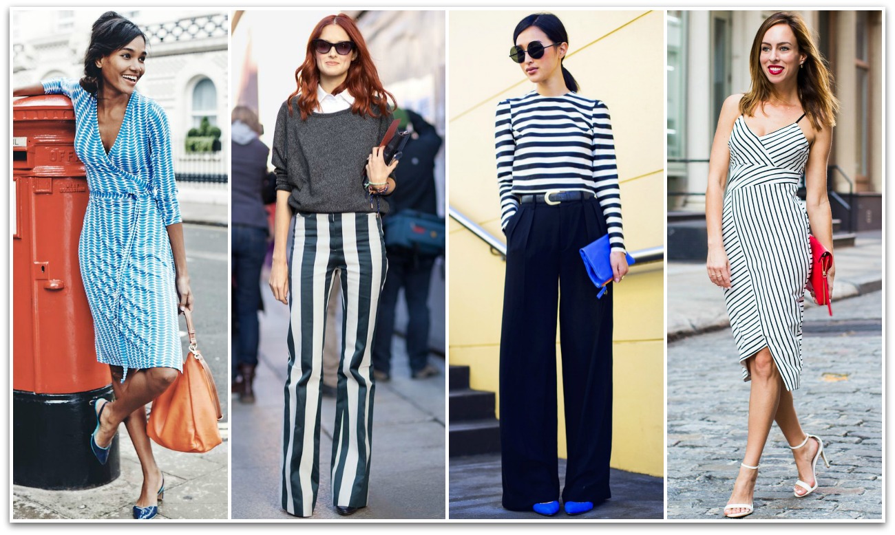
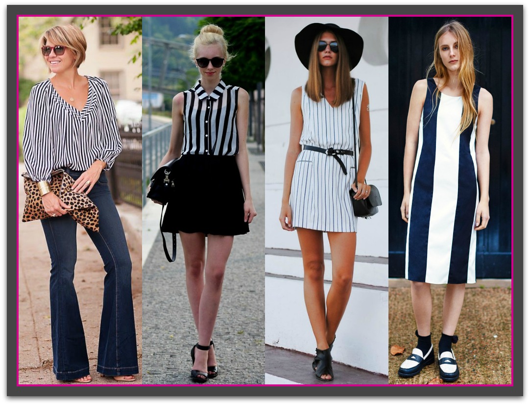
If you want to look toward current trends, bold and graphic stripes are the vertical stripe look of the moment. While historically, pin stripes are the reigning kind of vertical stripes, current trends and style have been dictating more graphic, statement-making large vertical stripes.
How They’re Perceived
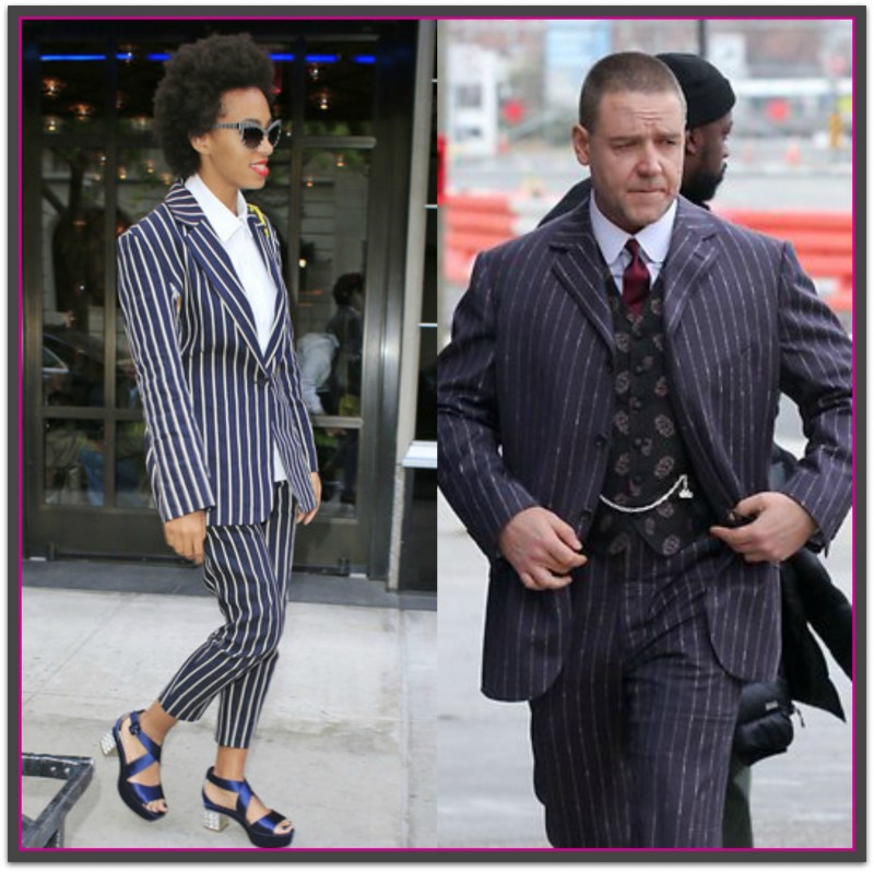
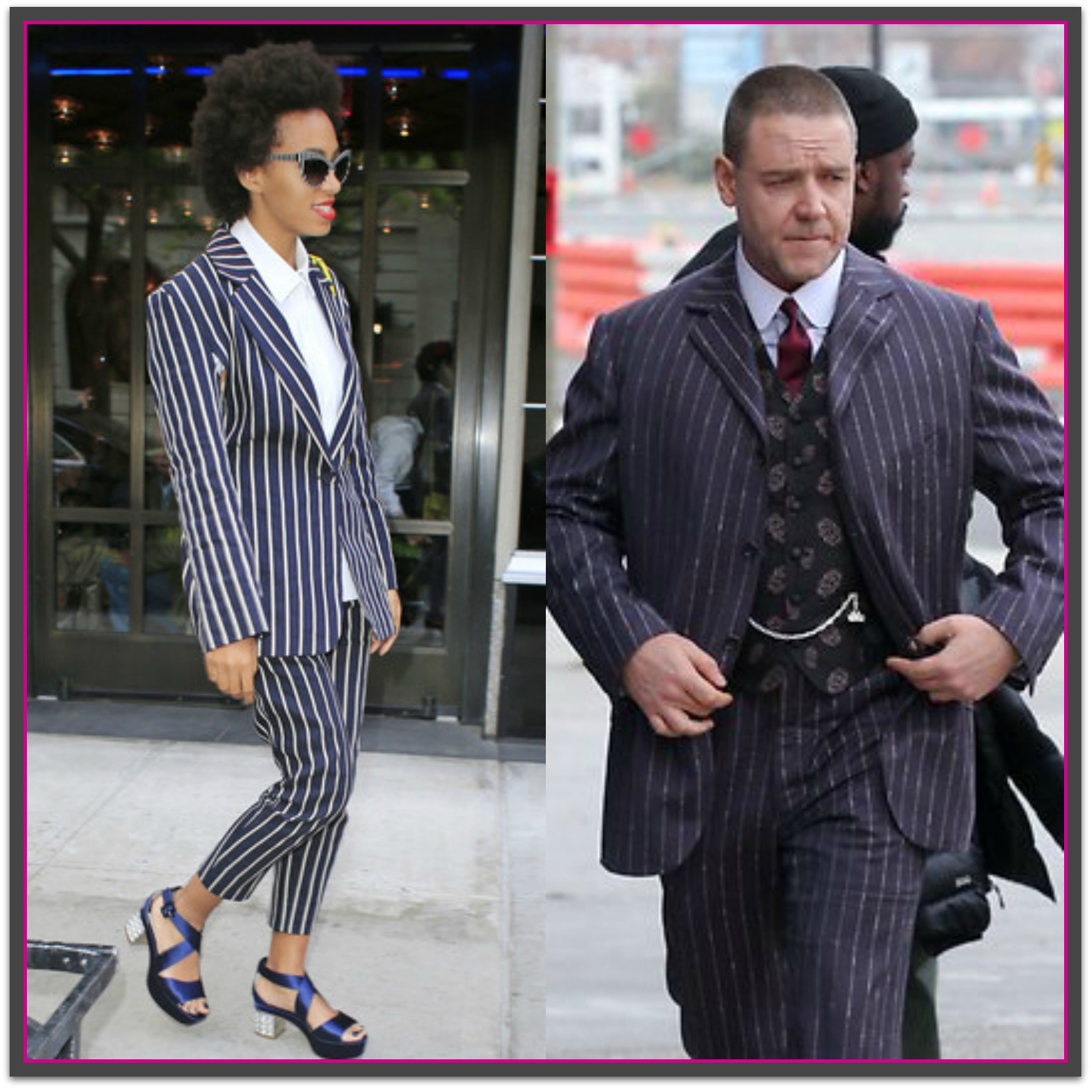
With a history associated with professional endeavors and formal events, the vertical stripe is seen as powerful, professional and authoritative. Variations of the stripe include pencil and chalk with each gaining their name from the width of the line created by the pin, pencil or piece of chalk. The narrower the stripe, closer together and more classic the stripe color, the more formal the impression they will create. If you are seeking the most professional look, opt for stripes in color pairings of neutral hues like black, navy, and white.
 Source: Image 1, Image 2, Image 3, Image 4, Image 5
One last vertical stripe worth mentioning is the gangster stripe. Stereotyped more from movie myth than truth, the fact remains that if you wear it, you run the risk of being seen as theatrically contrived than stylish.
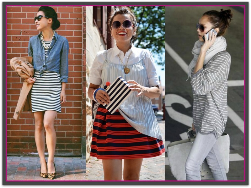
Visual Effects and Styling Tips
It’s virtually a no-brainer that vertical stripes are slimming. The vertical line naturally encourages the eye to travel up and down elongating and visually slimming the area. Here are some more vertical features you may want to look for if you want to increase the slimming effect:
- One central stripe as a focal point of the garment
- Many thin stripes close together
- Low color contrast in between the stripes
- Vertical stripes worn over your largest area
- Long length vertical garments
- Don’t wear vertical stripes over areas where you are curvy as the stripes will stretch out of shape.
Try to avoid wearing one prominent stripe to the side if you are wide, as this can make you look wider. A central stripe is best when you wish to look taller or slimmer. When opting for vertical striped pants, avoid fabrics that stretch as this will warp, hug, and expand over your fullest areas.
To read more about styling with vertical design lines see: The Vertical Advantage
 Source: Image 1, Image 2, Image 3, Image 4
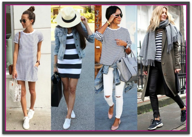
Horizontal Stripes
History
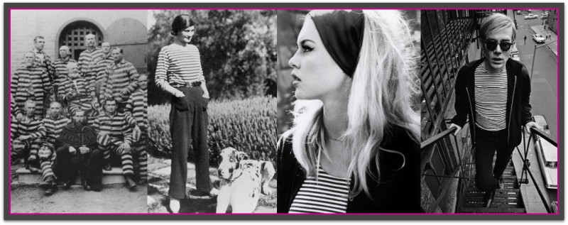
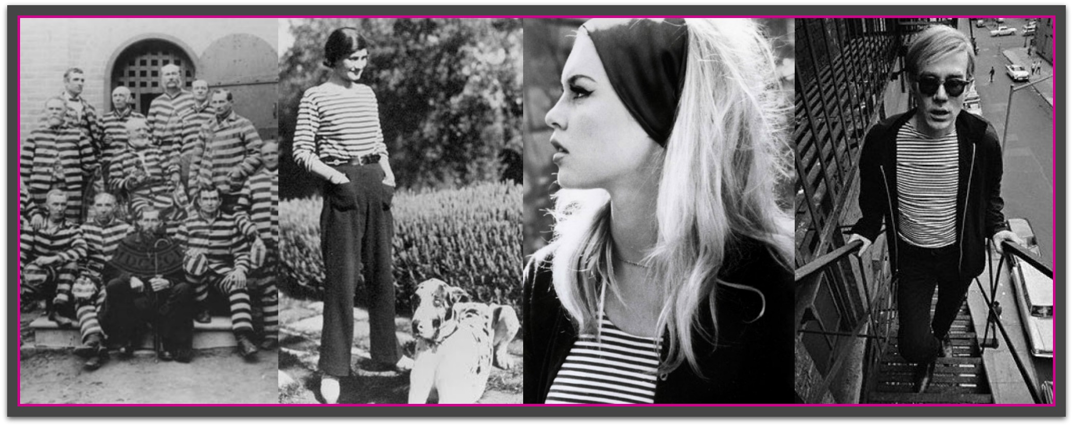
Dis you know that during medieval times, you could get sent to prison for simply wearing striped clothing? It’s true. Stripes were for prisoners, and well, evil people. We, along with the fashion industry, have definitely evolved from that belief. Now, stripes have moved on from their negative medieval connotations and have become one of the most coveted patterns for fashion.
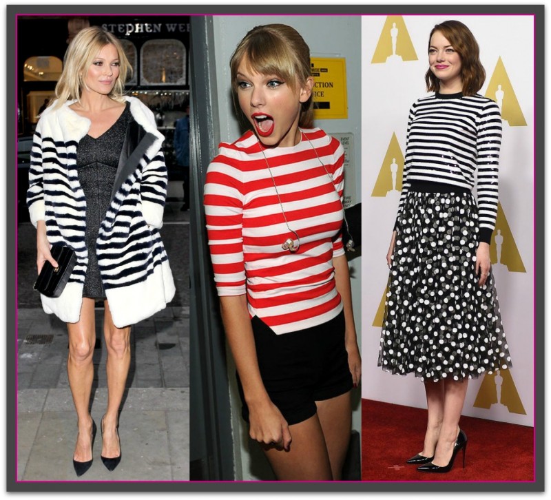
From the 1800s onwards, horizontal stripes became one of the fashion staples that we know and love today. Queen Victoria dressed her son Prince Albert in a striped sailor suit aboard the Royal Yacht, and from then on stripes were firmly in the public eye. The 19th century then saw the popularity of the horizontally striped Breton shirt worn by French navy men. Coco Chanel, however, gets the ultimate credit for bringing horizontal stripes into the 20th century when she sold it from her store. From then on, pop culture and fashion icons like Audrey Hepburn, Pablo Picasso, Brigitte Bardot, and Andy Warhol further popularized the striped Breton Shirt in the following decades. Nowadays, modern fashion icons like Kate Moss, Emma Stone, and Alexa Chung are huge fans of stripes, and are often photographed wearing this eponymous pattern and styling it in different ways.
 Source: Image 1, Image 2, Image 3, Image 4
Source: Image 1, Image 2, Image 3, Image 4, Image 5
How They’re Perceived
Definitely more laid-back than vertical stripes, horizontal stripes are the more casual and sporty of the two kinds of stripes. For business wear they are best left for your business casual days.
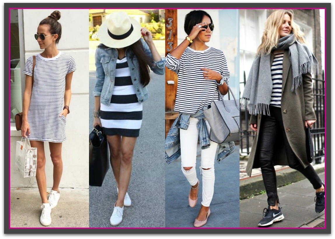
One of the most famous and frequent fashion comebacks is the Breton top and it can be relied on to give your look a chic, nautical image. While these stripes do have a definite sporty or casual stereotype there’s no need to feel trapped into the looks as there are many ways to dress the stripes up through the use of tailoring, color, sheen and shine, texture and accessories.
 Source: Image 1, Image 2, Image 3, Image 4
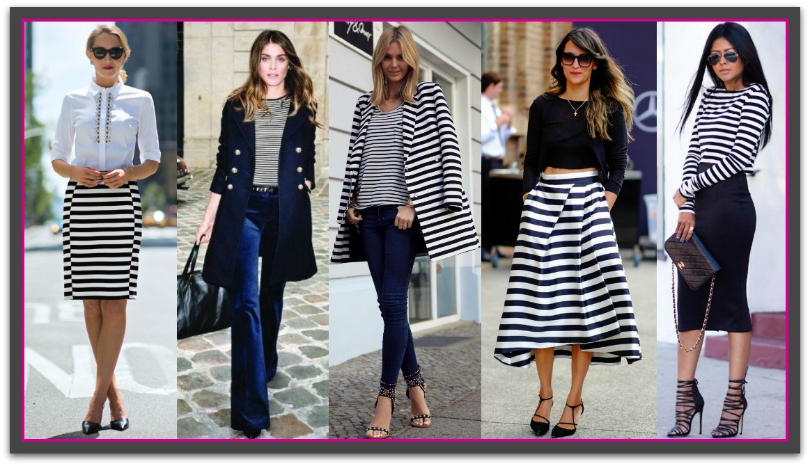
Glam up Your Horizontal Stripes Ideas
Source: Image 1, Image 2, Image 3, Image 4, Image 5
Visual Effects and Styling Tips
Horizontal stripes can be a bit tricky, but don’t listen to people that say they aren’t flattering. Pulling off a pattern is all about styling and finding the right fit for your body and personal style. With the right elements, horizontal stripes can even be, dare I say it, slimming. Here are some tips to make sure that horizontal stripes slim you down:
- Look for garments with many thin stripes close together
- Choose low to medium color contrast between the stripes. Think monochromatic like navy and midnight blue stripes or red and maroon stripes
- Ensure the garment is longer than it is wide (the middle photo below is too short).
- For pants and skirts look for sturdier fabrics with some elasticity.
- Wear the horizontal stripe over your smallest area.
- Consider your body type. Full figured women can get away with slightly wider stripes while petites should opt for thinner lines.
- Be mindful of the garment silhouette a striped item comes in.
Source: Image 1, Image 2, Image 3
To read more about styling with vertical design lines see: Horizontal Help.

If you enjoyed this week’s feature
please like it on Facebook or Instagram
or leave a comment/question below.
Thank you.
Ann Reinten AICI CIP
Author


Recent Comments